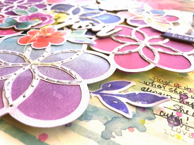
I decided to add a bit of hand stitching to the centers of most of the flowers. I love the added texture this gives. I went through the Die Cut Ephemera and added a few flowers and leaves around the page. I raised the cut file off the page by adding some adhesive foam under it.
sdfg
Here I tucked in a Flair Button and some soft pink thread. Under the photo I added an Accessory Sticker and Chipboard Accent Sticker. There are so many bits and pieces in this collection!
I went simple with the title and used one of the white Chipboard Title Stickers. I left it white since there were so many colors surrounding it. It stands out against them. I added a few more die cut flowers and a chipboard butterfly.
I seriously can’t get over how pretty these colors are. It’s hard to narrow down a color scheme because I just want to use them ALL! So I do…haha!
Here’s one last close-up of the top area of the photo. I cut a few die cut label pieces in half and used them as layers and used a few of the Accessory Stickers. I also used one of the Clear Stamps above the photo.
I hope this inspires you in some way. This collection is so pretty, and despite all these colors, you can narrow it down and do fewer colors. I’ve seen other DT layouts using just blues or just purples. I just can’t help myself from using them all! Be sure to check out my process video if you’d like to see how I made this.
Thanks so much for stopping by, and have a fun scrappy week :)


No comments:
Post a Comment