Thursday, April 30, 2020

Pool Party / Shimmerz

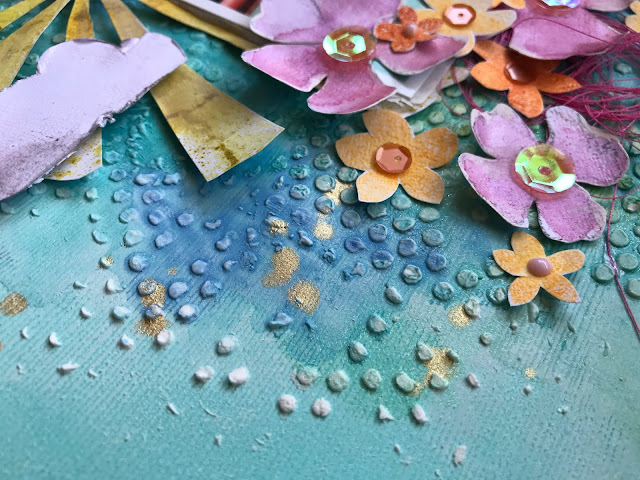
Hey there, friends!  I'm back today with a fun and bright layout for Shimmerz Paints featuring a whole bunch of Shimmerz goodness :)  I love making layouts "from scratch," which means I make most of it using only cardstock and Shimmerz.  I began this page with a light minty teal sheet of cardstock.  I wanted to create lots of texture and color, so I covered a lot of the center area with white gesso and went from there.

I used a very old dotted stencil and some modeling paste to first create some background texture.  Once that dried, I came in with lots of blue paints.  My first thought was to create a monochromatic page, but that went out the window when I decided to add in a big sun and some flowers :D


Colors used on the background:
Colors used on the sun: 
Colors used on the flowers:
Other:

Once the paste dried, I used all of the blue & green shades to add color.  I added some paint to a brush, swiped it onto the paper, added a bit of water and then watched the colors blend.  My pool photos were the perfect match.  I decided to brighten things up with some pink flowers, so I got brave and hand drew some.  They are totally wonky, but I love how they turned out!  I used all the pink, purple & red colors to add color to them.


I love mixing and matching Shimmerz together.  They just create the most beautiful shades!  After making several pink flowers, I fussy cut them out.  I then decided to add in some orange, so I pulled out an old Heidi Swapp stamp set and used some orange ink pads from Pinkfresh Studio to make those.  I also fussy cut those out and tucked them all around the pink flowers.  I topped them off with some SpiegelMom Scraps sequins.


To create this sun, I used the Paige Evans Sunburst Rays stencil.  I laid it over some scrap white cardstock and sprayed Mustard Seed & Rolling in the Hay over it.  I took the actual stencil with all the color on it and stamped it down on the back of the cardstock and loved how it looked.  So I cut it out :)  I popped it up using adhesive foam.  I love how splotchy and imperfect it is!  And what is a sun without clouds?  I hand cut those from white cardstock and used a bit of Vibez Grey Flannel to add some color around the edges.


I added some darker pink thread in a few places.  On the tiny orange flowers, I added a drop of light pink Nuvo Crystal Drops.  I love how cool this background turned out!  It feels so rough and bumpy.


I wound up adding some gold splatters, which is Miner Miner 49er...my favorite Shimmerz gold.


The only other embellishments I pulled from my stash were from the 2016 Simple Stories You Are Here collection.  I added in this orange dotted chipboard frame.


And I added these white clear stickers...they're visible yet subtle and don't distract from the photos.  I went short and simple with the title.  I used some shiny gold Thickers.  I toned down the shine by smudging some white gesso over them.  It just makes them have more of a matte finish.  I used a metallic gold pen to write my journaling.


Here's a few more just because :)


I really love how this came together.  How often do you make layouts using primarily cardstock?  It's a lot of fun for me!  I hope this gives you some ideas and shows you how you can make your own backgrounds and embellishments with only cardstock & lovely Shimmerz :)

Check out my process video over on the Shimmerz YouTube Channel :)

Thanks for stopping by, and have a wonderful day!

Wednesday, April 29, 2020

Just Smile / Hip Kit Club

Happy Wednesday!  Here's my newest layout for Hip Kit Club featuring the 2020 April Hip Kits :)  There are so many opportunities for rainbows in these kits...and I couldn't resist!  I was inspired by the beautiful Crate Paper Sweet Story collection, and I began by cutting out rainbow arcs from one of the rainbow patterned papers in the Main Kit. I pulled in other papers that had matching colors, and I cut arcs from them as well.  I wound up layering them to make a wonky rainbow.  I used that as the start of my design and went from there.

I used all three Art Philosophy Watercolors from the Color Kit.  I also mixed in a few Lindy's Gang sprays from previous kits.  I used thick white cardstock as my background and I did coat a lot of it with clear gesso first.  I used the watercolors on some plastic packaging and smooshed the color down first.  I came in with a brush and more water to help spread the colors around.  I wanted pink and yellow above the rainbow and blue and green beneath it.


After the background was dry, I arranged the rainbow and glued it down.  I machine stitched through each arc using matching thread colors.  I went through all the coordinating embellishments in the kits and found lots of great things!  I did a loose "tone-on-tone" here, meaning I added some pink pieces on the pink arcs, yellow on yellow, etc.  I hand cut a few random clouds from scrap white cardstock to add in, too.


I fussy cut some flowers from a Carta Bella patterned paper and used a few of the matching stickers in a few places.  I LOVE these title alphas!  They're holographic and pick up so many colors when the light hits them!


I continued on with blues and greens toward the bottom here with a mix of Carta Bella and Crate Paper stickers and chipboard.  I added in some enamel dots and my journaling down below.


I used three small black & white photos to really help the rainbow colors pop.  Plus these photos were taken at night and they were really grainy.  Converting them to black & white takes some of that away, and you're not limited to specific colors.  I did add in some matching tangled thread in a few places :)


Ahhhh....pink, orange and yellow!  LOVE!  I was also excited that this butterfly sticker was the perfect colors to add to the green & blue arc sections!  I added adhesive foam behind a lot of the pieces to create some dimension.


These large pink foam Thickers are sooooo good.  They stick so well and I just love the color.  To add some life to these clouds, I pulled a grey and blue gelato from my stash and smudged some color around the edges.  This just gives them a bit of depth so they aren't starke white and flat.


Here are a few more close-up shots :)


I really love how this layout turned out!  I honestly don't think you can go wrong with rainbows.  These kits make it easy to create rainbow pages...yeah!  I hope this inspires you in some way today.  I do have a process video for this HERE on the HKC channel.

Thanks for stopping by, and I'll see you soon!


Friday, April 24, 2020

Sweet You Are Loved / Hip Kit Club

Hello again, and Happy Friday!  Let's be honest...I'm not sure what day it really is anymore being stuck in 2020 Quarantine...ughhh...will this ever end?!  On a happier note, I have my latest layout for Hip Kit Club to share today :)  I used the 2020 April Hip Kits, and this is my first page using them.

My assignment was to create a grid design.  I was having a hard time focusing while making this page...home schooling and isolation were just weighing heavily and I couldn't get the creative juices flowing.  I changed the design around several times before coming up with a wonky grid.  I painted frames on cardstock at first and didn't like them that much.  So I cut them out and used them as layers on this page.

I absolutely adore the April Kits!  The Crate Paper goodness is off the charts, and I used lots of it to create these layers.


I used some acrylic craft paint from my stash to first paint four large squares on white cardstock.  The pink square is not paint...I used the Art Philosophy Watercolor from the Color Kit.  I used Blush and just brushed it on.  It's a beautiful pink!  I cut up the Crate Paper cut apart sheet and mixed and matched those to the frames.  I changed my idea and decided to fussy cut the frames out and then I distressed the edges and layered them behind the cut out pieces.


I distressed the edges of pretty much everything...haha.  I love the texture that adds.  I ran all the quadrants through my sewing machine using black thread.  Once I figured out how I wanted to lay everything out, I added a large chipboard title from the Crate Paper chipboard sheet.


I wanted this particular piece to serve as a secondary title, so I didn't crowd it with lots of embellishments.  I only added a dimensional butterfly sticker and these two cute cameras.  Both are from Crate Paper.  I also added in some black tangled thread, and I popped the cameras up using adhesive foam.


Although this layout was a challenge for me, I am still really loving all the texture and dimension.  This spot here was perfect for my journaling.  I also added in a few more bits...part of a yellow flower die cut (Crate Paper), a Carta Bella chipboard sticker, and a few fussy cut green circles (from a Pocket Life card).


I fussy cut a cute flower cluster from another Pocket Life card and tucked it in on the side here.  See how the torn and messy edges just create so much interest?  I love that!


I added my photo up on the top.  It's a rare photo of both my girls together.  That hardly ever happens...haha!


More die cuts and stickers added here...all from Crate Paper.


And a few more close-ups of all the goodness :)


Here's a tip...I cut this large yellow flower die cut in half since you can't even see the other part of it.  I used the other half down below.  One die cut...two places!


I hope this inspires you in some way, especially if you're in creative slump.  I know the quarantine is taking its toll on us, so we need all the help we can get!  I hope you'll check out the video of this layout...I show how it evolved and all the changes that went in to the final result.  The video is HERE.

Thanks for stopping by, and I'll see you again soon!


Tuesday, April 21, 2020

Bloom Shine / Paige Evans DT

Hello again, friends!  I'm back today with a new Bloom Street layout for the Paige Evans Design Team.  As soon as I saw Paige’s Leaf Background cut file I knew I had to use it! I cut the design on white cardstock with a Silhouette Cameo. I went with a rainbow color scheme and used lots of Bloom Street patterned papers to back all those leaves. I also used textured white cardstock as my background. I wanted to add some mixed media to the background to show through the cut file, so I sprayed a few matching colors of Shimmerz. I didn’t prep the paper with gesso at first, but I did blend some of the sprays with a bit of gesso and used a palette knife to smudge the color around.


I added adhesive foam behind the cut file to pop it up off the background. This gives it so much depth and keeps it from looking flat. I wanted to add a few little bits and pieces here and there, so I used several of those tiny lady bug stickers from the 4-Page Sticker Book. Aren’t they the cutest little things? I also tucked in a few colors of matching thread in a few places for added texture.


Since the cut file had so much color and shapes going on all over the page, I didn’t want to overcrowd it by adding a large title. I used two small words from the 4-Page Sticker Book. I stuck them to scrap white cardstock and then cut them out before I adhered them. I love the iridescent shine on the green one! I also used a few of the little bumblebee stickers from the 4-Page Sticker Book.


I fussy cut a few flowers from Paper 01 to layer on top of the negative space of the photo. I love the bright pops of color it gives against the black. I added in an ombre sticker above the photo from the Cardstock Stickers. I wanted to add some pops of color around the outer edges of the page, so I cut a chunk out of each side. I distressed the edges and then used more patterned papers to back the cut out spots. I then machine stitched around the edges in a messy fashion with blue thread. I also added a strip of Washi Tape around the edges of the cut file.


I love how this washi tape border turned out!  I wanted something subtle around the edges, and this did the trick perfectly.


Here are some more close ups :)


I hope this inspires you in some way today! I know it’s difficult to feel creative sometimes during this isolation period. I’m right there with you! There are so many happy colors in Bloom Street and it always inspires me.

Take care and thanks for stopping by!


Monday, April 20, 2020

Be Still My Heart / Pinkfresh Studio

Happy Monday, friends!  I have a new layout to share for Pinkfresh Studio featuring the beautiful My Favorite Story collection.  I'm a sucker for anything containing yellow, pink and blue, so this is right up my alley :)

I used the Plant Kindness cut file available HERE in the Pinkfresh Store.  This cut file is designed to work with the Print & Cut feature and the Plant Kindness patterned paper.  I have yet to learn how to use that feature (haha), so I used the cut file in a totally different way.  When you open it as is in Silhouette Studio, it's just a bunch of wonky floral & leaf shapes.  I cut out a ton of the shapes in different sizes on white cardstock.  I covered them all in gesso before peeling them off my mat, and then I used the Liquid Watercolors to paint them.

I hadn't used this gorgeous background paper yet, so I just had to use it here.  I replaced the light pink section with some blue patterned paper and then machine stitched through the lines.  I love how that makes the different sections really pop.  


I smudged some white gesso on the background so the area around the flowers would look a little cloudy and hazy.  I layered the flowers in a tone-on-tone fashion...meaning blue on blue, pink on pink, etc.  I also cut a few flowers from the My Favorite Story floral die cuts to layer in as well.  I used some of the chipboard circle stickers and tucked in some matching colors of tangled thread.


I wanted the white section to stay light, so I only added some light pink flowers and heart puffy stickers.  I went with white-on-white with the title and used the white puffy alphas.  I used one of the My Favorite Story tags as a layer behind the photo.  It's actually a brighter pink, so I lightened it up with some white gesso.  I also added some cord to it.  I used a gold metallic pen to write my journaling.


I added some puffy heart stickers to each color section as well as some enamel dots.  Here you can see the detail of the watercolor on the flower shapes.


More close ups!


I did use the Classic Words Die Set here to create this "beautiful" piece.


I hope this inspires you to try a little mixed media on your next layout.  This is a great way to do some mixed media in more of a controlled way.  Coloring the flowers is a bit messy, but then you can "neatly" arrange them on a clean background :)

I do have a process video HERE, so check it out to see exactly how I put this together.

Thanks for stopping by!