Sunday, February 28, 2021

The Perfect Day / Paige Evans DT

Hey, friends!  I'm here today with a bright summer layout for the Paige Evans Design Team featuring Paige’s Go the Scenic Route collection. I began this layout by choosing some gorgeous tropical flowers from the Chipboard Stickers. They’re pretty big, so I wanted to start with those and build the page around them. I layered my two beach photos on top of the flowers and then immediately knew I needed a sun. I used Paige’s Sunburst Rays Stencil with some modeling paste. Once I had the base of the layout ready, I started embellishing with more flowers. I added lots of color to the background. I used thick, smooth white cardstock, which I coated with clear gesso first. I used yellow and pink Shimmerz to add watercolor and then used blue Nuvo Crystal Drops to add some blue.


Since my two large flowers were pink and yellow, I reversed the colors behind them on the page. I added yellow over the sun and the texture really popped from the paste. Under the photos I added another Chipboard Sticker - a fun map! I fussy cut flowers from Paper 2 and tropical birds from Paper 15. I also used a few pieces from the Ephemera Die Cuts and Floral Die Cuts. I used a Puffy Word Sticker on top of the bottom photo and I stitched through it. I’ve never stitched on a photo before, but this one just seemed to call for it.

Unless I'm doing a tone-on-tone layout, I like to try and make all the colors contrast against each other.  For example, since I used a bright yellow flower here, I wanted a completely different color behind it.  I went with pink to match the large flower on the other side.  This way, the yellow stands out, the pink stands out, and the blue photos stand out.
This is an example of a tone-on-tone area.  A big blue flower over a blue area on the background with blue thread.  All the blue together, but different shades and tones.  But the title is purple, so it stands out, and the Document This piece is super bright and red, so it breaks up the blue flower from the blue in the photo. 
I love this Sunburst Rays Stencil! It’s so easy to get this fun texture and it really shows up well once the color hits it. I placed the large pink flower here to contrast against the yellow and the blue in the photos stands out as well. I layered in matching tangled thread, more fussy cut flowers, and another bird.
I will never grow tired of these bright tropical colors...they just scream summer and happiness!

I tucked in a die cut here behind the photo.


I used a metallic gold pen for my journaling.  I love how this bird is looking in toward the page.  He's obsessed with the beach, too :D
I went small with the title and used a Puffy Phrase Sticker. And this really was the perfect day. A boat tour around the Exumas in the Bahamas was breathtaking. The water really is that blue! These flowers and leaves create such awesome dimension because the petals and edges bend up so well. This blue color here is from the Crystal Nuvo Drops. I squirted some on the page and used a palette knife to smear. It’s so soft and shear, so I added a few layers. It looks wet and glassy when it’s dry, so it’s perfect for the water effect.
Here are a few more shots...I always take a ton!


I hope this puts you in a warm summer mood today!  I just couldn't stand it any longer...I needed to make a beach page...haha :D  

Be sure to check out my process video for all the details on this page:


Thanks for stopping by, and I'll see you again soon :)  Have a great Sunday!

Friday, February 26, 2021

Wake Up & Be Awesome / Hip Kit Club

Happy Friday...woo hoo!  Here's my newest layout for Hip Kit Club using the 2021 January Hip Kits.  I've had my eye on this rainbow paper for a while and finally decided to use it.  I wanted to use it as is, but with some dimension and texture added in.  I cut it out and then attached the rest of the blue paper to a piece of cardstock.  I distressed the rainbow, smudged white gesso over it, added white splatters to it and machine stitched on it before adding it back into its place.  I also popped it up using adhesive foam.  I absolutely love how it turned out!

I cut along each ray so I could add texture along all the edges.  I used different colored thread to create some zig zag texture.

I wanted to add some interest to the blue part of the paper, so I smudged some white gesso down first.  I used a mix of the Shimmerz Snow Way Man from the Color Kit and an Lindy's Spray (Mad Hatter Mint) from an older kit.  I wanted it to be just a shade darker than the actual background.  I also wanted to add more clouds, so I hand cut a few from some scrap cardstock.  I distressed the edges and added a tint of grey using a gelato from my stash.  I also popped them off the page.
I love how this watercolor turned out.  Tone-on-tone is so awesome!  I used a few of the butterfly embellishments here...a puffy sticker & a chipboard sticker.
I used three black & white photos, and I layered two of them here on the large main cloud.  I layered white tissue paper behind them as well as a few chipboard pieces and puffy button stickers.  I used this "wake up & be awesome" chipboard piece as the title.  I didn't really want a huge title, and this one was ready to go and it fit perfect right here.
Here are a few more little clouds I cut from cardstock.  I love the one layered under the rainbow...it just creates such wonderful depth.  I also added a few more puffy stickers.
More chipboard here...I used this cute purple bow and a piece of a yellow frame as a layer.
I took lots of close-ups of the beautiful rainbow :)


I added a few more pieces here above the top photo.  Layering makes such a huge difference in the final look of the page, I think.  Some pieces on top of the rainbow while others are under it...it just makes everything stand out so nicely.
And a few more just because :)

I really love how this turned out!  I hope it gives you some inspiration.  I will never tire of making rainbow layouts...haha!  They just always look so happy and all those colors together are just the best.

Here's my process video:


 Thanks so much for stopping by!  Have a fabulous weekend!


Friday, February 19, 2021

Special Kinda Love / Hip Kit Club

Happy Friday!  I wanted to share my newest layout for Hip Kit Club today.  I used the 2021 January Hip Kits and an exclusive cut file.  I enlarged the cut file to make it a really big title.  I like doing this because it helps me decide where my photos will go and it also serves as the big design element on the page.

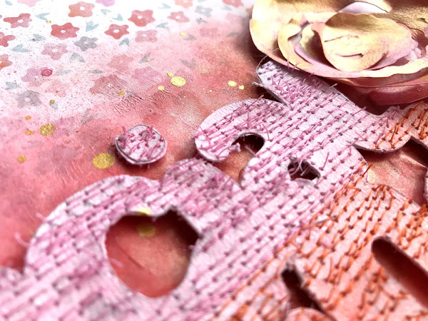
I cut the title on white cardstock so I could customize it.  I used one of the exclusive patterned papers and based my color scheme on that...lots of reds, pinks and coral tones.  I tore a big chunk of it and attached it to some thick smooth white cardstock to serve as the background.  I coated the lower half with clear gesso to prep it for some watercolor, and I smudged a lot of white gesso over the patterned paper to soften it up and to fade out some of the flowers.  I wanted to add watercolor to both areas since the title overlaps the center of the page.


I used a mix of products from different kits on the background.  I used the Shimmerz Naughty or Nice from last month's kit and mixed it with some Lindy's Gang Cockle Bells Coral from an older kit.  I wanted a nice deep reddish coral color to go behind the title, but also wanted it to match the flower paper.  I decided to machine stitch through the title after I cut it.  I wound up sewing it to a scrap piece of cardstock using three different thread colors and then fussy cutting it out.  It was kind of hard to read like that, so I added color to each word.  I used some Lindy's spray from an older kit as well as the Jen Hadfield Gold Glitter Spray from a kit from 2019.  I love how it turned out!

The title had so much texture, and I like how it stood out from the background.  I did pop it up using some adhesive foam to make it stand out even more.  I also used a few of the rolled flowers from the Color Kit.  I wound up making this one here on my own from white cardstock.  I covered it with gesso and then color it to match.  Not perfect, but it works...haha.
Here are the two flowers from the kit...I did the same with these as far as gesso and painting.  I used one of the wood veneer pieces and a few chipboard stickers as well.
I love how messy and rough this looks.  And the shadowing effect turned out really nice.
There are a lot of options with these rolled flowers.  I rolled these very loose.  You can also roll them very tight so they're even more layered and dimensional.  I added some metallic gold thread here for a pop of color and shine.
I did add some gold splatters and a puffy speech bubble sticker.
I went with black & white photos so everything would stand out.  Sometimes color photos can get lost if they blend in with the background too much, and these photos stood out better like this.  I added this cute bird die cut here along with some pink thread.
And here are more close-ups :)


I hope this inspires you in some way...it was fun to make!  I love when a cut file sparks an idea like this.  Be sure to check out my process video:


Thanks for stopping by, and have a great weekend!


Monday, February 15, 2021

Crazy Awesome Hot Mess / Pinkfresh Studio

Hello, friends!  I'm back today to share my newest layout for Pinkfresh Studio.  I used the new Keeping it Real collection.  It's so fun and colorful, and it's perfect for those crazy moments in life. I also used a new Crazy Times cut file, and I made it part of a large title design.  I cut it on my Silhouette Cameo using textured white cardstock, and I then I decided to fill in the open space with patterned paper.  I traced the "crazy" onto a yellow patterned paper and then cut it out.  I popped it up with some adhesive foam and placed it back over the cut file.

I used the Mini Ink Cubes to create the background.  I coated some textured white cardstock with clear gesso and let that dry.  I chose inks that matched this collection and scraped the ink pad along the paper.  I created a few different colored stripes and then used a brush and water to make the color run.  I did wind up adding a bit of the Liquid Watercolors to add more shades in a few spots.


I like to use textured cardstock for this technique because you can see the lines from the paper through the color.  I love how the inks react with water.  Some of the colors do change a little bit when they're watered down on gesso, but I used the watercolors to fix that.  So here you can see the dimension from the cut file...that's why I love to pop it up off the page!  I added some floral die cuts around the page and a few I fussy cut from papers. 

I used a variety of puffy alpha stickers and word stickers to add on to the title.  I love all the different sizes and fonts of letters and words!  I also added in some tangled thread in a few places in colors that matched.
I used more die cuts here on the side of the photo, and then added I Love This using the small multi-colored alpha stickers.
I went light on the background with the yellow ink since the title was yellow.  I wanted it to stand out, so I made sure other colors were behind it.
The sentiments are my favorite part of this collection.  They are all about real life...the good and the stressful parts.  Most of my photos are of everyday life moments, so it's perfect for me...haha :D
Here are a few more shots of all the details:


I hope you are inspired by this...it was a lot of fun to put together.  If you're a mixed media scrapper, have you tried this technique?  It's pretty quick and easy, and of course fun!

Here's my process video:


Thanks for stopping by, and I'll see you again soon.  Have a great day!