Thursday, July 28, 2016

Friendship / Hip Kit Club

Hey there and Happy Thursday!  I'm back again to share my newest layout for Hip Kit Club.  I used the 2016 July Hip Kitshttp://www.hipkitclub.net/july-2016 again, and as usual, they are nothing short of awesome!  My theme for last Thursday was Crazy About Text, so I decided to create a big and bold title using lots of patterned papers.  I searched Pinterest and found this fun quote.  It describes this photo perfectly...my friends and me after taking my Body Pump class one night.  We are always acting silly, and we have such a great time :D

I went through and chose several of the papers from the Main Kit & Paper Kit.  I created the quote in my Silhouette software and then cut small 2x2 squares from all the papers and arranged them on my cutting mat.  It took me a while to arrange all the letters...I wasn't sure at first if I wanted the quote up top or at the bottom.  I finally decided to stack it up on the left like it is here.  Once I knew where my photo was going to go I did a bit of packaging technique with some Shimmerz.  I also did a bit over on the left to add some interest to that side of the cardstock.  I also did some machine stitching to add a bit more interest.


This is really an easy thing to do.  For me, the funnest part is choosing the papers to use.  There may be one small section of a patterned paper, so it's easy to cut a small piece of it for cutting a few letters.  This font is from the Silhouette store...it's called Handtastic.  I did outline all the letters with a black pen eventually.  It really made them pop right off the page.


I love how the black splatters look, and the blue & yellow Shimmerz turned out really nice on the background.


These hearts weren't planned when I designed this page.  When I made my first layout a few weeks ago using the exclusive Art Class paper designed by Kim Watson, I cut hearts out of it on my Cameo.  I kept the scraps, and so I just hand cut around the heart scraps and made these open hearts.  They made great layering pieces!  So I decided to tuck them in and around the photo.  I also used a few of Kim's exclusive puffy stickers and some black tangled thread.


I love this big chipboard piece from Becky Higgins here below the photo...it fit just right in that area, and I like that it's black & white and doesn't compete with all the other bright colors.


My journaling fit just perfectly down here, and I was able to add several die cut phrases here as well as some puffy sticker dots.


Here's my process video if you'd like to check it out.  I hope you enjoy!


Thanks so much for stopping by!

Wednesday, July 27, 2016

She Brings Her Own Sunshine / Simple Stories + a video

Hello again, friends!  Today I'm back to share my second monthly layout for Simple Stories.  I think this Sunshine & Happiness collection was made just for me because I'm in love with every little piece of it!  I love the bright colors, the fun summer elements...just all of it.  I actually started this page using another photo, but I wound up switching it out.  I love the pop of pink from my daughter's shirt, and I think it pulls everything together nicely.

I started with some light blue acrylic paint and Shimmerz to create my background.  I used a fun doodly-type loopy loop cut file from the Silhouette store and cut it on a few different patterned papers.  I wanted to use them as background elements, and I love how they look on the blue paint!  I stitched through them with gold thread and then began layering up my embellishments.


I cut the majority of my title on my Cameo using the Luna font and various patterned papers.  I love using suns and sunshine on my pages a lot because one of Paige's nicknames is "Sunshine."  It's perfect for her little personality, and this collection is just the right one.  I used a gold metallic pen and then my pencil to outline the letters a little bit.  I added pop dots behind the "sunshine" sticker to add dimension, and I created a fun little cluster to the right using die cuts and stickers.


Here you can see the fun loopy die cuts.  I love the fun feel they give to the page.  I added some tissue paper and a tab sticker behind my photo as well as a few hearts.  I also used a heart stencil and some Distress Inks to add some subtle hearts to the background.


I fussy cut this cute sun & cloud from one of the patterned papers.  Again, I just feel compelled to use suns on pages about my Sunshine!  The orange thread adds a little texture and interest.


Here's one more close-up.  I used these cute balloons because they just looked cute :)  Plus they were just the right colors.  I raised them up and added more tangled thread.


Here's a process video showing you how I created this layout.  I hope you get some fun ideas from it!


Thanks so much for stopping by for a visit...have a great Wednesday!


Tuesday, July 26, 2016

Adorable Little Face / Bella Blvd + Video

Happy Tuesday, friends!  Today I'm sharing my newest layout & video for Bella Blvd.  This is my second video for Bella, and I had such a fun time making it.  I wanted to "get messy" so I used these amazing Studio Acrylics from the Illustrated Faith collections.  Let me tell you...I absolutely LOVE them.  The colors are so vibrant, and the quality of the paint is fabulous.  I used a card to smudge the paint onto my paper, and the results were awesome.


Here's my page.  I began with white cardstock as my background.  I used patterned paper from the Just Add Color collection that was mostly white with tiny black triangles on it.  I adhered it to my Cameo cutting mat and then dabbed some of these paints on it.  I smudged the paint around using a plastic card and then let it dry.  It dried very fast because this didn't take much paint.  I created these flower shapes in my Silhouette software and then cut out several sizes on the paper.  The paint did not mess up my mat or my blade at all.  What I wound up with was these gorgeous multi-colored flowers.  I am in love with them!  They look complicated, but it really was easy as you will see in the video below.

I couldn't believe how perfect this color photo matched the color scheme of the paints.  I wasn't sure which one I wanted to use because they both looked great.  In the end, I decided to use both!  I went with the bright colored one since it almost seemed like a crime not to with the colors matching so perfectly.  I also used the black & white one since I already had black elements going on.  They both bring out the brights and darks of the page.


Here you can see the flowers and the paint.  When I designed the flowers, I did an offset on them so when they cut, I not only got the full flower, but also an outline.  I love how they look mixed together like this.  I used this Ciao Chipboard "adorable" piece for my title.  I didn't want to leave it white, so I used my paint brush and watered down some of the paints and lightly painted on some colors.  It didn't stand out enough against the background, so I wound up doodling with a black pen.  I started with just outlining the letters in black, but it still didn't stand out enough.  So I scribbled until it was dark enough to pop.  I finished the title with some Tiny Text Alphas.  I also used some large black enamel dots for the centers of the flowers.


Here is one of the open flowers...you can get an outline of a shape like this when you do an offset when you're designing in Silhouette.  I added some other flower shapes using some of the Clear Cuts & Invisibles, which are like transparencies.  I fussy cut some and punched some.  I also fussy cut some flowers from another Just Add Color paper.  I love the pops of black they give around the page.  I also used some black & white sentiment stickers and black tangled thread.


I think thread is an excellent way to add little pops of color.  This area here, for instance...I think it needed some extra blue.  Just tangle up some thread and there you go...easy!


Here's a closer look at one of the Clear Cuts.  These punch very easily, and you can also run them through your die cutting machine.  I'm still swooning over these paint colors....


Here's one more look at the title area.  These chipboard pieces are so versatile, and you can paint them however you want with whatever you want.


Here's my process video...you can see how I made it from start to finish.  I hope you enjoy and get some fun ideas!


Thank you so much for stopping by today!

Saturday, July 23, 2016

Heart Them / Simple Stories

Hello again, friends!  I hope you are having a nice & relaxing weekend so far.  Today I'm sharing one of my layouts for the Simple Stories blog.  I wanted to spice things up a bit, so I decided to combine two collections here.  I haven't done that yet since becoming a CT member, and I'm so glad I did.  I used papers & embellishments from the Carpe Diem and Heart collections.  The Heart collection is a really small line with several papers and a few sticker sheets whereas Carpe Diem is huge and has every product under the sun.  It was neat to come up with a new look using both of them.

I started with this beautiful aqua/teal ombre paper as my background (from Heart).  I wanted to combine some papers from both lines, and I know a great way to do that is to use small shapes cut from different papers.  I used a fun cut file (Retro Rounded Corners) from The Cut Shoppe and cut out this fun shape in colors & patterns I thought worked well together.  I love the mix of bright and lighter pink, grey, golden yellow, salmon/coral & black.  I just scattered them onto the background and placed my photo right where I wanted it.  I used my sewing machine to stitch through them all.  I did use some Shimmerz Paints on my background.  You can see how I did this in my video below.


This "heart" piece is from one of the patterned cut apart papers.  I fussy cut it, added pop dots under it and used it as part of my title. I love the font, and the black really pops against the other colors.  I pulled some light pink alphas from the Snap Lights Alpha Stickers and placed them on that gold heart, which I also fussy cut.  And like I usually do, I added some tangled thread under the photo and the title.


Aren't these shapes the coolest?  I've been calling them flower stars...haha.  Whatever they are, I love them!  I added a cute balloon sticker by my photo, and this cute grey circle heart sticker is from Carpe Diem.  To jazz it up, I raised it up with a pop dot and added some aqua thread to it.  I also used several Carpe Diem Clear Stickers.


Here I combined stickers from both collections.  I also stitched with gold through "them" for some added interest and texture.  Here you can also see all the ink colors I used...aqua/teal, pink, gold and black.


Here's a process video for this page...you can see how I made it from start to finish.  I hope it gives you some fun ideas to try!


Thanks so much for stopping by!  Have a wonderful weekend!


Friday, July 22, 2016

She's So Colorful / Shimmerz Education Team

Hey, friends!  It's Friday...woo hoo!  I have a fun and colorful layout to share for the Shimmerz Education Team, and I used lots of Shimmerz Dazzlerz, Coloringz & Shimmerz Paints.  I love creating my own backgrounds, and Shimmerz make it super easy to do.  I used a big chevron stencil and a baby wipe to smudge some Dazzlerz through it.  It lightened up the colors and thinned out the paste.  I love how it turned out!  I used the Pink Paislee Fancy Free collection for this, and the Shimmerz colors I chose really compliment it well.

Another thing I learned from using a baby wipe to smudge the Dazzlerz is that they dry really quickly.  Since it thinned the paste out a bit, it was dry in no time.


Here you can see the beautiful Dazzlerz.  I used a combination of Sea U in the Mornin, Gummy Beary Blue, Jelly Bean Green and Sour Apple.  They blended perfectly together, and the baby wipe did a great job of making that happen.  I did come in with some Coloringz in Heidi Ho Blue & Don't Citron Me to add even more blues and greens as well as some original Shimmerz Paints in Key Lime & Blue Grass.  I used a clear acetate frame on top of my photo as well as a cute floral puffy sticker.  I had some blue sequins in my stash and they matched the blues perfectly.  I added some subtle pink splatters using Shimmerz Paints in Bubblegum Blast & Royal Red.


Here are the pretty green shades I mentioned above.  I love how they look with the blue embellishments.  I used this beautiful chipboard piece for my title and added small foam squares under it to give it some depth.  I did pull in a few pieces from the Dear Lizzy Happy Place collection like leaves and that yellow brush stroke sticker on the right.


At first I wanted this to be an all blue & green layout.  However, that changed when I saw this beautiful floral paper.  I've used it before, but every time I see it, those gorgeous flowers just beg me to cut them out!  So I did :)  I layered a few of them around the photo and this brought in lots of pink tones to the page.


My whole thought with my unique background was to have it peeking out from behind the photo and the flowers.  I love that you can use mixed media products to get subtle looks.  You don't have to cover your entire paper with paint or sprays.  I will say it is hard to know when to stop though...it's just so much fun to add all that color!


Here's one final close up of the bottom cluster.  I kept it simple and added in another flower, a fun sentiment circle, some heart stickers and a flair button.  I also added a bit of journaling.


Here's my process video for you.  I show how I created this background and even another background that I actually started with and then changed my mind.  I hope you get some fun ideas & try the baby wipe technique!


Thanks so much for stopping by!  Don't forget to check the Shimmerz Paint TV channel for lots more videos.  Have a great day!


Supplies Used:
Dazzlerz--Sea U in the Mornin, Gummy Beary Blue, Jelly Bean Green, Sour Apple
Coloringz--Heidi Ho Blue, Don't Citron Me
Shimmerz Paints--Key Lime, Blue Grass, Bubblegum Blast, Royal Red


Wednesday, July 20, 2016

Enjoy This / Hip Kit Club

Hello again, friends!  Today I wanted to share my latest layout for Hip Kit Club.  It's my first page using the 2016 July Hip Kits, and they are nothing short of beautiful (as always).  I'm constantly blown away by the exclusive papers and embellishments.  I used one of Kim Watson's designs for my background and for those pretty hearts.  I used one of Ashley Horton's heart cut files for this month and cut several sizes on the beautiful Art Class paper from the Main Kit.  I used some of the Don't Citron Me Shimmerz Coloringz from the Color Kit and mixed it with some of the Jeni B Bleu Vibez from last month's kit.  I printed three small photos and just wanted to place them around the scattered hearts.


These colors...oh my gosh! Yes, please.  I'm a sucker for all of these bright colors.  I used a few of Kim's exclusive die cuts here as well as one of the Amy Tangerine Rubber Charms.  I also added some tangled thread...I know that's no surprise :)


 This fun chipboard piece is from the Project Life Becky Higgins pack.  They make great embellishments on layouts!  I combined that with some of the exclusive die cuts, and that awesome yellow puffy flower is also exclusive.  I love how this pink heart looks against the teal background.


More yummy colors here!  You know I love adding thread, and this bright pink really pops against all the other colors.  I think using black & white photos really makes the brights pop as well.  Color photos might get lost in all the other colors.  Honestly it depends on the photo itself and what colors are in it, I think.


Here's one more close up of the title area.  Let me tell you...those green exclusive puffy alphas are AMAZING.  This is the third month of the kits including exclusive alphas, and the quality is awesome! The colors are perfect, and the fonts are so cool!  I love them!


Here's my process video if you'd like to check out the making of this page.  I hope you enjoy and gain some inspiration from it!


Thanks so much for stopping by!

Tuesday, July 19, 2016

Maniac Monday / A Flair For Buttons

Hey friends and Happy Tuesday!  Gosh, I haven't gone this long without posting in a long time!  I've been working on projects for the past week, but I can't share some of them just yet.  I do have a new layout up on the A Flair For Buttons blog today!  I love documenting photos from the classes I teach at the gym.  The members in my classes have become such treasured friends to me, and we spend a lot of time together sweating, burning and working hard. I snapped this picture back in January of about half the ladies in my class one Monday after we worked so hard in Spinning that we literally steamed up the doors!  I often refer to my Monday morning class as "Maniac Monday" since we all think we're crazy to want to work out that early on a Monday (haha!) and because one of their favorite songs is a fast run remix to the 80s song Maniac.  We have such a great time in there, and I love teaching!

I used flair from three different sets:  Just Ride, Work Out and Phrases 1.  I couldn't resist the biking flair once I saw them...they are perfect for this!  I started this page with a cut file (May Mash-Up) from The Cut Shoppe.  All the circles reminded me of the wheels on the bikes, so it was perfect.  I used some of the silver Deco Foil to distress it and make it shiny in spots.  I wanted to pull from the blue in the photo, so I used some Anchors Away Shimmerz Paint to create the messy blue behind the cut file.  I used bits & pieces from the older Simple Stories Daily Grind collection.


I used some of the flair in the centers of some of the larger circles.  I love this "Just Ride" one!  The colors matched the color scheme nicely, and I love the sentiment.  I used some large chipboard Thickers as part of the title and combined it with a scripty die cut I created using my Cameo.  I used some of the Shimmerz again to color in some of the Thickers, and I used gelatos to color the "Monday" die cut.


I wanted this cute bicycle flair to be right on the photo to emphasize what we were doing.  You know I love adding thread, so I did it here as well as under the cut file.  As you can see, I messed up the M here.  I tried coloring in the white parts with a black pen and I didn't like how it looked.  It just darkened it up too much.  So I tried painting over it with white paint....and it looks terrible.  But I didn't want to waste a Thicker, so I just made it work.  I added pop dots under that rectangle sticker...I love what it says!  Just perfect for our class!


Here you can see the fun foil on the circles.  I wanted it to look messy and worn, and it did just that.  This fun flair is from Phrases 1, and I love how versatile they are.  This one was perfect;  it was the right saying, the right color, and the messy circles on it fit just right.


Here's one more flair.  This one is from the Work Out set, and it is very appropriate for this page because we definitely get our heart rates up!  I love this one so much...I think I need another one!


Here are the sets in full:

Just Ride

Phrases 1

Work Out

Thanks so much for stopping by today!  I will be back tomorrow with another layout share.  Until then, make sure you check out the A Flair For Buttons Etsy Store!  You will be amazed at how many awesome flair there are.

Hope you have a wonderful day!

Wednesday, July 13, 2016

Seriously Sweet Sisters / Hip Kit Club

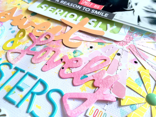
Hello again!  Today I'm back with a layout for Hip Kit Club featuring the 2016 June Hip Kits.  I used one of Kim Watson's star cut files for my background design and cut a few of them in different sizes using a few different papers.  I used lots of Shimmerz sprays and some of the Dazzlerz to create the background watercolor effect.  I mixed some of the Jeni B Bleu Vibez with the Spun Sugar Dazzlerz to create a light blue texture paste and smudged it through the exclusive stencil with a foam applicator.  Those little triangles are so fun!  I pulled pieces from all of the kits for my embellishing.

These are some cute selfies I took of me and the girls.  They aren't the best quality photos, but I absolutely love them.  They show my girls' personalities, and those are my favorite types of pictures.


I decided to create a long title combining lots of things here.  The "seriously" die cut frame is from Jillibean Soup and it's in the Color Kit.  I backed it with a green Project Life card.  "Sweet" is one of Andrea's cut files, and I used one of Kim Watson's exclusive papers to cut it.  "Lovely" is from the Dear Lizzy die cut phrases pack.  I misted it with some pink Shimmerz spray from my stash.  I used the gorgeous exclusive puffy alpha stickers for "sisters."  Those alphas are the bomb!!  The quality is outstanding, and they are the prettiest color.  I did some machine stitching on the bigger stars, and I did add enamel dots, tangled thread and some phrase stickers & die cuts.


Here's a closer look at the background work.  My three favorite colors all together...woo hoo!  I used pop dots under my photo to create some depth, and I added a few of the Simple Stories clear stickers around the page as well.


I created a little cluster down by the title.  The "Be Happy" circle is one of Kim's exclusive die cuts, and the buttons are from Paige Evans' Fancy Free collection.


Here's one final close-up of the top right.  I combined some exclusive puffy stickers with a Heidi Swapp chipboard speech bubble.  Love all those colors together!


Here's my process video if you'd like to see how this layout came together.  I hope you gain some inspiration from it!


Thanks so much for stopping by!  Have a great day!