Saturday, September 28, 2019

Magical Kisses / Using Older Supplies

Happy Saturday, friends!  I finally had some time to create a layout for fun...and I used older supplies :)  It has been since last November since I did an "older stash" layout, and it felt so good!  I was inspired by the amazing Paige Evans and her layouts featuring origami shapes.  She's made origami stars and more recently hearts in this layout.  I have never tried it, so I thought I'd give it a go.  I searched Pinterest for ideas and came across an origami butterfly tutorial.  I took me a few tries, but I finally got the instructions down and I made a bunch of them!

I used papers from the Dear Lizzy Day Dreamer collection from several years ago as well as a few older lines from Bella Blvd.  They  mixed and matched really well, and so I went with it.  I explain how to make these butterflies in my video, but there are a lot of tutorials on Pinterest as well.  It doesn't matter how big or small you want to make them...as long as your paper is a perfect square it will work.  I made several different sizes and colors to scatter around the page.  I used a Dear Lizzy paper as my background and added lots of Shimmerz to it :)


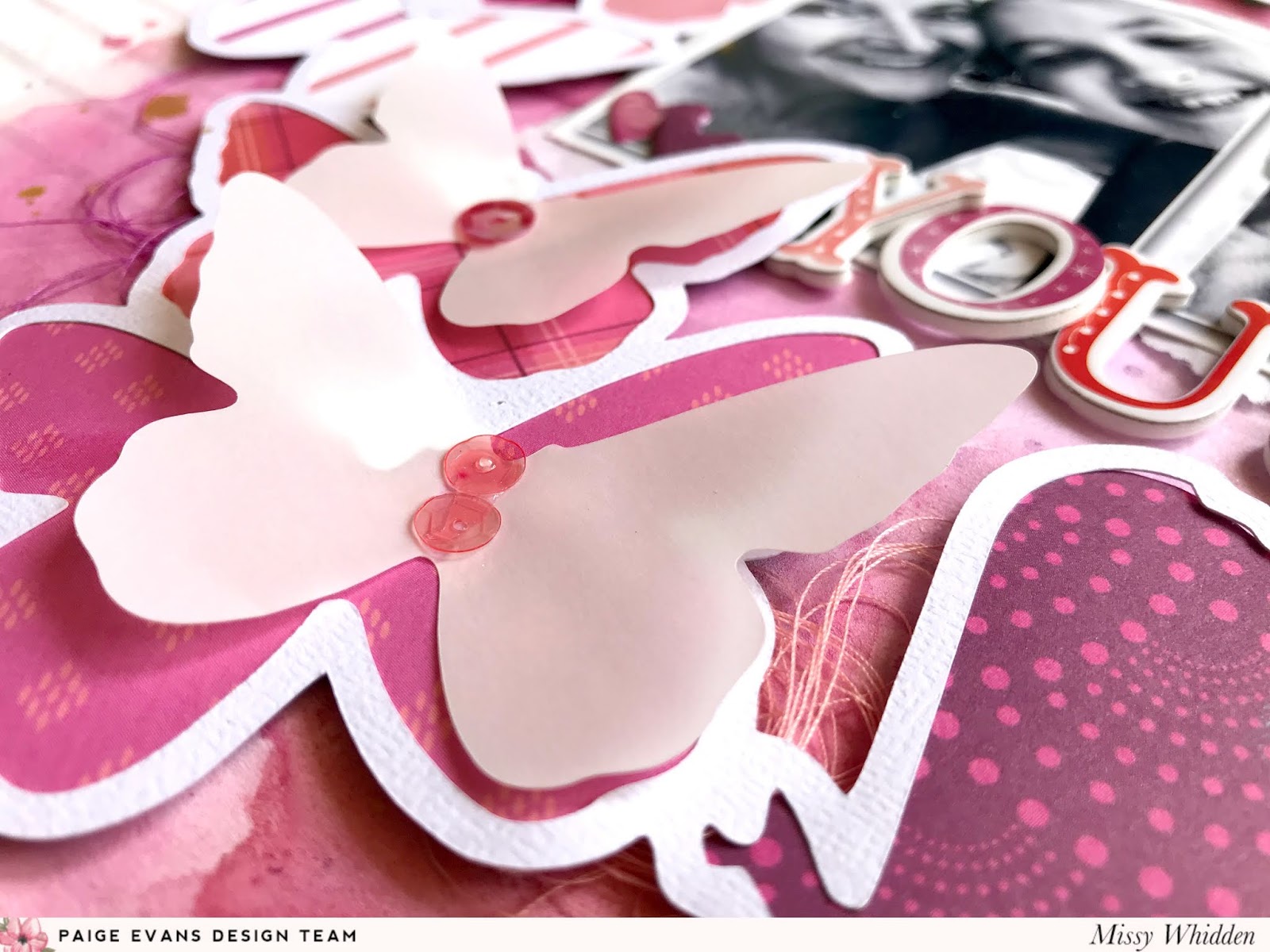
These butterflies are pretty dimensional, but I modified them so they'd be a bit flatter since I wanted to stitch through them on my layout.  I was able to run them through my sewing machine after I lightly taped them down.  They are still quite dimensional, but still flat enough to fit into a page protector.


I didn't add to many extra "things" to the page since it was quite full already with the butterflies.  I added a few Bella Blvd stickers and a few stickers from an older MAMBI sticker book from Michaels.  I did add lots of sequins from SpiegelMom Scraps at the end for some added shine and texture.


Before I glued anything down, I created my background.  I coated a lot of the yellow background with white gesso.  Since this was a thin piece of patterned paper, it really wasn't sturdy enough to hold a lot of wet sprays.  The gesso created a barrier between the paper and the liquids so I could spray a lot and let the colors spread and run together.  Nothing soaked through the paper.  I used some of my favorite Shimmerz colors...Coloringz Well Blue Me Down, Vibez Jeni B Bleu, Spritz Cotton Candy and Inklingz Coral Reef.  I also splattered some gold Miner Miner 49er at the end.


I just sprayed the colors onto my page, spritzed it with water and then tilted the page from side to side, allowing the colors to run all over the place.  The Coral Reef isn't a spray, so I used a brush to apply that.  These colors matched the butterflies perfectly.  I also used those same colors to add splatters with my brush after everything was dry.


I mixed and matched for my title here.  I used a shiny gold vellum sticker from the Heidi Swapp Sticker Book.  To tone down the very shiny gold, I smudged some white gesso over it.  I didn't want to just stick it straight down, so I stuck it to some vellum and then fussy cut it out.  This made it a die cut that I could place wherever.  I used some big pink Bella Blvd stickers for "kisses."  They were such a soft pink that they kind of blended in and didn't stand out very well.  To fix that, I used the Cotton Candy Spritz and a small brush to paint the bottom of the letters.  This made them a tad darker and made them more visible.


That's pretty much it...haha.  I took lots of close-ups because I just love all this pattern and dimension from all angles!


This is another cute Bella Blvd sticker.


I honestly had so much fun making these butterflies!  Once I got it down, they were easy to make.  Sometimes I don't want to use a cut file or my punches, so this was a neat alternative.  I hope it inspires you to try it...I definitely want to do it again!

Here's my process video....I hope my origami explanation makes sense....haha!


Thank you so much for stopping by, and have a great weekend!

Wednesday, September 25, 2019

This Change / Hip Kit Club

Hello again, friends!  I'm back again today to share my newest layout for Hip Kit Club.  This is my second layout using the 2019 September Hip Kits, and they are just soooo inspiring!  I felt drawn to this gorgeous Dear Lizzy She's Magical paper with all the wonky squares.  It's perfection...seriously.  I tore a big strip of it to use on the background.

I used thick white cardstock as my base, and I coated most of it with clear gesso to begin.  I wasn't sure how much mixed media I was going to add, so I wanted all of it ready to go.  I glued down the square paper and then pulled out several Lindy's Stamp Gang Magical Powders.  I used two from this month's Color Kit and a few from previous kits.  When you add water to the powders, they activate and turn into watercolor.  I went with a tone-on-tone look and added matching colors under each row of squares.  I wanted it to look like the paper colors were running down the page.


We've received so many Lindy's Powders over the last several months, so I have built up quite the collection of pinks and yellows.  After the background dried, I decided to machine stitch along all the squares using white thread.  I love the detail and texture this creates.  I also added even more texture with matching colors of thread.  I used lots of little embellishments from the kits adding them to the appropriate color areas.


These two pieces here are actually squares.  I used circle punches to make them round.  This big "magic and wonder" piece is from the Paige Evans Truly Grateful collection, and the smaller circle is a Pinkfresh Studio Office Hours sticker.  I fussy cut some Dear Lizzy flowers from patterned paper to add in as well.  All these little stickers are also from Dear Lizzy.  I mixed and matched the title using some of the large iridescent Thickers and some Paige Evans puffy phrase stickers.


I love all of these flowers and leaf die cuts from Pretty Little Studio.  They matched my colors perfectly.  I toned down the colors slightly by smudging some white gesso over them.  There are also a few Pocket Life cards that match this color scheme....I layered one under my photos.


It's so fun to take on the challenge of adding pieces tone-on-tone...it always creates such a fun effect.


The side of these Thickers is pink...so pretty!  I did add some adhesive foam under the big circle to raise it up off the page a bit.


I fussy cut this cute sun from one of the Truly Grateful 2x2 Paper Pads.


Stitching.....yessssss!  This is why I love it so much...it always looks so awesome!


Here are more close-ups of all the texture and details :)


And that's it!  I hope this gives you some ideas for your next project.  Keeping the design tone-on-tone is really fun, and it helps you to use specific items.  These kits are perfect for giving this a try :)

Be sure to check out my process video here if you'd like to see how this page came together.


Thanks so much for stopping by!  Have a great day!


Tuesday, September 24, 2019

You & Me / Paige Evans DT

Hey, friends!  Happy Tuesday :)  I have a new monochromatic layout to share today for the Paige Evans Design Team featuring Paige’s Butterfly Border cut file and lots of the Truly Grateful collection. I love the challenge of limiting my color palette and this collection has so many pink and purple shades. I chose several patterned papers from Truly Grateful and backed all the butterflies in the cut file. I used all the pinks and purples I could find to get lots of lights and darks. I used Paper 23 for the background. Those ombre stripes were a perfect match!


I wanted to add lots of pink and purple watercolors to the background, so I first coated the area behind the cut file with white gesso. I used a palette knife and my fingers to smudge it around. Once it dried, I used several pink and purple Shimmerz sprays to add color. I sprayed them directly onto the paper, spritzed a little water on it, and used a brush to help spread the color. I love how it looked once I placed the cut file over it. I wanted to create a little more dimension, so I cut the butterflies again using vellum. I placed a few of them on top of the cut file and added sequins from the Mixed Embellishments.


I chose a few die cuts in matching colors from the Floral Die Cuts to create a cluster on the other side of the photos. I also added a pink Wooden Button and a few more sequins. I went simple with the title and used Thickers.


To add even more color and texture around the page, I layered in various colors of tangled thread under the cut file. I also attached a few small vellum butterflies beside the cut file in a few places. I used a fine tip black Sharpie to write my journaling under the photo. This was a pretty easy layout so create once I had the cut file finished. One of the fun things about creating a monochromatic layout is it limits what papers and embellishments to use. Once those pieces are chosen, it’s just a matter of finding a place for them.


I love the Truly Grateful Thickers!  I stuck with my color scheme here and overlapped some of the letters right below the photos.


I never get tired of dimension on layouts.  Just by adding a little bit of dimensional adhesive under the cut file makes such a significant difference.  It makes it a lot easier to tuck things like thread under the shapes.  The shadow effects are the best!


Have you used the Truly Grateful sequins on any projects yet?  They are the prettiest pinks and reds...perfect for this page.  I added some Heidi Swapp Gold Color Shine to create a bit of shine as well.


More close-ups....because you know I take too many :D


Have you ever tried a monochromatic layout?  It's a really fun challenge, especially with this collection.  There are lots of color possibilities :)  I have a process video....yay!


Thanks soooo much for stopping by!  See you again soon.


Thursday, September 19, 2019

My Heart / Hip Kit Club

Hey, friends!  I have a new layout to share for Hip Kit Club using the new 2019 September Hip Kits!  I know I say this every month, but they are SO gorgeous!  The new Dear Lizzy She's Magic collection is beautiful, and we get a lot of that this time around. 

To start this page, I began with a bright diagonal striped Dear Lizzy paper.  I went punch crazy and punched lots of different sized squares.  I decided to create a vertical design with the squares and layered them in the center of the background paper.  I went with a light blue cardstock from the Cardstock Kit as my base.  I coated a lot of the center area with white gesso first and let it dry.  I pulled out some of the Lindy's Stamp Gang Magical Powders to add color on top of the gesso.  I used several pinks from previous Color Kits as well as the new Cocklebells Coral from this month's Color Kit.


Once the color was dry on the background, I arranged the squares like I wanted them.  I glued them down and then wanted to add some gold.  I machine stitched in a small zig zag pattern matching the diagonal patterns on the squares.  I popped up some of the squares using adhesive foam.  I added some Dear Lizzy heart stickers, some Truly Grateful puffy dot stickers, and some Pinkfresh Studio light blue enamel dots around the page.


I fussy cut these flowers from another Dear Lizzy paper, and they are gorgeous!  I layered them around the photo and then tucked in another floral Dear Lizzy sticker.  I also did some embossing.  I used a few of the Dear Lizzy stamps.  I stamped them on vellum and then used gold embossing powder.  I fussy cut them out and used them as little embellishments around the page.  I love the pop of gold they give!


I added in a few more leaf die cuts from the Pretty Little Studio die cut pack.  This fun flair button is also from Pretty Little Studio, and it matches perfectly.


I love how messy and imperfect the embossed hearts turned out.  Vellum is so fun because it's subtle, but it also makes a statement.  Here you can also see more stamping...I used one of the exclusive stamps that looks like stitching here.  I used a gold ink pad from my stash.  The gold splatters I added are from the Lindy's Glittering Gold Powder from this month's Color Kit.


This gold shimmery goodness never gets old!  Always so pretty :)


I went small with my title.  I used some of the Truly Grateful puffy word stickers.


Here are a few more close-ups of all the details :)


I had a lot of fun making this...I hope it inspires you in some way!  Have you gotten your September Kits yet?  You will be in awe of all the gorgeousness!

Here's my process video if you're interested...


Thanks for stopping by, and have a great day!


Monday, September 16, 2019

Weekend Good Times / Pinkfresh Studio

It's Monday...again :)  I wanted to share my newest layout for Pinkfresh Studio.  I combined the two newest collections (Office Hours & Just a Little Lovely) on this page, and I also used the Liquid Watercolors

I began with one of the exclusive cut files coming very soon tot he Pinkfresh Shop.  They should be loaded any day now :)  I love the fun geometric shape combined with the pretty floral.  I paired that with some of the new Adorable frames washi tape.  It matches the geometric shape perfectly, and each shape has the prettiest watercolor effects.  I rolled the large washi onto some scrap cardstock and cut the shapes out.  I used them as layers behind my photo.  I used those colors to determine my background color choices.


I used some smooth white cardstock as a background, and I coated most of it with clear gesso.  Once it dried, I used the Liquid Watercolors to create a fun rainbow color scheme.  I used a brush to apply the color and also so create splatters.  Once that dried, I glued the cut file over it.  I finished it off with some machine stitching using metallic gold thread.


Here are some embellishments from the Office Hours collection.  I used a puffy sticker, a die cut and a fabric die cut here right on top of the photo.  I also used another die cut as part of the title.  I also layered some white tissue paper behind the photo for a fun messy layer.  I raised the photo up by adding some adhesive foam under it.  Finally, I tucked some tangled thread under the photo.


Here you can see the dimension from the layering.  I love how the watercolor turned out...so pretty and vibrant!  I decided to add some gold splatters, so I watered down some metallic gold acrylic paint and used a brush to splatter it.


I tucked in some more thread on the right side here and then finished off the title.  I mixed and matched with some of the puffy alphas from the Office Hours collection.


I layered the floral part of the cut file under the photo and then tucked in a floral die cut from Just a Little Lovely.


Here are some more close-ups of all the details :)


I did create a cluster under the title...I used pieces from each collection again.  I used the Liquid Watercolors to paint the blue flower here on this die cut, and then I popped it up with adhesive foam.


And that's it!  I hope this gives you some ideas for your next project.  It was a lot of fun to put together, and it was a fun challenged to mix and match collections.  Be sure to check out my process video here if you're interested:


Thanks so much for stopping by, and have a great day!