Tuesday, October 29, 2019

BeYOUtiful / Paige Evans DT

Hey, friends! I'm back today to share a fun mixed media layout for the Paige Evans Design Team using lots of Paige’s products. I used Paige’s BeYOUtiful cut file, her Doily stencil, and lots of the Truly Grateful collection.  I am loving these deep rich colors!  This was so fun to make :)


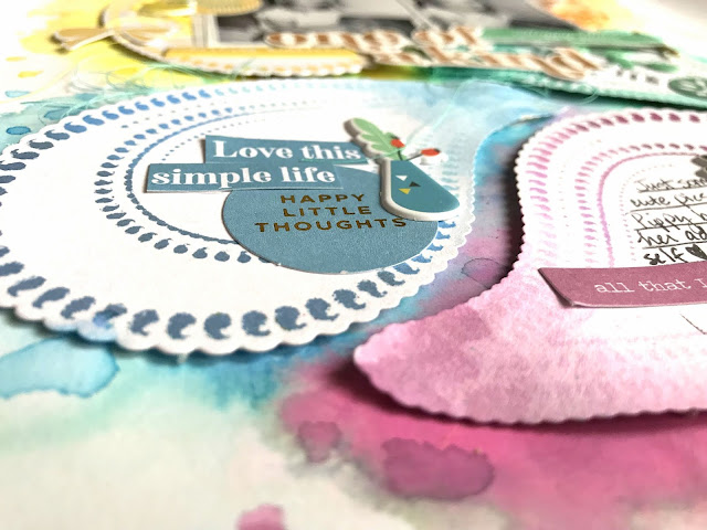
I cut the design from Paper 21 and used Paper 10 as my background. I wanted lots of texture and color on this page so I used a few patterned papers to back the letters in the BeYOUtiful cut file. Before I glued the papers down, I added small strips of adhesive foam behind it to create dimension. Once I had my color scheme down, I began work on the background. I wanted three big texture spots on the background, so before using the Doily stencil, I smudged a lot of white gesso down. Then I placed the Doily stencil over those areas and scraped modeling paste over it using a palette knife. Once that dried, I used several Shimmerz sprays that matched the golden yellow, deep blue, and bold pink colors. I sprayed the colors right onto the paper, spritzed it with a bit of water, and used a brush to help spread the colors around.


I sorted through lots of embellishments and chose leaves from the Floral Die Cuts and I also fussy cut smaller flowers from Paper 15. Here you can see all the amazing texture and all that rich color…so good! The shadow effect from the dimension really makes this pop off the page. I added more fussy cut flowers here and then added an Epoxy Sticker along with tangled thread underneath.


I did more of the same in this area. I wanted to keep the embellishments to a minimum since the background was so textured and beautiful. I did add a matching Epoxy Sticker above the photo and I tucked in tangled thread in a few spots.


I took lots of close-ups of all the pretty textures and colors :)  Here's a good shot of the cut file's dimension.  Adhesive foam makes such a big impact!


I used some Truly Grateful die cuts here on the right side of the photo.  I overlapped this circle piece right onto the photo since it had some open space.  I like overlapping onto photos if it doesn't cover anything important or make the photo look too busy.


More dimension and texture :)  Do you ever look closely at your patterned papers to see if any images can be fussy cut?  Paige's papers always have tons of flowers that are perfect for cutting.


I wish you could touch this modeling paste!  So bumpy and cool!


And a few more...


I hope this gives you some ideas to try on your next layout. It was a lot of fun to create! Have you tried Paige’s stencils yet? They make a huge impact on layouts. Give them a go! Thanks for stopping by and be sure to check out my process video for more details.


Have a great day!

Tuesday, October 22, 2019

This is Real Life / Hip Kit Club

Happy Tuesday, friends!  I'm back today with a new layout for Hip Kit Club featuring the new 2019 October Hip Kits…woo hoo!  They are full of rich colors perfect for Fall or anything, really.  I was immediately inspired by the gorgeous Pretty Little Studio floral wreath paper from the Main Kit.  I fussy cut it and then used the exclusive wreath cut file to layer over it.  I cut that on white cardstock.  I used thick white cardstock as my background, and I first added clear gesso to it.  I used the Bougainvillea Fuschia & Grab a Guy Gold Lindy’s Starburst Sprays from the Color Kit to create some beautiful watercolor areas.


I show in my process video how you can easily change up each of these colors to keep them bold and rich or make them soft and subtle.  I did a bit of both here.  I sprayed the color directly onto the paper, spritzed it with a bit of water and then used a brush to help spread the color around.  The gold splatters here are from the Glittering Gold Magical Powder from last month’s Color Kit.


Layering this cut file over the wreath created instant texture and dimension.  I love how you can see bits and pieces of the wreath peeking through the cut file.  I did add some adhesive foam behind the wreaths to give them some height.  I also layered in more leaves and flowers around the wreaths.  I used lots of the exclusive pieces…chipboard, vellum leaves, die cuts and even some that I stamped using the exclusive stamp set.


I layered a few Pocket Life cards behind my photo as well as some tissue paper.  I used a deep pink distress oxide to stamp these leaves…they turned out so pretty!  I stamped them onto some of the packaging from some stickers and then fussy cut them out.


I love these mix of Fall colors…the deep and rich pinks, yellows and oranges mixed with the soft blues are just perfection.


For my title, I mixed and matched some of the soft gold Thickers with the exclusive puffy orange alphas.  I had to do some trimming on the Thickers to make the letters fit together, and I wound up gluing them onto some vellum first and then fussy cutting them out.  That made it easier to move them around as individual words instead of loose letters.  And you can’t even really see the vellum at all.


I did add in some pink and blue thread in two places.  I love those pops of color and texture!


And one more for good luck :)


I hope this inspires you in some way!  I absolutely love how it turned out, and it was fun using a Fall color scheme.  I give a lot more information about the kits (especially the Color Kit) in my process video here, so be sure to check it out!


Thanks so much for stopping by, and I'll see you soon!

Thursday, October 17, 2019

Hey Reese / Hip Kit Club

It's me again...another new layout to share for Hip Kit Club :)  I used the 2019 September Hip Kits, and this time I focused on the Dear Lizzy She's Magical Stamps.  I used one of the cute little rainbow stamps to create fun scalloped borders.  I used textured white cardstock and several colors of the Lindy's Stamp Gang Starburst Sprays from previous Color Kits.  I simply sprayed some ink onto some plastic packaging, stuck the stamp to a stamping block, dipped the stamp into the color and pressed it onto the cardstock.  I love the messy splotchy look it created!


I love this messy effect of stamping with the Lindy's.  I made a few rows using different colors and then cut them out.  I wanted to layer them over each other and create a fun background design element.


I embellished around the photo with some of the Dear Lizzy frames and stickers as well as some of the Pretty little Studio die cuts.  I punched some holes in these sticker tags and added some cord from my stash.


I mixed and matched the title using some of the big white Thickers and some letters I fussy cut from a Pocket Life card.  It had the word "September" on it, so I was able to cut my daughter's name.  I kept going with the diagonal direction here and created a small cluster using a Truly Grateful die cut and more Dear Lizzy stickers.  I turned these rainbow stickers upside down to mimic the scallop borders.


I fussy cut this beautiful flower cluster from another Pocket Life card.  It matched perfectly!  I added in a few colors of tangled thread under it to continue to pull colors from above to this area of the page.


I added a branding strip from a Dear Lizzy paper above the scalloped borders.  I decided to add some texture, so I machine stitched along the top edge using matching threads.


I did add some of the Lindy's to my background.  I used thick white cardstock, and I coated a lot of it with clear gesso first.  I used a brush to add the blue and yellow here and some pink up top.  I used the same Lindy's sprays as I used to make the scallops.  They have all been included in past Color Kits.


A few more shots of the details...


I had lots of fun making this....the scallops were a nice surprise!  I hope it inspires you in some way.  The Hip Kits have so many fun possibilities.  I show how I did this entire layout in my process video, so check it out if you're interested:


Thanks so much for visiting me!  Have a lovely day :)


Tuesday, October 15, 2019

Hard at Work / Pinkfresh Studio

Hello again, friends!  I'm back again today to share another new layout for Pinkfresh Studio.  I mixed and matched the Office Hours and Just a Little Lovely collections again, and I just love that challenge.  I used the Floral Notebook cut file, which is available in the Pinkfresh Studio Store.  I cut it once on white cardstock, and then I altered it and removed the floral element and cut it four more times on patterned papers from both collections.

I wanted lots of layers and embellishments around the photos.  I also wanted some watercolor peeking around from behind everything.  I used the Liquid Watercolors for that.

A quick note about these photos...I was at my desk one day trying to get some projects done, and my silly child decided to sneak up behind me and start trying to smudge my glasses...haha.  She has nonverbal autism, so she has a ton of funny little quirks.  Smudging my glasses is one of them :)  She saw herself in my phone and did her sweet little wave.  I just love these memories!


I started by backing the cut file with papers from both collections.  I love this pretty floral.  I chose lots of stickers and die cuts that matched these colors.  I wanted to add in some yellow, so I started with adding it to the background.  I coated the white cardstock with clear gesso and then used the Liquid Watercolors and a brush to apply the paint.


Since I had yellow on the background, I chose some die cuts and stickers that had yellow on them.  I also really love this soft coral color mixed in....so pretty.  I did fussy cut some of these pieces from an Office Hours paper.


I used the Office Hours white puffy alphas for my sarcastic title...haha :)  I also tucked in some blue thread for some extra color & texture.  I love the fun Fabric Tags from Office Hours, too!


This cut file makes great texture!  I love this notebook edge.  I tucked in several circle elements at the top here and a "wake up & be awesome" sticker as well as more blue thread.


I love these little clocks!  It's so fun to mix and match elements....flat die cuts & stickers, puffy stickers, enamel stickers....it's all good :)


I tucked in another die cut at the top here and machine stitched through it.


Here are a few more close-up shots...


I machine stitched through my title using white thread.


I hope this inspires you today...it was so fun to make!  I love taking two completely different collections and making them work together.  I also love how this color scheme turned out.  You can check out my process video here for all the details!


Thanks so much for stopping by, and have a great day!

Monday, October 14, 2019

Pinkfresh Studio Ink Pad Release Blog Hop

Hello, friends!!  Welcome to the Pinkfresh Studio October 2019 Ink Pad Release Blog Hop!  I couldn't be more excited to be a part of the release of these beautiful new inks!  There are 48....yes...48 NEW Ink Pads that coordinate with the Pinkfresh Studio Liquid Watercolors.  There are four shades of each color, and they're all beautiful!

You should have arrived here from Lea's Blog.


Here's the layout I created using lots of the new Inks.  I wanted to create a rainbow color scheme, so I chose six sets of the Mini Ink Pad Cubes.  I also used the Pretty Paisley Stamp &  Die Set.  I created an ombre effect on each paisley by stamping all four of each color onto the stamp.  I used the matching die to cut the shapes out and then arranged them to make a fun background design.


Obviously these Ink Pads are perfect for stamping.  But they're also perfect for using as watercolor!  I used the same colors to create my messy background.  I stamped the ink pads onto some plastic packaging, spritzed it with water and then used a brush to paint around the edges of each paisley.  It worked perfectly!


I used a few older collections to embellish with.  I used die cuts, stickers, puffy stickers and chipboard pieces from Everyday Musings and Joyful Day.  I decided to go tone-on-tone, which means I matched the ink colors to the embellishments.  Example:  all green stickers went on the green paisley.


These inks stamp VERY well, and the colors are so pretty.  I added some adhesive foam behind the paisleys to raise them up off the page and create dimension.


I also used the inks to color the points of each paisley.  These inks definitely have multiple uses!


I smudged some white gesso over this gold die cut to tone down some of the shiny gold.  I love how it fits perfectly under the photos as the title :)


 Here is my process video if you're interested in seeing these Ink Pads up close and how I created this layout.


Of course, there are GIVEAWAYS!!  You can win the full size ink pads here on the Blog Hop, and you can also win the Mini Ink Pads over on the Pinkfresh Studio Instagram feed.  Each designer will be giving away a $25 Gift Card, and all you have to do is leave a comment on all the blogs.  The winners will be announced on Monday, October 21st over on the Pinkfresh Studio GIVEAWAY PAGE.  You must check there and claim your prize within two weeks.  
Also, there is FREE SHIPPING on all orders in the US over $100 in the Pinkfresh Studio Store without having to use a code. 
You are invited to the Inlinkz link party!
Click here to enter
Now head on over to Natasha's Blog and see what she created!  Happy Hopping!