Happy Wednesday, friends! Happy April...already! Today I wanted to share the second layout I had published in the March 2015 issue of Scrapbook Generation's CREATE Magazine. This was for the color challenge, which was a set of beautiful and bright Spring colors...yellows, oranges and greens.
When I am assigned a color challenge, my first thought is it start from scratch and create my own background. I'm sure I have the perfect papers in my gigantic mountain of patterned papers (haha), but I don't want to go searching through all of them. So I started with white cardstock and did my usual messy goodness :)
A coat of clear gesso to start...as always. I used a stencil and some orange and yellow distress ink and rubbed it through the stencil. Next came the acrylic paints in various shades of yellow and orange. You can see that I created lots of drips and little splatters. I did pull a few pieces of solid yellow and solid orange paper...just enough to back my photos with, along with a piece of vellum behind that. When I think "Spring," I think "flowers," so I used the Funky Florals die cut file from The Cut Shoppe and used acrylic paints and gelatos to paint them.
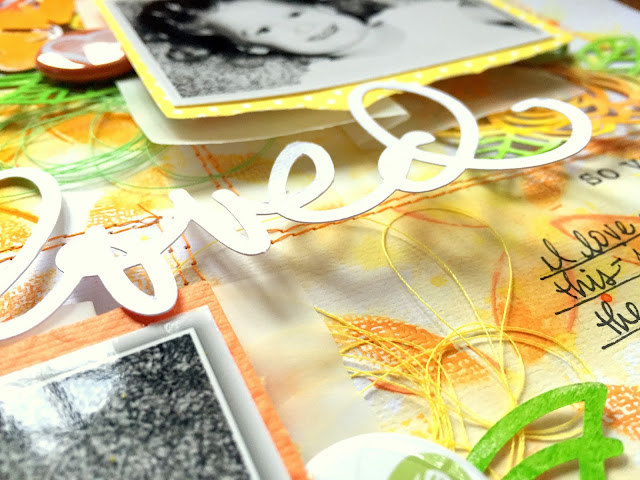
I absolutely LOVE the dimension of these clusters. None of the flowers are laying perfectly flat, and the pop dots under the pictures make them higher. My die cut title is also high up...it all wound up being very dimensional. I added some orange stitching around each photo cluster.
I love how these paint splatters turned out. Using acrylic paints is fun...it's a lot thicker than watercolors, but when water is added, you can make it similar to watercolor. The color will be bolder, like here with this orange. I added some flair from A Flair For Buttons and some tangled thread.
Some of the flowers I layered under all the layers and some I layered right under the photo. I am really excited with how this turned out...I just love the depth!
The floating title....to achieve this effect, I just added a bit of glue to the bottom of the L and the top of the D so they would stick to the patterned paper. It's too thin to add pop dots, so it really is kind of just floating.
I hope this inspires you to try a layout from scratch and get the exact colors you want. This really is fun, and you don't need one single collection to create it. Just odds and ends from your stash. Paint can do so much for a layout...I am so happy I finally decided to embrace getting messy! :D
Thanks for stopping by!


Soooooooo cool!!! Love the background! Wowzza! Awesome splatters, and I LOVE the mix of mediums: gelatos, paint, distress inks - AWESOME!!! ❤️
ReplyDeleteThank you so much for such awesome and thoughtful words in my blog! I was so surprised!!! You made my day! :)
So amazing Missy!! I love the mix of Yellow and Orange and the stitched squares behind the photos! And the Funky Florals cut file looks awesome on your page!!
ReplyDeleteYour "usual messy goodness" is simply perfect, Missy! Love your stitched frames and all the depth and dimension you've created here, and that color palette is perfectly delish!
ReplyDelete