Thursday, April 30, 2015

Days Like These / Shimmerz

Hey there, scrappy friends :)  Today, I'm sharing a layout I created for Shimmerz using several delicious mixed media products.  It began as an experiment and turned out to be something I am very happy with :) (Go HERE to visit the Shimmerz Paint Store, and remember to mention my name when you check out and you can receive some free product!)

I began with white cardstock.  I added clear gesso to it first and then pulled out a few Dazzlerz in bright colors.  I used a Dylusions geometric stencil and a palette knife to spread multiple colors onto the cardstock.  I loved the mosaic look once I was finished.  I added some bright papers behind my photo.  I decided to use my Cameo to cut a really large title.  I decided to leave it white so it wouldn't compete with the Dazzlerz design.  The Dazzlerz go on so smooth and creamy...they were made for stencils!  I used my finger to smudge some Gummy Berry Blue onto the "days" part of my title.  Easy and fun :)


Here's a close up of the Dazzlerz.  They dry true to the color in the container, and they're very shiny.  If you're a bling and sparkle lover, these are for you!  I did use some plastic packaging and some Coloringz to add a bit more color.  This pink color is Pink Stiletto.


These paper layers are from Bo Bunny's Lemonade Stand collection as well some generic white tissue paper from my stash.  It makes great layering material.


I love the white-on-white look...very subtle and it doesn't get lost in the mix of all the other "stuff" going on throughout the page.  I added in some wood veneer hearts, which I colored with Coloringz and Vibez.  I also added lots of splatter drips, too.  Those yellow lines behind the title are Dazzlerz in Lemon Drop.  I added in some Coloringz in No Yoking on top of it.


One last close up the beautiful Coloringz and Vibez together....so pretty!  By the way, these liquids color wood veneer beautifully.


I hope this inspires you in some way to get creative with these products!  Thanks so much for stopping by, and have a great day!

Here is a video of my process creating this layout.  Enjoy!


Products Used:
Dazzlerz--Pucker Up Pink, Sour Apple, Gummy Berry Blue, Lemon Drop
Coloringz--No Yoking, Pink Stiletto
Vibez--Jeni B Bleu, Sunset Strip

Tuesday, April 28, 2015

Awesome Sauce Photographed / My Mind's Eye

Happy Tuesday, friends!  Today I’m sharing a page I created for My Mind's Eye using the beautiful On Trend collection. If you haven’t seen this collection in person, you simply must get your hands on it! It’s so pretty and my favorite parts of it are the shiny gold elements, the fun overlays and the beautiful patterns on the papers and the Journal Cards.

I used some of the new Canvas Cardstock to build my page on and it’s amazing! This design was inspired by a few of the Journal Cards, so I used them as key elements on the page. I started with the Canvas Cardstock in Snowbound. It’s very sturdy and beautifully textured. I used a bit of watercolor on it, and since I used the plastic packaging technique, I didn’t use gesso beforehand. The cardstock took it very well and didn’t warp at all.


I used almost an entire pack of the Rub-Ons on this page! I just love them so much, and they adhere very smoothly. There are several fun designs, and I used them all around the photo and Journal Cards. The flower clusters are Rub-Ons that I fussy cut out. I love the texture it gives rather than just rubbing it directly onto to the paper. This also works well for layers so the rub-on doesn’t tear. I also added a bit of gold stitching.


I cut my title on my Cameo and paired it with more Rub-Ons. I really love the white-on-white look. Add in the pops of gold, and it’s just too pretty for words!


Isn’t that 'Awesome Sauce' circle SO cute?! I punched it out of a Journal Card. I just had to have that as a big element on the page because it’s just the cutest saying. I added some stitching through it and added pop dots under it. I just LOVE that gold and white striped journal card….too gorgeous!


One last close-up…the overlays in this line are awesome…I cut this circle out and layered it with a few strips of patterned paper. The date sticker is from the Fancy That line.


I think this collection is really pretty, and if you're a fan of GOLD, then I know you'll love it as well.  I love that I find ways to use the Journal Cards in other ways than Project Life or pocket page-style scrapbooking.  I think they are great tools for layouts.

I hope this inspires you in some way....thank you for stopping by!

Sunday, April 26, 2015

You Are My Sunshine / Hip Kit Club + a process video

Happy Sunday!  I hope you've had a wonderful weekend so far.  Today I'm sharing my latest layout for the Hip Kit Club using the 2015 April Hip Kits.  These products are just so pretty...I think this month has been my favorite so far.  The colors....just amazing.

For this, I started with some of the kraft cardstock and some of the squares from the Webster's Pages sheet included in the Embellishment Kit.  I cut out the ones I wanted and finally decided to do a horizontal design.  I added in a few more patterned papers and then came in with the gesso and paints.  I show this in detail in my process video down below.

The kits this month have a lot of Thickers included, so I was excited to be able to mix and match my title along the yellow strip of paper.  I think I also have trademarks now....haha.....tangled thread, watercolor and using vellum under my photos.  I think I do this on every single page nowadays!  I can't help it....I just love it.


Thickers and stitching!  I did have to go back and glue these letters down because of the gesso and paint...plus I pulled them up a few times.  I love these fonts and colors.


I wish I had several more packs of these round epoxy puffy stickers....they're awesome!  And I couldn't resist adding in some gold elements from Heidi Swapp.  I used a yellow gelato to color that Freckled Fawn wood word arrow.


This camera is originally white, so I used blue gelatos to color it blue.  I love how it turned out, and it was just what the lower half of the layout needed.  I added a few epoxy stickers, a wood tag, a few sentiment stickers and some thread to finish the cluster off.


These frames are very cool....you can staple and stitch through them easily.  They may great layering pieces.  And they come in delicious colors!


One more close up of this gorgeous gold....I just love it so much.


Thanks so much for stopping by!  I hope this gives you some inspiration for using these kits!  Here is my process video....enjoy!


And stay tuned for next weekend.....It's National Scrapbooking Day, and there is a huge crop going on over on our Hip Kit forum!!


I hope to see you there!!

Saturday, April 25, 2015

I Am / My Scraps & More + a process video!

Happy Weekend, friends!  I feel like I haven't shared many projects lately.  That's mostly because I can't share what I've been creating lately.  But believe me...I have been a busy little bee behind the scenes!  Not a moment to spare as far as scrapbooking is concerned.  So many projects have to be completed in advance and then you can't share them until weeks later!  But they are coming :)

Today's layout is my latest project for My Scraps & More.  Our April Sketchathon is coming into its last week, and this is the third sketch I created for it.


I used the Simple Stories I Am collection, and it inspired me to create a page about ME and things that are important to me.  I did want to add a bit of watercolor to the background, but I didn't want it to overpower the layout.  So I pulled in some of the coordinating colors and made a subtle mess behind my layering.

This layout reflects my life of being an Autism Mom.  I felt that all the sentiments I added to this page are perfect for this theme.  I decided not to add any extra journaling because I probably would've written a book!  So as I looked through all the stickers and papers, these are the ones that spoke to me and made me say, "That's exactly what I feel right now."  This collection is so perfect for self-reflection.


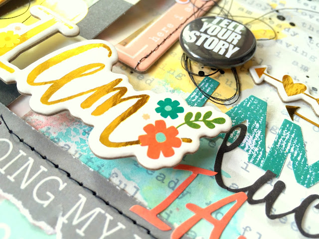
These strips were part of a 4x6 cut apart sheet, and they describe me perfectly.  I am doing my very best for my children, and yes, we ARE on a journey.  I often ask myself if I'm going to be okay, and even though I have doubts, I know everything WILL turn out okay. I'm strong.  I'm going in the right direction, and I am lucky.  I did add some machine stitching.  I used some really old (REALLY OLD) Stickabilities alphas for "autism mom."  I just had to add that in because that is definitely who I am :)


I love all these little pops of gold (surprise...haha)!  I love the clear stickers and the sticky brads in this line....so fun and easy to use!


More of the same here.  I stitched through those little chipboard frames that I layered in and added in some tangled thread to my layers.  More fun stickers and sentiments as well.


One last close up of the title area...I used a chipboard piece, which I raised up with pop dots.  There are SO many fun word stickers in this line.  I did add a flair button from my stash...it was too perfect not to use.


Here's a process video showing how I created this layout from start to finish.  Hope you enjoy it!


I hope this inspires you to create a layout about YOU!  It was therapeutic in a whole new way for me.  And this collection is perfect for it.  Come on over and join us on the My Scraps boards...lots of fun challenges over there ALL the time!

Have a great weekend!

Wednesday, April 22, 2015

Almost to Vegas / My Mind's Eye

Happy Wednesday!  Today I'm sharing my latest layout for My Mind's Eye using the Hello World collection! It’s one of MME’s newest lines, and it’s just perfect for travel photos. One of our favorite places to visit is Las Vegas, and I always love taking pictures from the plane as we fly over the mountains and Lake Meade. It’s just an amazing view, and so I decided to scrap a few photos from the air.

I began with the “Beauty” Bonjour paper because it is pretty neutral. I wanted to add some mixed media to my background, so I used a stencil and some gelatos to create the plus sign shapes. I also used some distress paint and watered it down onto some plastic packaging and smudged it all over the background. I love a messy look, and that technique creates it. I chose a few patterned papers to layer under my photos and then used some smaller paper strips and various embellishments to finish it off.


I LOVE these shiny gold alpha chipboard stickers from the Niche line…they are perfect for this page! I combined the with some of the stickers from Hello World to create my title. I always think big and shiny when it comes to Vegas! I also added in a few of the Wood Veneer and Enamel Shapes.


Here you can see more of the mixed media work as well as the layering. I also used the rub-ons in the collection…they go on so smoothly! That glittery gold arrow is from the Niche “Fancy That” Stickers.


Here’s a look at the bottom cluster on the page as well as my journaling. I love to journal right onto my page if the design allows it. I added a fun brad next to my writing for a pop of that pretty red color. I love the Flair in this line, too….just adorable!


One final look at a few of the embellishments…the wood veneer may be one of my favorites in this line! They are all so cute and they stick very well. Here you can also see some of the new MME cardstock…there are a ton of gorgeous colors. I used the Deep Blue here and the Antique Gold in my paper layers under my picture.


Thanks so much for taking a look!  This really is a fun travel line, and I had lots of fun putting this together.

Have a great day!

Tuesday, April 21, 2015

Captured / My Scraps & More Sketch #104

Happy Tuesday, friends!  Have you seen the latest sketch over on the My Scraps & More Sketch Blog?  It's fabulous, and it was created by our guest designer Nicole Nowosad!  She's amazing, and so is her sketch....check it out!


Here is the page I created.  I pulled out some Crate Paper Open Book & Kiss Kiss and went to layering.  My favorite part is the vellum piece with those geometric hearts!  I chose the papers I wanted and then cut them into strips.  I smudged some white gesso onto parts surrounding the photo cluster and then added in some gelatos and watercolors....it's very subtle.  These soft colors are so beautiful and I didn't want to go loud with this.  I smudged with some gold Color Shine, too.


Okay, so I've been hoarding these gold glitter Thickers.  I decided to bite the bullet and use one on this page, and I'm glad I did.  I LOVE how it turned out!  I layered some die cuts and rub-ons here, too, in addition to the machine stitching.


I love this transparent frame....it was just meant to be right here in this spot.  I layered in a few of my flair buttons, another gold rub-on and an acetate die cut to bring in a bit more of the green.


This vellum....oh my gosh.  LOVE!  I even smudged the gesso and mixed media over it and it did warp slightly, but I fixed that with the stitching.  That gold is just my fave!


Be sure to hop on over to the Sketch Blog and play along with us!  There is a GREAT prize up for grabs.....THIS!!  The Up in the Clouds collection from Pinkfresh Studio!!


Definitely worth playing for! :D  Thanks for stopping by, and have a great day!

Sunday, April 19, 2015

Meet the Cheeseballs / Hip Kit Club + May Kits Reveal!

Happy Sunday, friends!  Today I'm sharing my first layout for the Hip Kit Club using the gorgeous 2015 April Kits.  There is just so much stunning color going on in these kits...I just can't get enough of it!  I created this fun and goofy page that was up on the blog last Tuesday.  My husband and I are about as cheesy and silly as it gets, so this page represents that :)

Most of my "messy" factor is on that Just For Fun watercolor card from Heidi Swapp.  A pack of those comes in the Color Kit, along with a set of Prima Watercolor Pencils.  I used them to create that beautiful collage of color.  I wanted lots of colors in this, so I used a few pieces of patterned papers (all from Amy Tan Rise & Shine) and some of the Pea Pod green cardstock.  I cut those messy circles on my Cameo, and I think those are my favorite part of the design.


Here's a closer look at some of the layers.  I love mixing and matching my alphas for the title work, and both of these Thickers come in the kits.  I love that round wood veneer tag....the colors.....ahhhh!


As always, I added some machine stitching throughout the layout.  This is the bottom right cluster, and I brought in a piece of each color, combining paper, die cuts, epoxy stickers and chipboard.  That fun stamp is from Elle's Studio, and it's in the Color Kit.  I also added a bit of watercolor for some blue color.


This was so fun to make!  I show exactly how I did this in my process video down below :)


Here you can see this awesome chipboard frame that I used for layering.  I used some yummy gold thread for stitching...so pretty :)


Here is the process video....I hope you enjoy watching it!


In case you missed the reveal of the 2015 May Hip Kits, here they are!!  Full of Pink Paislee, Chickaniddy and more!!

2015 May Main Kit
2015 Cardstock Kit
2015 Color Kit
2015 May Embellishment Kit
2015 May Paper Kit
2015 May Project Life Kit

Thanks so much for stopping by!  Have a GREAT day!