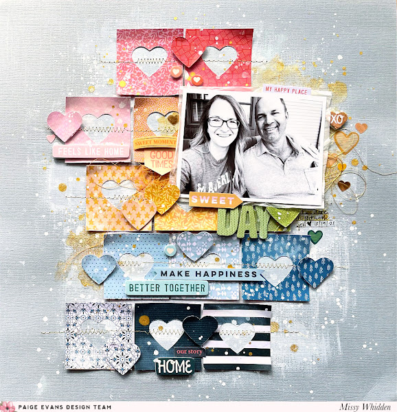
Hello again, friends :) I'm here today with a new layout for the Paige Evans Design Team. It features Paige’s Bungalow Lane collection.
I created yet another rainbow inspired page using only one patterned
paper. I punched hearts from various squares on Paper 20.
I arranged the squares in uneven rows to create the bulk of the
background design. I used a light gray cardstock for the base. To add
some messy effects behind the squares, I used my acrylic brush to spread
around some white gesso.
I decided not to add lots of color since the squares added plenty of
that. Instead I used a bit of Jen Hadfield Gold Glitter Spray and
treated it as watercolor. I used a brush to add some of that behind my
photo and a few other areas on the page. I also splattered white acrylic paint. I think the white makes such a bold yet subtle statement on the gray cardstock.
After I glued down the squares, I machine stitched through each row
using gold metallic thread. I also bent up the edges of the paper to
create more texture and dimension. I used the punched hearts as
embellishments and I popped them off the page using adhesive foam. I
added bits and pieces that matched each color section. I used pieces
from the 8-Page Sticker Book, Foam Phrase Stickers, and Thickers.
It’s a lot of fun to embellish tone-on-tone because it helps to narrow
down which pieces to use in certain sections of the page.
I decided to go light on the thread and only added it in two places. I tucked in some metallic gold thread here under the right side of the photo. I added some yellow/orange over on the left side. I also had a fight with my gold pen and had to use my black Sharpie instead for my journaling...haha.
I love embellishing tone-on-tone. It makes the process like a treasure hunt...you need pink things for the pink area, orange for the orange area, etc. So you can only use a limited number of items per color square. It just helps narrow things down, and the color on color effect is always a win!
I popped up these hearts with adhesive foam, and I love how that looks. Since the squares are stitched down flat, it's nice to have some things creating a shadow. I do love the curled up edges of the squares. That's another easy way to get some depth. This is also a good shot of the shiny gold!
I did more of the same on the top part of the layout. I used various
stickers that matched each section. On the orange section I used part of
a Layered Sticker and
I tucked in matching thread coming out from under the photo. I decided
to print my photo in black & white to make it stand out against all
the colors. I layered white tissue paper under it as well as adhesive
foam.
More close-ups of all the details :)
I wanted to keep the title short and sweet, so I combined a sticker from the 8-Page Sticker Book with some of the green Thickers.
I added just a small bit of journaling to right of the title and added
the date. I wanted to add something small to the right side of the
photo, so I created a small cluster of various heart stickers that were
gold or yellow in color to match the gold on the background.
I hope this has given you some scrappy inspiration today. I always find that rainbows and tone-on-tone makes for a great layout :) It includes all the colors and it just makes me happy!
Be sure to check out my process video for all the details:


This is a great web site. Good sparkling user interface and very informative blogs. OmAstrology
ReplyDeleteI’m certainly happy I came across it
ReplyDeleteI’ll be bookmarking it and checking back regularly!
ReplyDeleteHello, I’m happy to see some great articles on your site.
ReplyDeleteI would like to thnkx for the efforts you have put in writing this blog
ReplyDeleteI am hoping the same high-grade blog post from you in the upcoming as well
ReplyDeleteIf you know of any please share. Cheers!
ReplyDeleteThanks for sharing this brilliant article it was a very useful and helpful article.
ReplyDelete