Monday, June 20, 2022

A Good Day / Paige Evans DT

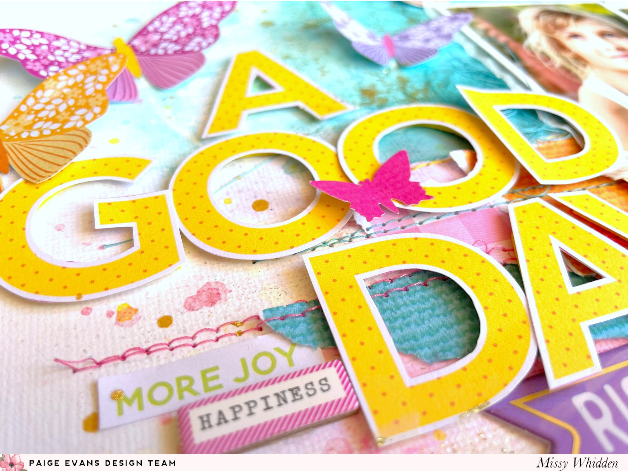
Hey, friends!  I'm here today with a new Splendid layout for the Paige Evans Design Team. I was inspired by all of the beautiful butterflies in this collection, so I began by fussy cutting several of them from patterned papers in the 12x12 Paper Pad and the 6x8 Paper Pad. My photos are perfect for them because it appears that she’s looking up at them flying around. I used textured white cardstock for the background, which I coated with clear gesso first. I wanted to add a few colors to the background, so I went with lots of blue up top and pink on the bottom. I used a few Shimmerz sprays to create that watercolor effect and then splattered white acrylic paint and Gold Glitter Spray. I tore a few strips of a few patterned papers from the 12x12 Paper Pad to give my photos a place to sit, and I machine stitched through them. I placed all the butterflies in random areas to make it look like they flew right onto the page.

I love the torn edges on the paper strips. To create even more texture I ran the edges through my distresser. I tucked in a fun metallic banner from the Cardstock Stickers under the photos. I also tucked in some dark pink thread here to create texture. Finally, I added an Epoxy Sticker under the title. I’ve been on a glitter kick lately, so I smudged gold Nuvo Glimmer Paste in a few areas using my fingers.
 
I planned to use a large title as part of the design, so I fussy cut it out and played around with the placement before I attached the butterflies. Larger bits are harder to work in at the end of the process, so I made sure to work with those in the beginning. I popped the letters up with adhesive foam to create dimension. I used a small butterfly punch from my stash to add a tiny pink butterfly here on the title. I chose a few tiny details to add here including a small piece from the 8-Page Sticker Book and another small sentiment from the Chipboard Stickers.
It’s fun to see the textures show up through the watercolor areas. These bright butterflies really stood out against the pretty blues. Here you can see the bits of gold shining through. I only glued them down on the centers so I could easily bend the wings. Instant dimension! I used a white gel pen to add trails from a few of the butterflies. I also tucked in matching blue thread here under the photo.
I wanted to add a bit of detail here, so I used a white gel pen to create some subtle trails coming from some of the butterflies.  I wanted to machine stitch, but there was just too much on the page to run it through my sewing machine.  
I always like to layer, so I tucked a butterfly under the corner of the photo here and added a small sentiment sticker from the 9-page Sticker Book.
I love this shiny gold banner sticker from the Cardstock Stickers.  I trimmed off some of the white border and added it under the photos.  It was the perfect length.  I tucked in some darker pink thread under it to make this blue butterfly pop off the page.
I chose blue for the background here because it reminds me of the sky, and also because those yellow title letters would really pop against it.
I had to play around a lot to get the right placement for the title.  I originally thought I'd place the title under the photos, but it covered up too much of the paper strips.  I settled on the left side of the photos and then popped up the letters using adhesive foam.  I love the shadows that creates!
I took a lot of close-ups, so here are a few more :)


I hope this gives you some ideas to try out on your next project.  I love how this all came together!  Be sure to check out my process video to see all the details.


Thanks for stopping by, and have a great day!

Thursday, June 2, 2022

You & Me / Paige Evans DT

Hey, friends!  I'm back today with a new layout for the Paige Evans Design Team featuring Paige’s new Splendid collection. It’s my first project using it and I couldn’t resist using all the beautiful colors to create a rainbow design! I also used Paige’s Star Burst cut file. I cut the design on my Silhouette Cameo from white cardstock. I chose lots of bright papers from the 12x12 Paper Pad to create the sun bursts. I decided to turn it horizontally and arrange my two photos close to the center star.  I used textured white cardstock for the background and I coated the bottom portion with clear gesso. I chose matching shades of Shimmerz Paints to create a watercolor effect to match the rainbow colors.


I sprayed the star gold and then coated it with some gold Nuvo Glimmer Paste to make it sparkle. I traced each sun burst on one of the papers and cut them out. I decided to add dimension to the sun bursts by popping them up using adhesive foam. I glued the actual cut file down flat on the background so the sun bursts would jump off the page. I also distressed the edges to create more texture. I wanted to embellish the sun bursts with small things, so I added some flowers from the Cardstock Stickers and a few butterflies I fussy cut from the 6x8 Paper Pad and a 2x2 Paper Pad. 
I love how this watercolor area turned out! I continued the floral embellishing down around the title area. I dug into the 8-Page Sticker Book for these and then added the “shine” sticker from the Epoxy Stickers.  It was perfect to add on top of the photo since it matched the gold star.  I also used a phrase from the Epoxy Stickers for my title. I used a shiny gold label sticker from the 8-Page Sticker Book to frame the outer edges of the photos.
Here’s another angle of all the beautiful papers and colors. I did smudge some white gesso on some of the sun bursts around the photo area to fade out a bit of the color. This just helps the photos to stand out a little more. I also splattered white acrylic paint and Gold Glitter Spray. If you’re a fan of texture and dimension, this collection is for you because flowers and butterflies are perfect for that! It’s so easy to bend the petals or wings up so they float off the page. Splendid is full of them!
I took lots of close-ups here.  Embellishing tone-on-tone is awesome because it helps you narrow down what you can use in certain areas.  Sometimes the amount of stickers and things can be overwhelming, so this helps take some of the guess work out.
I love how this watercolor section turned out.  The blues and purples turned out so pretty, and I love the little matching butterflies.
I'm telling you--that Nuvo Glimmer Paste is incredible.  So fast and easy, and the sparkle factor is off the charts!  Here you can see the depth created from the adhesive foam.  Something about lifting things up off the page just makes it look so awesome.
More close-ups of all the gorgeous colors and patterns :)
I almost wrote my journaling with a gold pen, but I felt like the black worked better since the photos were black and white.
I hope this inspires you in some way today.  I had a lot of fun sorting through Splendid, trying to figure out where to begin...haha :D  The cut file definitely helped me get started.

Be sure to check out my process video here to see how I made this from start to finish:


Thanks for stopping in, and have a great day!

Saturday, May 7, 2022

Amazing Laugh / Paige Evans DT / iNSD 2022

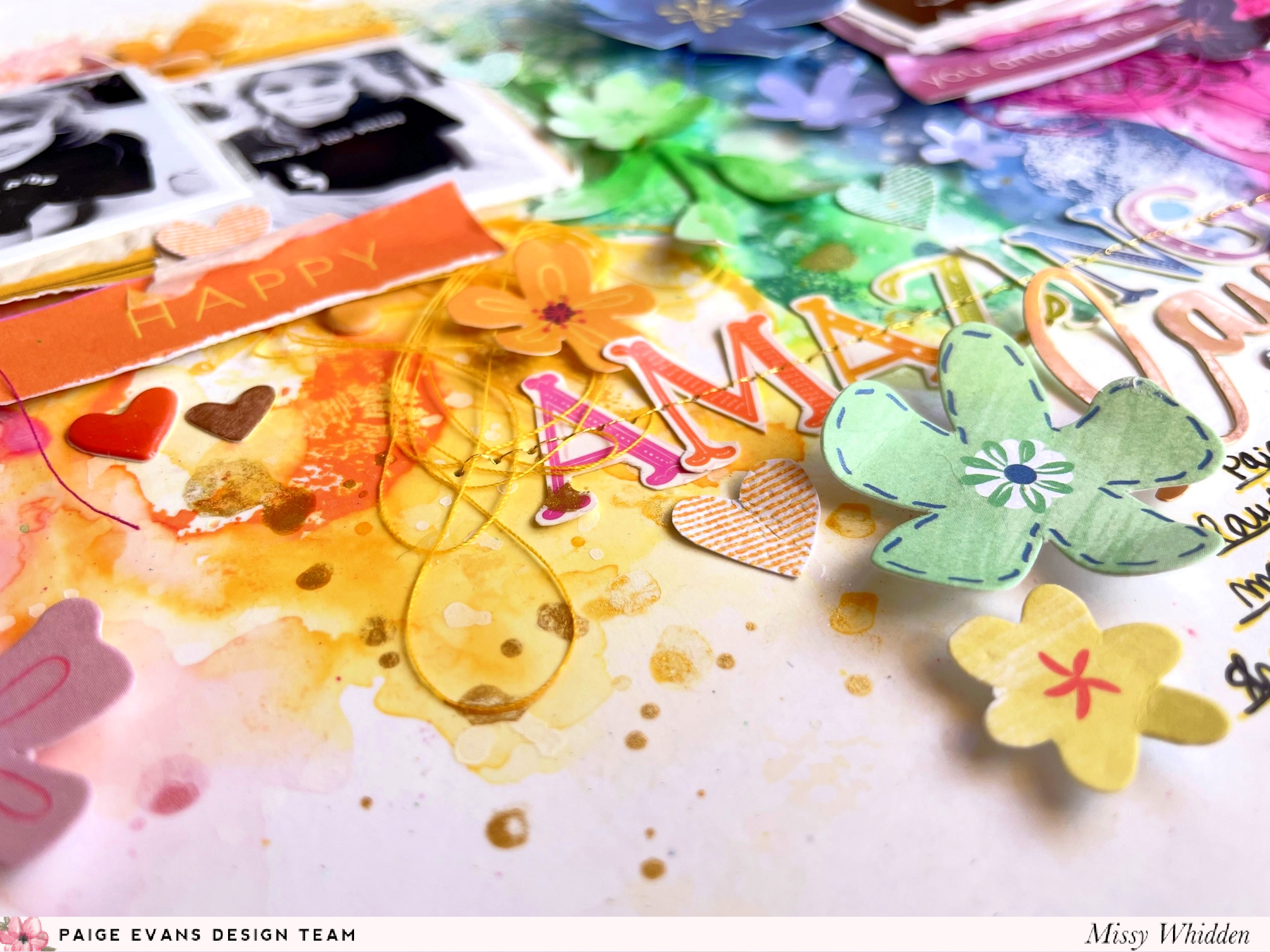
Happy iNSD, friends!  I have a fun and bright layout to share for the Paige Evans Design Team.  I created this for a challenge over at Paige's Facebook group as part of the iNSD festivities.  My challenge is to use either STENCILS and/or STAMPING.  I used both because I absolutely love making my own backgrounds.

I used Paige's Polka Dots stencil and a few of her stamps.  I used a circle stamp from Horizon and a small lined heart stamp from Turn the Page.  I also used a lot of floral die cuts & stickers from Truly Grateful as well as a few fussy cut flowers from Oh My Heart.

For this background, I used thick smooth white cardstock.  I coated the whole thing with clear gesso first.  I divided the page in half and used the stencil on the top half.  I scraped white texture paste over the stencil to create that bumpy effect.  On the bottom half, I used a rainbow variety of Distress Oxides with a circle stamp to create a row of circles.  I added some water to that and used a brush to help the colors spread and run, making it look like the paper was left out in the rain.  I went back under that row with the same circle stamp and created another row and did the same thing with the water.  I used matching colors of Shimmerz sprays to add some color to the textured part up top.  You can see more details on this in my process video.

These ink colors match the Truly Grateful collection so perfectly.  I went through all the die cuts and pulled out anything that matched.  I used small bits of patterned papers from the 6x6 Paper Pad to layer beind the photos.  I also added some white tissue paper.  I used matching colors of tangled thread to use as added texture.
I decided to add all the flowers and stickers in a tone-on-tone manner, meaning everything yellow is on the yellow section, etc.  I love this technique!  It helps you narrow down your embellishments and makes the selection process easier.  I wasn't sure what to do for a title, so I used the AMAZING stickers from Truly Grateful and stitched through them with metallic gold thread.
Here's a good shot of the stenciled texture up top.  It feels rough and bumpy, and it just looks so cool once color runs over it.  Here you can also see some of the small hearts I stamped and cut out.  I used the same Distress Oxide inks to create those.  I also added gold splatters at the end.
I added some adhesive foam under the photos to pop them up off the page a little bit.  That always makes it easier to tuck and layer things under them, like these circle puffy stickers and epoxy stickers.  
I added a "laugh" sticker to finish off the title area.  My favorite thing is to mix and match fonts when it comes to titles.  I added a few more flowers underneath the title in line with the correct color areas.  I first wrote my journaling using a gold pen, but it didn't look right, so I went back over it with my black Sharpie.
Here are a few more close-ups of all the details...


I hope this inspires you in some way to get creative today :)  Be sure to join us over on Facebook today for a TON of challenges and FREE CUT FILES!  Paige has loaded up on the freebies, and there are hourly challenges happening all day long.  You don't want to miss it!  GO HERE.  

Here is my process video for this...I make the layout from start to finish.  It's a fun journey!


Thank you for stopping by, and I hope you get lots of crafty time today :)

Wednesday, April 20, 2022

You Are Beautiful / Paige Evans DT

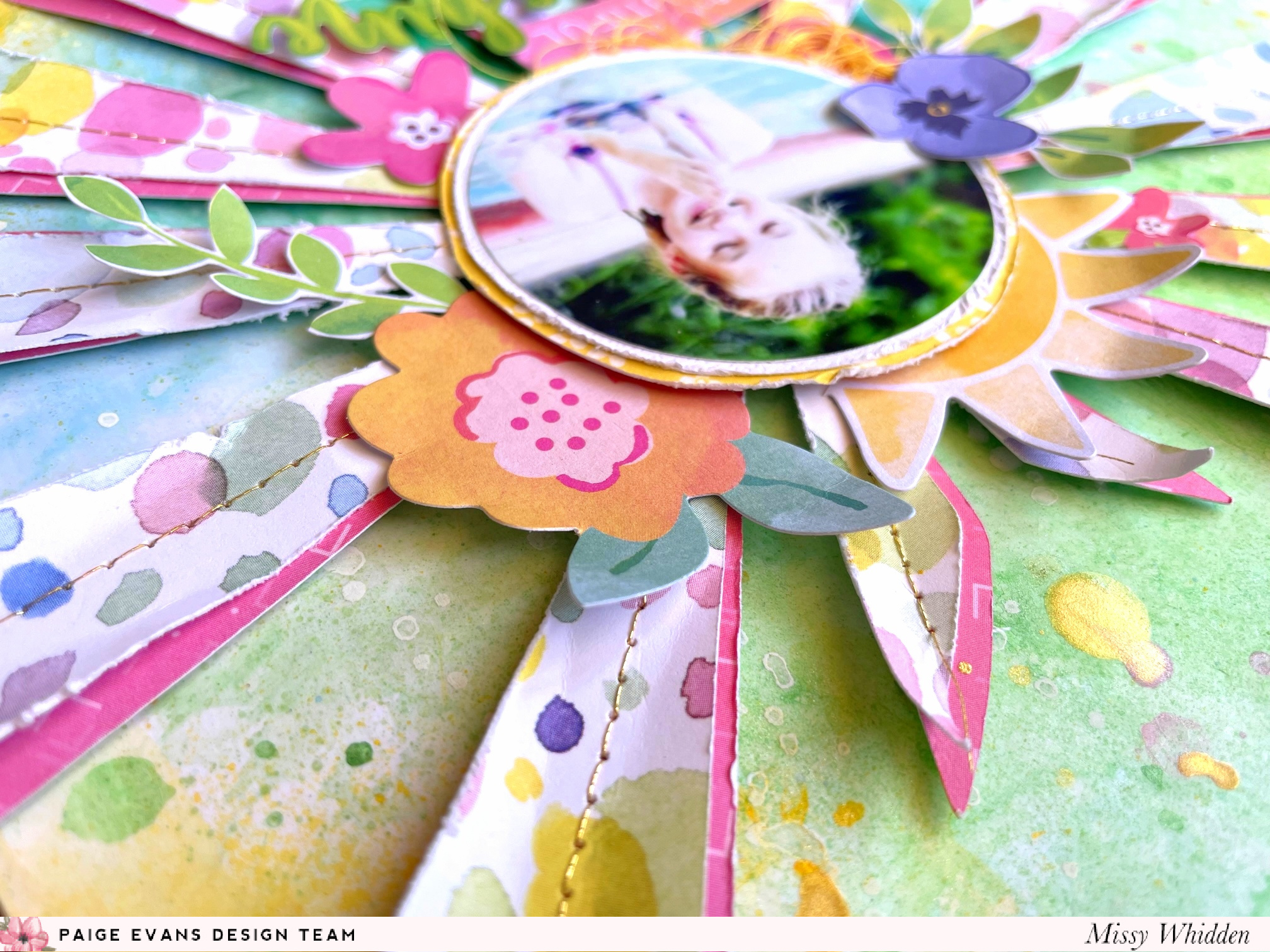
Hey friends!  I'm here again with a new layout featuring Paige’s Bloom Street collection. I can’t resist making bright summer layouts with it! I started by cutting Paige’s Heart Sunburst Cut File from Paper 20. All those colorful circles just called out to me, so I made that the focal point paper. I also cut it a bit larger from Paper 05 to create a pink shadow. 

I went with thick, smooth white cardstock for the base and I coated it with clear gesso to prep it for lots of watercolors. I wanted to mimic the colors in the photo (which I punched out with a 2.5” circle punch), so I added green and blue Shimmerz sprays behind the cut file. Yellow wasn’t even on my radar, but as the layout went on, I added it in as well. I placed the photo in the center of the sun and embellished around it with lots of flowers and leaves from the Floral Die Cuts.
After the background dried, I splattered lots of white acrylic paint, Shimmerz, and Gold Glitter Spray. I machine stitched with metallic gold thread along each sun ray and then popped the whole piece up with adhesive foam. The effect of that dimension is so worth it! I also used a few stickers for small titles from the Cardstock Stickers and the 8-Page Sticker Book. I distressed the edges of the sun to add even more texture.  

To add a nice big pop of yellow to the page, I tore off a chunk of the background and glued some of Paper 14 behind it. I feel like this really brightened up the page and made this flower cluster shine. I brought in all the colors from the sun over to this side, added adhesive foam behind some of the flowers, and tucked in thread. All of these colors, layers, and textures are just what this side of the layout needed. I clustered my journaling in this area as well using a metallic gold pen.

I love what a little bit of stitching can do for a layout.  Something so small yet creates such wonderful detail :)  Here you can see the benefits of adding adhesive foam as well--lots of dimension and shadowing.
I like to make sure my photo always stands out against busy patterns and colors, so I backed it with some white cardstock and bit of yellow paper.  This creates a bit of a barrier between the photo and the background.  It helps to separate everything in the photo from everything around it.  It's something small that makes a big difference without you really even realizing it :)
I love how this fun background turned out.
I went light on the thread and used only a bit of yellow here.
And some blue here :)

I didn’t plan this, but I love how the edge of the pool in the photo almost lines up perfectly with the diagonal direction of the sun rays behind it. Sometimes the photos just work like that and I couldn’t have planned it if I had tried! Gotta love scrappy surprises!

I hope this inspires you in some way today.  I loved how it all turned out, and it was so much fun playing with an older collection.  Be sure to check out my process video to see how this page came together:


Thanks so much for stopping by, and have a great day!