Friday, June 30, 2017

Be a Fruit Loop / Paige Evans Design Team

Happy Friday, friends!  The weekend is here...yessss!  Today I'm sharing my newest layout for the Paige Evans Design Team, and it's up on her blog today.  Our theme for this week was to use our favorite technique.  If you know me, I have several...haha!  I incorporated mixed media, of course, as well as bright colors and a big quote for a title.

I found this quote on Pinterest and knew right away I had to use it.  My little Paige is definitely a Fruit Loop...haha!  She makes the funniest faces, and these photos were perfect :)  I used papers from the Oh My Heart, Fancy Free and Take Me Away 6x6 Paper Pads to cut all those letters, as well as some papers from the Oh My Heart & Fancy Free 12x12 Paper Pads.  These alphas are from The Cut Shoppe.  I cut each patterned paper into a 2x2 square and cut them on my Cameo.  My background is Paper 11 from Take Me Away.  The bright yellow was perfect for this!  I covered a lot of the area with white gesso first and then used lots of colorful Shimmerz Paints to create all those watercolor splotches.  I used the packaging technique and a brush.


Aren't these colors just beautiful?!  I love the contrast between the paper and the background.  I machine stitched through each row of words with yellow thread, and I also lightly traced a shadow around the letters with a black fine tip Sharpie so they would pop a little more.


So I went light on embellishing since the background was already busy and colorful enough.  My photos are black & white so they stand out quite a bit, which is what I wanted.  I added a piece of aqua paper from the Fancy Free 12x12 Paper Pad under the photos as well as some tissue paper. I also tore a piece of floral washi tape from the Oh My Heart Sticker Book and layered it around the photo.  I cut that little scalloped border in half and used it on both sides of the photos.  That is from the Oh My Heart Puffy Stickers.  The buttons are from Fancy Free, and I added in some tangled thread and some sequins from my stash.  Those are from SpiegelMom Scraps.


Here's the other side of the photo strip...more of the same items from the other side.  I did add a few clear stickers around the page from the Oh My Heart Sticker Book.  I added some hearts to the open space of the photos.  The yellow one is from the Fancy Free Puffy Stickers.  The pink one is a Chipboard Sticker from Oh My Heart, and the blue one is a Puffy Sticker from Oh My Heart.


When you create a big title like this, it takes up a lot of room.  This can be a good thing because it limits where you can put everything else.  It takes the guess work out of the equation.  Once I laid out the letters, I only had so much space to place the photos, so I didn't have to spend a lot of time trying to decide that.  I placed small embellishments here and there, including this fun Fancy Free Puffy Sticker and those little Xs.


In three spots around the page, I used these cute Oh My Heart stickers from the Sticker Book and a few floral stickers.  This one is from the Oh My Heart Chipboard Stickers.


The colors!!!!!!!!!!  I never get sick of these colors...seriously my favorite!  I love how the letters kind of curl up and create some dimension!


Okay, one more photo...haha!  I really love how it all came together :)


I hope you have enjoyed this...I really love it!  I have a process video here if you'd like to watch.


Thanks so much for stopping in!!  I'd love to know your favorite techniques :)  Have a great weekend!


Thursday, June 29, 2017

Hello Hello Beautiful / Hip Kit Club

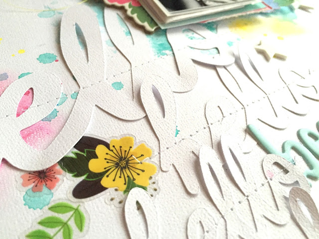
Hello again, friends!  Today I wanted to share another layout for Hip Kit Club using the 2017 May Hip Kits.  My theme for this particular layout was to use alphas in a creative way.  I decided to use one of the exclusive cut files that Nicole designed and repeat it in different sizes.  I cut four "hellos" in different sizes on white cardstock.  I wanted it to take up a lot of space and to be tone-on-tone with the white background.  I angled all the cut files and machine stitched through them.  I used some of the Prima Watercolor Confections from the Color Kit on my background to create the watercolor splotches along with some Shimmerz Paints.  I embellished with lots of florals, stars and a few hearts.


I love this white-on-white look.  I like that it's very subtle technique yet very effective and pleasing to the eye.  I used some of the clear sticker flowers from the Shimelle Sticker book (Project Life Kit), and the light blue alphas are Hip Kit exclusives.


I fussy cut this gorgeous floral wreath from one of the 4x6 Project Life cards...it's so pretty!  I also used a few of the 3x4 PL cards as layers behind my photo as well as some tissue paper.  I used a few of the white foam Thickers and some thread from my stash.


Here's another close-up of the cut files.  I really like the dimension they have here...I didn't want to glue all the loopy letters down, so they kind of stick up off the page.


I wanted some small smudges of color here and there, so I added a small amount of pink, aqua, yellow, light blue & grey.  I added some foam and thread under this die cut heart.


I created a visual triangle with the watercolors...this is the bottom right corner.  I also used some gelatos.  I love how the cardstock's texture shows through those.  Here I also used more of the Shimelle stickers and a fussy cut flower.


I have been wanting to use those gorgeous Crate Paper chipboard flowers, so I layered them around the photos.


I do have a process video like always if you'd like to check it out...


Thanks so much for stopping in today!  Have a wonderful Thursday :)

Tuesday, June 27, 2017

Easy Breezy / Bella Blvd

Hey there, friends!  Today I'm sharing my newest layout for the Bella Blvd Creative team.  This week, the CT is providing lots of Summer inspiration.  Summer is my favorite season to scrap, so I was excited to create my layout.  My photos are of me and my husband having a very windy dinner on the beach in Aruba last year.  I'm amazed that we got any photos without my hair flying everywhere!  I finally gave in and just embraced the breeze and took some funny and memorable photos :)  I wanted to recreate the tropical feel of the island, so I used this hibiscus and leaf cut file from Paper Issues.  I used papers from the Secrets of the Sea Girl and Boy collection for them, and I used Shanna's Favorite Illustrated Faith Watercolors on the background.


I used white gesso on my background paper is from the Secrets of the Sea Boy line, and it was perfect for adding all these bright colors.  I used some plastic packaging with the watercolors to create some fun artsy splotches of color that would show through and around the flowers.  I love the dimension of the flowers.  I added in a few palm tree Fundamental Stickers from Illustrated Faith Delight in His Day.  I couldn't resist adding that adorable flamingo from the IF Basics Paper Pieces pack.


Layering die cuts is a great way to create depth and dimension on your layout.  I also used the watercolors on the flowers to create the illusion of some darker shades.  I machine stitched through the centers of each leaf for some added interest and texture.  That "I Can't Even" sticker is from the Secrets of the Sea Girl line Fundamentals Sticker sheet...that's what I was feeling when my hair wouldn't stop blowing everywhere!


Isn't that flamingo just gorgeous?  It's the perfect embellishment for a Summer page.  I added in a few colors of tangled thread  here and there and a few stickers from the IF Delight in His Day Fundamentals Stickers.


I think these colors are so pretty together.  I made sure the watercolor was a different color than the flower on top of it.  This allows them to really stand out.  Right above the top photo, I added in a Designer Clip and some more thread.


Finally, I added my title.  I used some Tiny Text Alphas and mixed and matched colors & fonts.  I used the grid pattern of the background paper to write my journaling.


I hope this inspires you to mix and match your collections to come up with something fun and bright!  Don't be afraid to jazz up your background with some paints or spray mists...a little bit of that can really change up the look of your layout.  Plus it's a lot of fun!

I do have a video, so check it out if you'd like:


Thanks so much for stopping  by!  Have a fantastic day :)

Monday, June 26, 2017

Island Vibes / Cocoa Vanilla Studio

Happy Monday, friends!  I'm back today to share my newest layout for Cocoa Vanilla Studio.  I created a bright and layout focusing on Summer, which is my favorite!  I used the beautiful Hello Sunshine collection.  This photo is of me and my husband last year in Aruba, so I wanted to create a sunny and tropical vibe.  I started with my title, actually.  I knew I wanted to the word "island" as part of the title, so I created it in my Silhouette software using the Bromello font.  I welded it and cut it on white cardstock.  I used some watercolors to paint it blue to match the collection.

I tore and cut part of the sun ray paper to use as a background layer. I love creating some sort of sun on my Summer pages, but I didn't want this one to take up the whole page.  I added some yellow/gold and blue watercolors to my background paper after covering a lot of it with white gesso.  I embellished with lots of goodies...die cuts, dimensional flowers, woodies, cardstock stickers and puffy stickers.


I love how this turned out.  The dimension on this is so great...the watercolor made the paper curl up  on the edges.  Here you can see the background and lots of embellishments.  I was excited to use that colorful circle "Summer" die cut piece under the title.  I added some foam under it.  I added in a pretty floral die cut to the left of the photo as well as a bright blue flower and some puffy stickers.


Here's a better look at that cluster.  I love how it turned out.


I used another dimensional flower here as well as a die cut flower and a fussy cut flower.  I added some thread as a final touch.


Here are a few die cuts I added in.  The blue piece is a frame, and I like the touch of blue it gives.  I threw in another puffy sticker because they're just so cute :)


I added one more flower here as well as a few fussy cut ones.  The CVS woodies are so cute!  I love the touch of neutral wood around the edges.  I also did some machine stitching with metallic gold thread on all the sun's rays.


I hand cut "VIBES" from a few of the patterned papers here to finish off my title.  I smudged a little gesso over some of the letters so I could rub in a little blue gelato.  I did a few lines of journaling and added the date.


I really love how this came out!  I hope it has inspired you in some way.  I do have a process video if you'd like to see how I created this.


Thanks so much for stopping in!  Have a wonderful day, friends :)

Saturday, June 24, 2017

She's a Dreamer / Shimmerz Education Team

Hey friends!  Happy Weekend...woo hoo!  I have a new layout to share for the Shimmerz Education Team.  I wasn't sure what I wanted to create for my project, so I picked up a Jane Davenport patterned paper pad and was instantly inspired by all the gorgeous colors and abstract designs.  I decided to create a messy and artsy background using lots of Shimmerz goodies and some circles punched from paper.

I started with a white cardstock background.  After punching all the circles and seeing what colors I had to work with, I selected several Shimmerz products to create my background.  I used Coloringz Pink Stilettos and No Yoking with some plastic packaging and smushed the color down.  Then I directly sprayed some Vibez Jeni B Bleu onto the page.  I love how it sort of turned into a color blocking design.  To add in more shades of pink, I used a palette knife and some Paste-eez Raspberry Sherbet on top of the base pink.  I also sprayed some Vibez Cold As Ice and Coloringz Heidi Ho Blue for some blue variation.


I really love how bright and colorful this turned out!  I randomly adhered the circles after the background dried and then pulled some Bella Blvd puffy stickers and some sequins from SpiegelMom Scraps.  I also added some coordinating threads under my photo.  I even attached some circles on to of the photo since I had some open space.


I love the tone-on-tone colors here with the background and the circles.  I added lots of matching splatters after the circles were down.  For my title, I combined some older American Crafts white alphas with a fussy cut word from a Dear Lizzy paper (the Lovely Day collection).  I added some journaling under the title using an Illustrated Faith pen.


I did try and add in this deep reddish-pink color mixing some AcriTonez together (Pinkadelic, Roses Are Red & 3 Sheets to the Wind) and smudging it through a circle stencil.  It didn't turn out like I hoped, but I added some water and dabbed it with a paper towel and it turned out okay.  I love that deep color, and it matched the circles & stickers perfectly!


I did do a bit of machine stitching here.  I used a few strips of the Jane Davenport washi tape down here at the bottom and added a Bella Blvd sticker.


I also embellished with some older Simple Stories stickers.  I think this blue may be my favorite color!


I hope this inspires you to be inspired by your papers or embellishments.  Try creating a layout "from scratch" and build your own background.  Shimmerz are perfect for that, and there are so many colors to choose from!

Here's my process video if you'd like to see how I created this.


Thanks so much for stopping by!!

Supplies Used:
Coloringz--Pink Stilettos, No Yoking, Heidi Ho Blue, Night Moves
Vibez--Jeni B Bleu, Cold as Ice
Paste-eez--Raspberry Sherbet
AcriTonez--Pinkadelic, Roses Are Red, 3 Sheets to the Wind


Thursday, June 22, 2017

Laugh Out Loud / Hip Kit Club

Happy Thursday, friends!  I'm back to share another layout I created for Hip Kit Club featuring the 2017 May Hip Kits.  This layout actually started out as something completely different.  I was inspired by a beautiful circle layout by Paige Evans, so I pulled out several of my circle punches.  I punched circles from several of the patterned papers and a Project Life card.  I also used the Prima Watercolor Confections from the Color Kit on some white cardstock to create a messy background and then I punched circles out of that.  That background was the beginning of my layout, but I wound up not liking it.  When that happens, I punch shapes out of it and turn it into something I do like :)

I used some of the Begonia cardstock from the Cardstock Kit as my base. I knew I wanted to create a diagonal design, so I covered a lot of that area with white gesso.  I came back over that with the watercolors and created a messy background that would show through all the circles.  I used three photos in a strip and used some of the Butter cardstock behind it as well as some tangled thread, a Shimelle sticker and an exclusive Hip Kit puffy scallop border sticker at the bottom.


I glued down all the circles so all the colors were evenly distributed around the page.  I machine stitched through the bigger circles with black thread.  I love that added detail and texture.  I added a few stickers from the Shimelle sticker book as well.


I added some adhesive foam under my photos to give them some lift and added a Crate Paper chipboard heart on top.  That "Love" sticker is from Shimelle as well.


I was kind of nervous about using such a bold color for a background and then adding all the mixed media on top of it....but I like how it turned out.  My photos are wild and crazy, so I needed a background to match :)  I did add some black splatters as well to bring out the black in the photos.


Here's a shot of the top of the layout...more colorful circles, stickers and thread.


I decided to use on of the exclusive die cuts for my title...it described my photos perfectly!  I added some foam under it and some thread, and I added a bit of journaling underneath.


I hope this inspires you in some way...especially when you've lost your creative mojo and nothing you're making suits you.  Just keep making it work.  My first background wasn't making me happy, so instead of trashing it, I punched circles from it.  Sometimes a disaster can bring about something that pleases you!

Here's my process video if you'd like to watch the struggle...haha!


Thanks for stopping by, and have a great day!!

Tuesday, June 20, 2017

Hello You / Paige Evans Design Team

Hello and Happy Tuesday, friends!  I'm back to share my newest layout for the Paige Evans Design Team.  Our theme this week is Monochromatic, and I decided to really challenge myself and go with purple.  I have no idea why I chose that color, but it just seemed like the right thing to do at the time :)  I used mostly papers and Ephemera Die Cuts from the Take Me Away collection. 

To start, I went through each paper and die cut from the collection.  I fussy cut out any shape that was purple from Papers 11, 13, 16 and 24.  I cut a few windows, some frames, some lists and some hexagons.  I knew the background would be random, and I just wound up layering each piece in a vertical design in the center of the background, which is Paper 15.  I covered a lot of the center area with white gesso and then used three different purple Shimmerz Paints over that.  I used the packaging technique and a brush to get all that messy color down.


I decided since there were so many small details on the page I would keep my title small.  I liked how this tag looked here as a layer, and the sentiment was perfect.  I added in some purple thread and did some machine stitching in a few places.  I pulled a few sequins from my stash and from SpiegelMom Scraps in purple shades.  One of my favorite things about putting this page together was coloring the silver glitter Thickers from the Fancy Free collection.  I just scribbled a purple gelato over it and rubbed it in with my fingers.  Instant color!


I love how all these layers turned out.  The hexagons are very subtle, and I love the contrast with the darker sequins and thread.  To raise my photos up a little bit, I added some foam adhesive under them.


I went light on the journaling and just typed a few lines on my computer.  I didn't really have a good spot to hand write any journaling, so the typed strips were perfect and didn't take away from any of the design.


I love the contrast of the dark photos with the light purple shades.  All those light colors really allow the photos to stand out.


Here's one last close-up of all the details.  I am really loving those altered Thickers!  You could do that with any color and really get some fun shapes!  I did add in one of the Take Me Away Metal Clips here as well.


I hope this inspires you to create a page using only one color...it's a challenge but really fun!  I love how this turned out.  Here's my process video if you'd like to check it out:


Thank you so much for stopping by, and have a great day!