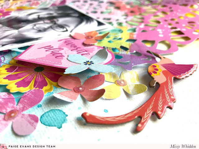
I wanted to create some dimension, so I popped the doily up a bit by adding adhesive foam behind it. I went with a black & white photo to create contrast and allow the colors to really pop. I embellished around the photo using a lot of the Floral Die Cuts, a Chipboard Sticker, and some punched flowers. I used the scraps of Paper 24 to punch the flowers and scattered them around the photo.
I used an old Martha Stewart flower punch to create these flowers. I haven't used that punch in years, and it felt good to use it again. I used some sequins from SpiegelMom Scraps in the centers to finish them off.
I also fussy cut a “favorite places” heart from the cut apart sheet in the 12x12 Paper Pad. I went simple with the title and used an Epoxy Sticker. I especially love that it’s purple since I wanted to bring some of that color down to the bottom of the page. I also added in tangled thread for more color and texture.
I added a piece of white tissue paper behind my photo for a messy layer and then tucked in several different colors of tangled thread.
I created a little floral cluster in the top left corner using more punched flowers. I used the rest of Paper 24 to punch them and then added in a Chipboard Sticker.
I love how all that mixed media on the background shows through the open spots of the cut file!
Here’s a close-up of the doily detail. It’s such a beautiful cut file and cutting it on this paper makes a really bold design element. This paper is perfect for those of you who like the look of paint strokes but don’t want to make them yourself. And look how colorful and pretty this is and all I did was cut it out! I did add some white splatters as I finished the page by watering down some white acrylic paint and using a brush.
Flowers are my favorite because the petals are easy to fold up to create dimension and texture.
One more close-up just because it's so pretty!
I hope this gives you some inspiration for your next layout! I can’t get enough of this Horizon collection. It’s impossible to not fall in love with all of those amazing colors and patterns! I really loved putting this together. Be sure to check out my process video here for lots more details!
Thanks so much for stopping by, and have an awesome Friday!


No comments:
Post a Comment