I pulled out the 12x12 Paper Pad and used four papers. In single sheets, they are Paper 2, Paper 13, and both sides of Paper 15. I loved the pink painted look of Paper 13, so I tore a big chunk of it to use as part of the background. I used thick smooth white cardstock as the base and I coated it with clear gesso. I wanted to create a dark navy blue watercolor area to really make my photo and all that pink pop off the page. I used a mix of Distress Oxides, Shimmerz, and acrylic paint on the white cardstock, and I splattered white acrylic paint on the pink paper behind the photo.
I went wild with fussy cutting lots of bright and beautiful flowers from Paper 2. I also used a few flowers from the Floral Die Cuts. All of these colors really stand out against the navy blue. I tucked them in all along the torn edge as well as behind the photo. I also cut a few smaller flowers from the 6x8 Paper Pad. I fussy cut a few birds from Paper 15, and I used the blue backside of that paper to add a dark blue layer behind the photo. I also tucked in some colored thread in a few spots.
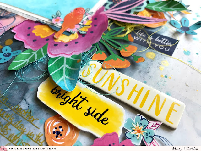
I used the Cardstock Stickers and Chipboard Stickers here for the title. I created a little floral cluster here using most of the colors from the larger flowers. I love how you can get such wonderful dimension from flowers and leaves by bending up the edges! I added adhesive foam behind the “bright side” Cardstock Sticker to make it even with the “sunshine” Chipboard Sticker.
These colors are just so rich and lush...I can't get over them! I love how they all look layered together like this.
There are so many patterned papers in this collection that deserve to shine! I love adding mixed media to just about anything, but this is one of those papers that really don't need anything else. It's perfect if you love the mixed media look without actually doing it :)
I didn’t want to do too much mixed media on this pink paper because it is gorgeous as is, so I just added a bit of white, turquoise, and gold splatters. I tucked in more fussy cut flowers and a bird. My photo has a lot of open space, so I overlapped a few small things on the edges. I wanted the blue to really stand out, so I didn’t want to crowd it by adding even more embellishments.
I love adding white splatters to patterned papers like this. Like I said, I didn't feel like I needed to add too much more.
Here are more close-ups of all the gorgeousness :)

I hope this inspires you in some way today! This Go the Scenic Route collection is spectacular and I can’t wait to make many more layouts with it! These colors are my all-time favorite!
Here's my process video if you're interested :)
Thanks for stopping by!


No comments:
Post a Comment