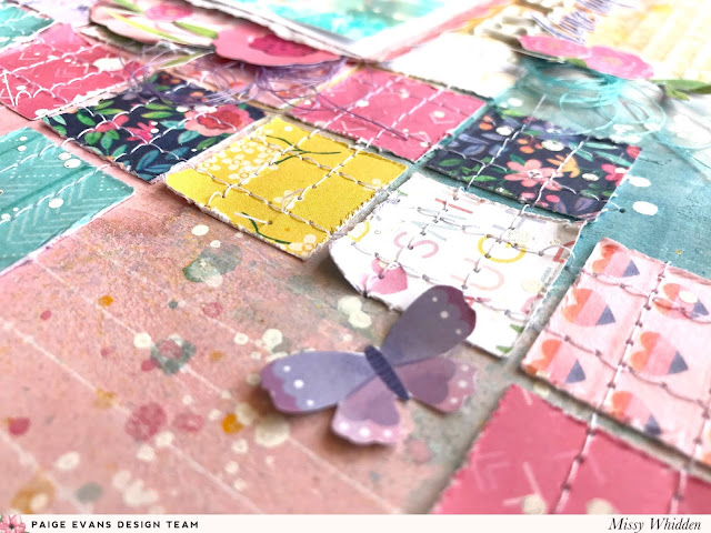
I used a combination of Distress Oxides and Shimmerz to create a watercolor effect. I also splattered some watered down white acrylic paint.
Once I glued down all the squares, I machine stitched through them with
white thread to add detail and texture. I wanted mostly solid colored
embellishments since there was so much pattern going on. I added purple
butterflies that I fussy cut from Paper 08 and one large one from the Layered Butterfly Stickers.
I embellished around the photo with mostly pink flowers. Since there was so much blue in the pool image, the pink was a nice contrast. I fussy cut flowers from Paper 11 and Paper 12 and layered them on both sides of the picture. My title is a combo of a Puffy Word Sticker and a few fussy cut words from an Ephemera Die Cut. I like the pop of dark blue that brings to this area, which echoes the dark blue in some of the washi tape. I added a few more pink flowers with blue thread underneath. That scalloped border under the photo is from the Ephemera Die Cuts.
Since I was scrapping a pool photo, I wanted a sun somewhere. I fussy cut this one from Paper 17, popped it up with adhesive foam, and added yellow thread under it. Here is the larger butterfly I mentioned earlier.
Since I used patterned paper as my background, I did have some warping going on once I added the mixed media. That's going to happen. I try my best to flatten it out by laying heavy paper pads on top of it for a while. I don't mind some warping...it's to be expected. I still love using patterned paper like this :)
I also love wrinkling up the edges of die cuts to give them dimension like this.
Another way to add a little bit of depth is to add dimensional foam. I added a small piece under this smaller flower, and you can see the difference it makes. It just helps to bring the page to life a bit more. Overlapping is another great idea...like I did the title here.
Here are a few more close-ups of all the colors and textures!
Here's the process video for this layout if you're interested:
Have a great weekend!


No comments:
Post a Comment