Happy Friday, scrappy friends! Today I'm sharing my latest layout for My Mind's Eye. Have you gotten your hands on any of the new MME cardstock yet? There are a few different types, including Mini Dots and Canvas as well as some shimmery and smooth. I used the Mini Dots for my background and some of the Canvas in a few of the pretty blue colors for accents. I also pulled in some elements from the On Trend collection to document these sweet pictures of my little family. My mom was attempting to get a good shot of us for our annual family posed photo....and you can see how it went...haha. But these are real life, and I'd rather have the outtakes like these than the most perfectly posed photo any day.
I started with the white Mini Dots paper and added a bit of Mermaid Lagoon Distress Ink to it. I used the packaging technique and then added some splatters. I wanted to play off the blues in the photos and add in bits of light green and gold. The On Trend line is perfect for this...tons of gold and mint in it. I didn't use much patterned paper at all...just the strip down at the bottom. The rest is 3x4 Journal Cards, vellum and cardstock.
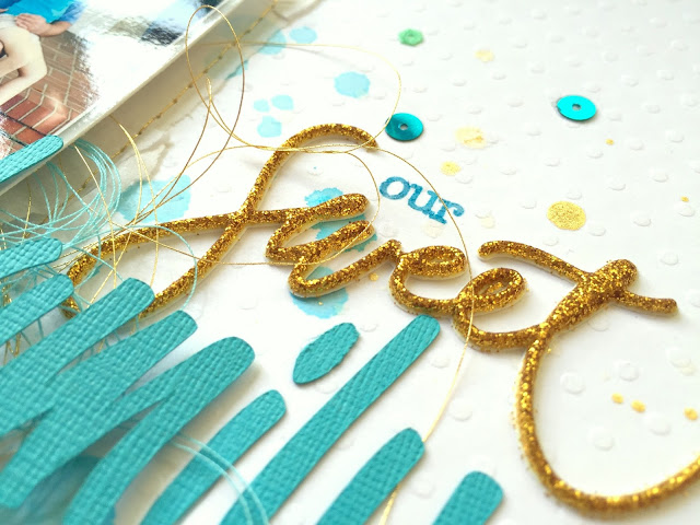
These adorable sequins are part of the On Trend line, and I made a little banner out of these cute triangles. I also scattered some of the blue and green smaller round sequins around the page and added some rub-ons. The gold puffy stickers are from the Niche line.
I didn't add any gesso to my background because I knew I wasn't going to add that much liquid. I would suggest adding gesso if you're going to do a lot because this Mini Dot paper isn't super thick. But it did well with what I did here. I love these gold touches from the machine stitching.
The Canvas cardstock did a great job in my Silhouette Cameo...it cut perfectly. I paired this die cut title with a puffy glitter sticker from the Niche line. I love the mix together!
Here's the bottom of the page...more delicious cardstock paired some patterned paper, some gold decorative tape, tangled thread and a 3x4 Journal Card. I just punched the sentiment out and stitched it down.
I love how this turned out...pretty clean and simple to really highlight the sweet pictures.
Thanks for stopping by, and have a great day!


loooove the colors on this page, and everything all your details are amazing!!! such fun pics, I like ones that really show what everyone's personalities are so much better :)
ReplyDeleteThis layout is so amazing Missy! I love this color scheme and the fun grid design! And those photos are too cute! Perfect family photos!!
ReplyDeleteLove this multi-photo layout to bits, Missy! Such gorgeous color, and I'm totally going to use those sequins as banners... Brilliant!
ReplyDeleteMuch appreciated for the helpful details you share. Read this profile and learn more CPS Tester. CPS Test tells you how many clicks you can do quickly.
ReplyDelete