Sunday, May 31, 2015

Mini-Mower / Hip Kit Club + a Process Video

Happy Sunday, friends!  I'm sharing one of my latest layouts for the Hip Kit Club using the 2015 May Hip Kits.  I have been wanting to use the multi-colored striped paper from American Crafts since I received the kits, and so I used a big piece of it here.  I started with the teal background paper from Pink Paislee Citrus Bliss line.  It matches the AC paper perfectly.  I brought in more pink, yellow and teal with more layers of paper under the photo.  I added a bit of white gesso to the background after I adhered all the layers, and then I used one of the cute AC stencils and some modeling paste.  I wanted it to look subtle, and I love how it turned out.


The PP Citrus Bliss line is full of cute lemons and citrus, and I decided to use one of them on this page.  Since Paige is mowing the concrete (haha) I decided to go with the thought of "When life gives you a mower, you mow...."  That may be a far stretch, but it made sense to my crazy brain :D  I used my Tiny Attacher to staple the acetate piece on the side.


I added some vellum behind my photo strip and added pop dots under it.  That blue ampersand is from Chickaniddy Crafts, and I love the color.  I also love these black Thickers...they add just the right amount of black on the page.


Here's a look at the top of the layout.  More enamel letters, a few puffy stickers from Evalicious, and some Chickaniddy stamps.  I added in some of the AC washi tape, tangled thread and a random die cut I had lying around on my desk.


Here you can see the modeling paste.  I lightly traced around the letters with a silver pen to give them a little bit more definition.  I didn't want them to overpower the page, so it allows them to be seen but not more than other elements on the layout.  Aren't those puffy stickers so cute?  They're from Evalicious.


Those cute triangles are included in the Citrus Bliss ephemera pack...and they're clear acetate.  I created a little banner and then stitched it down.


Here's the process video showing how I created this page from start to finish.  Enjoy!


I hope this inspires you and gives you an idea of what you can create with the 2015 May Kits!  I do have another project for this week coming up tomorrow.

Thanks for watching!  Have a great day!

Friday, May 29, 2015

Our Sweet Family / My Mind's Eye

Happy Friday, scrappy friends!  Today I'm sharing my latest layout for My Mind's Eye.  Have you gotten your hands on any of the new MME cardstock yet?  There are a few different types, including Mini Dots and Canvas as well as some shimmery and smooth.  I used the Mini Dots for my background and some of the Canvas in a few of the pretty blue colors for accents.  I also pulled in some elements from the On Trend collection to document these sweet pictures of my little family.  My mom was attempting to get a good shot of us for our annual family posed photo....and you can see how it went...haha.  But these are real life, and I'd rather have the outtakes like these than the most perfectly posed photo any day. 

I started with the white Mini Dots paper and added a bit of Mermaid Lagoon Distress Ink to it.  I used the packaging technique and then added some splatters.  I wanted to play off the blues in the photos and add in bits of light green and gold.  The On Trend line is perfect for this...tons of gold and mint in it.  I didn't use much patterned paper at all...just the strip down at the bottom.  The rest is 3x4 Journal Cards, vellum and cardstock.


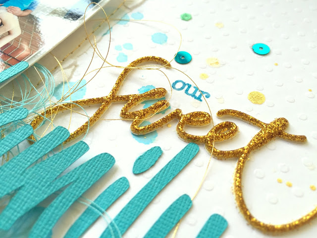
These adorable sequins are part of the On Trend line, and I made a little banner out of these cute triangles.  I also scattered some of the blue and green smaller round sequins around the page and added some rub-ons.  The gold puffy stickers are from the Niche line.


I didn't add any gesso to my background because I knew I wasn't going to add that much liquid. I would suggest adding gesso if you're going to do a lot because this Mini Dot paper isn't super thick.  But it did well with what I did here.  I love these gold touches from the machine stitching.


The Canvas cardstock did a great job in my Silhouette Cameo...it cut perfectly.  I paired this die cut title with a puffy glitter sticker from the Niche line.  I love the mix together!


Here's the bottom of the page...more delicious cardstock paired some patterned paper, some gold decorative tape, tangled thread and a 3x4 Journal Card.  I just punched the sentiment out and stitched it down.


I love how this turned out...pretty clean and simple to really highlight the sweet pictures.

Thanks for stopping by, and have a great day!

Thursday, May 28, 2015

Birthday Time at The Cut Shoppe + a giveaway!

Happy Thursday, friends!!  Can you believe it's already been a year since our dear scrappy friend Ashley Horton opened up The Cut Shoppe?  She has created so many amazing cut files, and to celebrate, there is a 50% OFF coupon code for today and tomorrow!!  You can't beat that for stocking up on some awesome cut files!  Use the code TCSBDAY1


Each of the Design Team Members is giving away one of her favorite cut files from the shop.  One of the first ones I used was this awesome Arrows With Attitude background cut file. We're going to give it away FREE to one lucky commenter!  So if you'd like to have this, leave me a comment down below by midnight Tuesday June 2nd.  I'll announce the winner on June 3rd.


Here's the layout I created using this cut file...so many fun possibilities!


Thanks for stopping by, and go check out The Cut Shoppe and pick up some files for HALF OFF!

Have a great day!

Wednesday, May 27, 2015

I Love You a Bunch / The Cut Shoppe + a Process Video

Hey there, friends!  I have a fun and colorful layout to share with you all today for The Cut Shoppe.  I used two awesome cut files on this page...Picture Perfect and Geometric Graffiti.  I've been wanting to use those geometric triangles for a while now, and I finally made them into a background.


Here is my layout.  I used two older Pebbles collections for this...Hip Hip Hooray and From Me to You.  They are both fun and bright, and so I chose lots of papers from both lines to back the triangles.  I traced the edges with a black pen to make them pop a bit more.  Once my background was finished, I used white gesso to prime the area behind the photo and then came in with some watercolors and gelatos.  I then just added in lots of fun little chipboard pieces, stickers and tangled thread.


I used the Picture Perfect frame on top of my photo.  As you can see, it is originally a rectangular shape.  I resized it and made it square since my photo was square.  I also machine stitched around the edges.


I added in some Thickers for my title and a fun Crate Paper rub-on down here at the bottom.  I actually went too fast when I was tracing and my black pen made a big mark outside one of the triangles.  So I covered it by adding in these cute sentiment stickers.


Here's another look at those beautiful triangles.  I love how the color mix turned out and how the watercolor looks blended over it all.  I did add a bit of washi tape and tangled thread under the photo.


Here's another angle of the fun frame.  I did add a Jillibean Soup stamp here...I stamped it on vellum.  It was an impulse decision simply because the stamp set was lying on my desk at the time and I just felt like using it!  Haha...the crazy mind of a scrapbooker, right?! :D


I did make a process video of the making of this page if you're interested in watching.  Here you go!


Thanks so much for stopping by!  Have a great day!

Tuesday, May 26, 2015

It's a Sister Thing / CREATE Magazine

Happy Tuesday, friends!  I have another layout to share with you today.  It's another layout for Scrapbook Generation's CREATE Magazine 2015 May issue.  This one was for the My Favorite Things feature.  I used a few stamps, stencils and dies from MFT, and let me tell you they are awesome!  I LOVE the quality of these products. 

Be sure to download your FREE copy of the magazine HERE so you can see what the other Design Team members created with their products.

I used two different stencils and used pink and yellow distress inks over them.  I used my mini ink blending tool.  I love how the pinks and yellows blended so nicely together.  Then I used those same inks spritzed with water on plastic packaging and smudged them over it all.  I then came in with the stamps and some black Archival Ink.  I love the random look to it all, and the black really pops.


These dies are so fun to play with!  I just ran them through my Cuttlebug with white cardstock.  I did add several paper and vellum layers behind my photo, and I did a lot of machine stitching.


I just love this pink color...oh my goodness.  I think it looks so pretty up next to yellow and orange.  And with my "made from scratch" background I was able to pull some REALLY old random patterned papers from my shelves to use.


I mixed up my title and added a messy paint streak stamp under it.  You could really do so many things with those stamps!


Here's a look at the background.  It's really not that hard to do...mostly because it's random.  Just don't be afraid of messing it up....just go for it!


And lastly, one more close-up of the upper right corner.  I added in tangled thread circles around the page as well.


I hope this inspires you to get a little random with inks and stamps!  It really is fun :)

Here are links to the products I used:

Diagonal Bars Stencil
Stencil Grid Stencil
DC Trendy Triangles Stamps
DC Abstract Art Stamps
Die-Namics LLD Accent It - Celebrate
Die-Namics LJD Rustic Hearts

Have a great day!

Sunday, May 24, 2015

This Grin / Hip Kit Club + a Process Video

Hey, friends!  I've been a busy bee this month...and I have another layout to share for the Hip Kit Club using the 2015 May Kits.  The very first item I picked out for this layout was the bright blue and white star paper from Chickaniddy.  I hadn't used any of it yet, and so I wanted to make it a primary element in this layout.  At first, I didn't plan on using any yellow...but you can see that changed. 

After I got my background papers where I wanted them, I smudged down some white gesso and then went over it with some of the Mermaid Lagoon Distress Ink and the Lemon Twist yellow Paint Dabber.  I also used two of the small American Crafts stencils once that was dry.  The Chickaniddy stamps (the open triangle) also made it onto this page.


Here you can see the mix of alphas and chipboard used to create my title.  I layered the enamel "Awesome" on top of the big ampersand from Pink Paislee.  I really love how the background looks here, too.


Here's a look at the top layers.  I added some blue machine stitching, some tangled thread, and I painted the wood veneer with the Electric Lime Paint Dabber.  These kits have so many possibilities!


These orange triangles were made using one of the AC stencils.  I pulled some orange ink from my stash and used my blending tool to make them.  And since distress inks react with water, I used a few drips to smudge the triangles a bit.


And one more close-up of the title area.  I did trace around GRIN with a pink pen to make it pop out a little more.


Here's the process video of this layout from start to finish if you'd like to watch.  Enjoy!


Make sure to check out all the awesome kits over at the Hip Kit Club...the June kits should be coming soon, and they're gorgeous!

Thanks for stopping by, and have a great day!

Saturday, May 23, 2015

More Jillibean Soup Guest Designer Projects!

Hey, friends!  Happy Memorial Day Weekend!  We have no plans except to play with the girls in the pool.  Sounds good to me! :D

Today I wanted to share my other two projects I created for my Guest Design spot at Jillibean Soup earlier this month.  I used the Saffron Yellow Pepper Soup collection to create this page.  The background paper is from the Soup Staples III line.  There are a lot of umbrellas and rain elements in this line, and these pictures of me and my friend Jennifer getting caught in the rain at Universal Studios were perfect.  We wound up getting caught in a huge downpour right in the middle of the Harry Potter part of the park, so we found ice cream to take away the blues...haha!

I started with a triangle stencil and some gelatos.  I also added in some watercolors and inks.  I wanted to add in some yellow and teal into my background, so the watercolors and inks are perfect for that.  I added several patterned papers behind my photos and then added some machine stitching.  I decided to use the die cut "I've got Sunshine on a cloudy day" as part of my title....and then added in "also known as ice cream" because we all know that ice cream IS sunshine...haha!


I used some of coordinating stamps throughout the page.  I also threw in some tangled thread.  I cut "ice cream" on my Cameo and used some {} Thickers from my stash.  Here you can also see the mixed media pretty well.  I love the splotches!


Here's a look at the top right.  That today stamp is part of the collection.  I love the pops of yellow here.


I used one of the tab stickers here on the side.  I love how these triangles turned out.  I like that they sort of have an edge to them, yet they still look kind of faded and messy.


One more close up of the title area.  Pop dots sure make a huge difference, don't they?  I love all the dimension here.


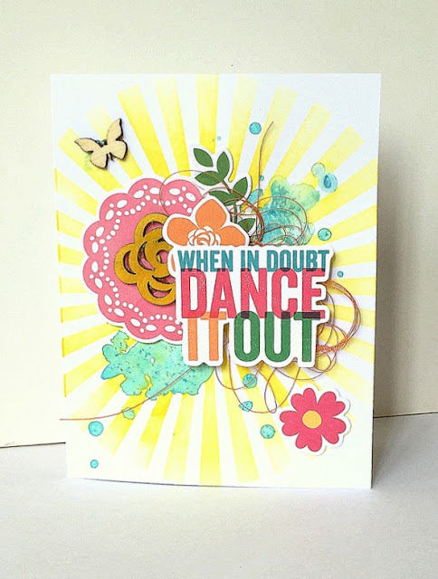
Here's the second card I created.  I love how it turned out!  I used a sunburst stencil and some Distress Ink in Mustard Seed.  I just blended it with my small blending tool.  Then I added a little bit of blue watercolor and let it dry.  Then I just added in a few stickers and some tangled thread.  I colored the wood veneer flower yellow and glued it down.  I did add pop dots under the sentiment.


Thank you so much for your visit today!  I hope you enjoy your weekend!

Friday, May 22, 2015

Jillibean Soup Guest Designer

It's Friday!  Yay!  Earlier this month, I had the honor of Guest Designing for Jillibean Soup.  I made two layouts and two cards, and today I'm sharing one of each.  I was thrilled when I made the list of Guest Designers last year.  For this layout, I used the beautiful Summer Red Raspberry Soup collection.

I started by using a square punch to create a grid design full of patterned paper squares.  I adhered them and stitched them down with my Brother.  Next, I came in with a little bit of gesso and watercolors to add a bit of messiness behind my photo.  I used a few pieces of patterned papers to layer behind my photo and then embellished around it with wood veneer, stickers and die cuts.


Here you can see how some of the squares aren't lying flat...that's because I added the watercolor there.  I like how it does this...it adds a bit more dimension.  I added in some tangled thread in between my layers here.


I love using my Cameo to create part of my titles, and so I cut the word "joy."  I used some of the Mini Alphas in the collection as well.


Here's one more look at the stitching and the watercolor.


Here's one of the cards I created.  I'm not the greatest card maker, so I just approached this like I would a layout without a photo.  I used the triangle placemat as a stencil and blended some Peacock Feathers Distress Ink over it.  I hand cut the wonky circles from patterned paper and then punched the large center one.  I used some white gesso to blend out some of the color right behind my die cut title.  Some thread finished it off.  I used the Saffron Yellow Pepper Soup collection for this.


Thank you so much for looking today!  I'll be back in a few days to share my other two GDT projects here.

Have a wonderful day!

Thursday, May 21, 2015

Turks & Caicos Sunset / CREATE Magazine

Happy Thursday, friends!  Have you seen the 2015 May issue of Scrapbook Generation's CREATE Magazine?  Here's the link if you'd like to download your own free copy.  It's FULL of gorgeous scrapbooking and crafting inspiration...319 pages!!  I'm so excited to have three layouts, one card and one tag published in this issue.  Today, I'm sharing one of my layouts.


Paper House was one of the manufacturers featured in this month's issue, and several of the Design Team members were sent product to create with.  I received a beautiful beach line.  I pulled out an old photo of me and my husband from 2005.  We took a Spring Break trip to Turks & Caicos.  Talk about perfection....I sure wish I could go back!

I wanted to use all of the fun beachy colors in the papers, so I created a fun pie chart design and backed the open spots with papers.  The fun palm trees were perfect for this island page and the cork stickers were so cute.  I added a little bit of gesso and mist to the background.


Here's closer look at one of the pie charts.  I added some machine stitching for more texture and interest.  My alphas are from my stash...they're October Afternoon.  I cut "sunset" on my Cameo.


I really loved the small square filtered photos with paper clips...they look like little Instagram photos.  And these little sticky epoxy buttons were the perfect pop of color to add in.


One last look at these fabulous palm trees...they're very realistic and match this collection perfectly.  I'm so happy I had some island pictures to document!


Be sure to check out the magazine...there are SO many amazing projects in there.  And I'll be back to share my other projects.

Thanks for stopping by, and have a great day!