Thursday, April 16, 2020

Fun Pool Day / Hip Kit Club

Hello again, friends!  I'm taking a break from all of the home schooling and therapy sessions...man on man!  This is crazy at the moment, which I am sure you all know.  Sheesh I need a break!

Here's my latest layout for Hip Kit Club using the 2020 March Hip Kits.  I chose papers from the Main Kit to match my pool photo.  I used one of the free background cut files for this month to create all the different sized octagons.  I wanted to cut my photo in the same shape, so I did that as well.  I chose the light pink cardstock from the Cardstock Kit as my background.  Since my photo is primarily blue, the pink background was a nice contrast.

I used a mix of the pink Nuvo Mousse from the Color Kit and some Lindy's Gang Magical Powders from older kits on the background.  I love how this all came together!


I worked on arranging all the octagons.  Once I decided on a vertical design, I distressed the edges and added some adhesive foam behind them.  I chose embellishments from Heidi Swapp, Pebbles and Paige Evans to scatter around the page.  This "easygoing" piece is a transparent vellum sticker, so I stuck it to white cardstock and cut it out.  I also traced around the edges of some of the octagons with a gold pen.  After I glued them down, I wished I had stitched around them...so this pen gave a similar effect.


I mixed some of the Bloom Street Vinyl Stickers with the blue glittery Thickers for my title.  I decided to bring some of the octagons over to the left side of the page, so I created a little cluster to nestle into the title.  I used more Heidi Swapp stickers here...I attached this one to vellum.  I wished after that I had used white cardstock so it would appear whiter.  I wound up smudging some white gesso behind it to make it stand out a bit more.  And how cute is this flamingo?  It's a Pebbles sticker, and I did trim off some of the white border.


I smudged some white gesso over the darker teal octagons here to soften them up a bit.  I splattered some watered down white acrylic paint as well...I'm really loving that effect lately.  The gold splatters are from the Jen Hadfield Gold Glitter Spray that we got back in the November Kits.


These colors are just so pretty...I can never get tired of working with them!  I added some pink and blue thread in a few places for added color & texture.  I used a gold metallic pen to write my journaling.


Here's a great angle to see the dimension from the adhesive foam.  It just helps everything to pop off the page.  I added a few of the enamel dots and heart stickers in a few places.


Here are more close-ups of all the details :)


This octagon tore as I was distressing the edges, but I used it anyway.  It gives it character...haha :)


I hope this inspires you in some way during this monotonous quarantine.  It's so hard to get creative some days.  Maybe this will give you a spark!  I do have a process video for this HERE on the HKC channel.

Thanks so much for stopping by, and I'll see you again soon!


Thursday, April 9, 2020

Favorite Ride / Hip Kit Club

Hello Hello!  I'm back today to share my newest layout for Hip Kit Club :)  I used the 2020 March Hip Kits again, and I finally came up with an idea to use Bloom Street Paper 13.  It's one of those papers where you love both sides.  I used the side with all the rainbow phrase tabs.  I started by cutting them all up and arranging them into rainbow order.  I came up with this wave design, and I really love how it turned out!


I chose the Stonewash cardstock as my background because it reminds me of a sky.  And skies always go with rainbows :)  I began by lightly gluing down all the tabs in rainbow order.  I tucked the tops of each row underneath the bottom of the row above it.  Once they were all glued down, I smudged some white gesso below and above the rows.  My favorite part about these tabs is how easy it was to bend up the edges so they curled up off the page.  I did decide to do some machine stitching, and I sewed along the to of each row.  I changed out the thread to match the colors.


I layered a few patterned paper pieces and Pocket Life cards behind my photo as well as some adhesive foam.  I cut a few flowers from the other side of Paper 13 and layered them around the photo.  I also added some of the Heidi Swapp stickers down below with some puffy dot stickers and dark teal thread.


More Heidi Swapp stickers and thread :)  I used some of the Nuvo Mousse from last month's Color Kit...the light purple color.  I mixed it with some Lindy's Starburst sprays from past kits and you can see here how shimmery it is.


I added some of the Heidi Swapp arrow/chevron stickers to the rainbow.  I placed them on matching color areas and popped them up with some tiny pieces of adhesive foam.  I like how they show movement since my daughter just finished a ride on the 4-wheeler :)


I added a few of the Bloom Street butterfly stickers on matching areas.  All the white splatters are from watered down white acrylic paint.  That's my favorite way of adding white splatters because it doesn't soak through the page and disappear when it dries.


I love how the title turned out!  It's a simple one, but it worked perfectly.  I curved the "favorite" sticker from Bloom Street under the purple row...it's the perfect color for that area, too!  I added "ride" using the light blue glittery Thickers.  I added a small cluster with another fussy cut flower and some puffy stickers and thread.  I used a white gel pen to write some journaling.


Here are more close-ups :)


Texture...yessss!  I did add a bit of color on the background above the top row here.  I used more Lindy's Magical Powders from past kits...we've gotten so many that there is most definitely the perfect color to match anything at this point!


Here's a better shot at the top area.


I hope this inspires you in some way today...I really do love how this turned out.  I had been eyeing that paper for a while trying to figure out how I wanted to use it.  I do have a process video for this over on the HKC channel HERE.

Thanks for stopping by, and I'll see you again soon!


Tuesday, April 7, 2020

April Challenge Layout / Pinkfresh Studio

Hello again, friends!  Today I wanted to share the April 2020 Monthly Challenge over at Pinkfresh Studio.  We have a sketch and a beautiful color palette this month, and I created a layout to coordinate with it!  Check out the sketch:


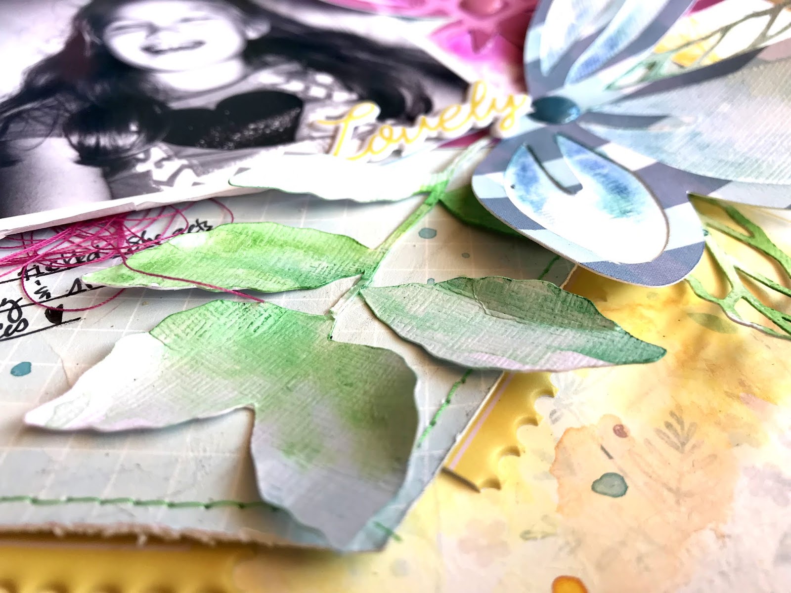
These colors match the Noteworthy collection perfectly, so that is what I used :)  I decided to enlarge the entire design of the sketch, so I cut a big hexagon from a light blue patterned paper.  I used one of the new cut files Flowers and Leaves (available HERE) and cut three large flowers from different papers and a few leaf sprigs from white cardstock.  I used a floral paper as by background, and I covered a lot of it with white acrylic paint and then gesso.  I wanted the area all around the edges of the design to be faded with only the pattern on the outer edges showing.


I used the Liquid Watercolors to paint the leaf die cuts.  I backed the large flowers with white cardstock, which I also added gesso to.  I painted the "petals" using coordinating watercolors to make the flowers look more dimensional.  I also added watercolor on the background around the edges of the hexagon.


I love how these flowers turned out!  I dabbed a bit of the watercolor on and used my fingers to smudge it.  I wanted the centers to be darker and then fade out to white around the larger edges of the petals.  I also love how the edges of the flowers naturally just curl up, making it even more realistic.  I added some of the Noteworthy Enamel Dots to the centers of the flowers.


I used a variety of the Noteworthy pieces to embellish around the photo.  I used one of the large envelopes, some stickers, some puffy stickers, and I even dismantled a dimensional sticker and used part of it here.  I used another leaf sprig over to the left of the hexagon and topped it with a floral puffy sticker and some matching thread.


I gave the hexagon a bit more interest by stitching around the edges using green thread, and then I popped it up off the page using dimensional adhesive.  I did add some blue and yellow splatters at the end.


Dimension...woo hoo!  Yes, this will get smushed down once this page eventually goes into an album, but that's okay.  Honestly, I haven't put my pages in albums in years.  I have so many stacked in rubbermaid containers...kind of like file folder style.  I ran out of albums a long time ago, and the kind I like aren't made anymore.  So into containers they go (for now...haha)!


I used some of the puffy sticker frames around the edges of the hexagon for some tone-on-tone interest.  I used a fine tip black Sharpie to write my journaling.


Here's the other part of the dimensional sticker that I dismantled.  I just tucked these flowers behind the photo and added a small one-word title using the multi-colored puffy alpha stickers.


And a few more close-ups of all the details :)


I hope you'll join us for the challenge!  As always, there is a chance for you to win a $50 gift card to the Pinkfresh Store...woo hoo!  That's a fantastic prize!  Find the challenge info HERE.

**********************************************************************************

Also, there is a 6th Anniversary Instagram Hop going on right now, and there is a grand prize worth $250!!!  Also they're giving away SIX $60 gift cards!!  What!!  You can start over on the Pinkfresh Instagram account and then hop to each designers' pages.  You just have follow everyone, like their posts and leave comments.  Go check it out!!

Thanks for stopping by, and I'll see you again soon.

Friday, April 3, 2020

Hello Sunshine / Paige Evans DT

Hey friends!  I'm here today with a new Bloom Street layout for the Paige Evans Design Team. I’ve had my eye on these beautiful watercolor dots on Paper 20, so I tore a big chunk of it to use as the main part of my design. I love that is has all the colors, so I pulled lots of matching embellishments to go around and below my photos. I layered a torn piece of Paper 09 for another textured layer, and I love the pop of pink that adds. I adhered those papers to some smooth white cardstock. I used modeling paste over Paige’s Polka Dots Stencil to create texture and then added yellow Shimmerz.


Look at all that awesome texture! I created a cluster of embellishments under the photos with the Ephemera Die Cuts4-Page Sticker BookPuffy Vinyl Stickers, and Cardstock Stickers. I love the birds in this collection! I added adhesive foam behind several of the pieces to pop them off the page. I also created more texture by adding in tangled thread in a few places.


I fussy cut a few flowers and leaves from Paper 02 to layer around the photos. Behind my photos I used pieces of Ephemera Die Cuts and Paper 14 as layers.


I smudged white gesso on the patterned paper behind the photos to fade out some of the circles. I added blue and purple Shimmerz and then added that awesome sunshine piece and this beautiful bird from the Ephemera Die Cuts.


I love using suns on bright pages like this.  They just keep things sunny, which I love :)  I used a few more stickers here to bring more pops of color above the photos.


I decided to print my journaling instead of write it since my background was so textured.  You really can't write on top of modeling paste.  Here you can see the effect of the dimensional foam under the butterflies and bird here.


Here are more close-ups all the fun details :)


There are few shiny metallic silver stickers in this collection.  I toned down the shine a bit by smudging some white gesso over it.  It's still shiny, just not as much.


I just love how colorful and fun this turned out! I hope it inspires you to use a big piece of a patterned paper on your next layout. This whole layout was inspired by Paper 20! It’s fun to see where one piece of paper and can take you.

Thanks so much for stopping by!


Thursday, April 2, 2020

Sweet / Hip Kit Club

Happy Thursday, friends!  I'm back today to share my newest layout for Hip Kit Club.  I used the 2020 March Hip Kits and an adorable exclusive cut file.  I decided to use lots of colors, and I love how it turned out!

I started by cutting the tassels on white cardstock.  I backed them with various patterned papers in the Main Kit.  I also cut some of the loose pompoms on white cardstock and later colored them to match.  Once I had the tassels backed, I chose a light blue background.  It's a paper from Heidi Swapp.  I coated a lot of the area with white gesso and let it dry.  I pulled out a rainbow variety of Lindy's Gang Starburst Sprays from older Color Kits to color up the background.  I wanted the color to be soft and show through and around the cut file but not overpower it.


I used the same Lindy's Sprays to color the pompoms.  I used Grab a Guy Gold, Mad Hatter Mint, Hibiscus Rose, and Blue Hawaiian Blue.  I popped them all up with some dimensional foam.  I backed the oval frames with a few of the cute animals from the Jen Hadfield die cuts and stickers.


I know I say this all the time, but the effect of using dimensional adhesive is so awesome!  It just brings everything to life.


I did some fussy cutting for this as well.  I cut a few flower clusters from some Pocket Life cards to use as embellishments.


Here's another one on this side of the photo.  I also fussy cut one of the pink frames from another Pocket Life card.  I used some matching thread in a few places, and I added a cut Bloom Street butterfly sticker here.


How cute is this fox?  There are so many little animals...I want to use more of them soon.  My title is short and simple...it's from the Bloom Street Vinyl Thickers.


This llama....all the heart eyes!  I did use my black Sharpie to add some dots around the scalloped frames.  I had originally wanted to machine stitch on them, but I totally forgot to do it before I glued it all down...haha.


More Heidi Swapp stickers above the photo.


This "Oh, Hey" is a vellum sticker.  I stuck it to white cardstock and then punched it out.


This bicycle...so cute!  I fussy cut it from a Pocket Life card.  It doesn't even have anything to do with this page, but it was too precious to not use somewhere.


I used some pink and yellow embroidery thread from my stash to create a little bow on the bigger tassel cut file.


Ahhhh...there is the bicycle.  Bravo, Kim Watson, on this gorgeous design!


One more close up of the journaling area.


And that's it!  I really love how this one came out.  I hope it inspires you in some way today.  We need all the help we can get these days to inspire creativity.  Be sure to check out my process video HERE on the HKC channel.

Take care, stay healthy, and I'll see you soon!