Thursday, April 9, 2015

My Scraps & More's April Sketchaton + a process video!

Happy Thursday!  Today I'm sharing a layout that I created for the annual April Sketchathon we're having over on the My Scraps & More forums.


We are celebrating the entire month with sketches.  A new sketch is presented every day...woo hoo!!  I created the sketch for last Friday.  We would LOVE to have you join us for some scrappin'!

Here's the sketch I designed:


Here's the layout I created from it.  I used the new Basic Grey Prism collection, which is available in the store HERE.  I started with the geometric stamp, then added my paper layers, and finally moved on to the mixed media stage.  I usually start with the paint first, but this one went a little backwards.  The end result is the same, but the process just took a different turn.  And that's what keeps it interesting, right?!

My background color is from using watercolors on a piece of plastic packaging and smooshing it down on to the paper like you would a stamp.  I used lots of goodies from the collection...there are some really fun die cuts and acetate pieces.


Here you can see all the layers, stamping and stitching.  I've been using my Tiny Attacher more these days...


Aren't those acetate die cuts adorable?  I layered a few of them together here and made my journaling fit the open spaces created by the die cuts and my title.


I did wind up using these messy scribbly circles instead of the square in the sketch, but the rest of it is pretty much the same.  I did add some of my favorite Michael's washi tape here.


And a close up look at the paint.  Using plastic to apply the paint is so fun and you get such an abstract artsy look.  I just love it!


Here's a process video showing you how I put this layout together from start to finish.  Enjoy!


I hope you'll come join us for our Sketchathon!  I'll be back later throughout the month with three more sketches.  The rest of the team is doing an outstanding job with the sketches, so don't miss out on all the fun and different styles of sketches!

Thanks for visiting me, and have a great day!

Wednesday, April 8, 2015

Today You Were So Adorable / Shimmerz

Happy Wednesday, friends!  I hope your week is going smoothly and that you're getting in some quality scrapping time!  Today I'm sharing my latest layout for Shimmerz.  I used a very unlikely color combo here...shades of purple mixed with shades of orange.  I was inspired to create this background when I saw my photo.  I knew I had no purple patterned papers that would match it, so I pulled out my Shimmerz goodies and started from scratch.  All of the Shimmerz products I used can be purchased HERE in the store.  If you mention my name at checkout in "Notes to Merchant," you can score some free product!

I used a sunburst stencil and Vibez in Sunset Strip.  Then I used Plum Pudding Spritz to create some messy splotches.  I sprayed the liquid onto some plastic packaging and smudged it onto my paper.  It gives a great watercolor effect.  Next, I took a Dear Lizzy flower stencil and mixed a few blue shades of Vibez, Spritz and Coloringz and mixed them with Dazzlerz Sea U in the Mornin'.  I wanted a deep teal color, and mixing Blue Jeans, Sapphire and Heidi Ho Blue with it gave it the perfect shade.  I rubbed it over the stencil to create those funky flower shapes.


Here you can see where the pretty Plum Pudding creates this gorgeous purple/pink color.  I added a bit of Inklinz in Beets Me and a few splatters of Coloringz Pink Stilleto.  I love how it looks up next to the orange and blue tones.  I did machine stitch along the edges of the rays with blue thread.


I used these same products to color this wood veneer from Studio Calico.  I also added a touch of Dazzlerz Pucker Up Pink to it.  I rubbed some white gesso over it after it dried to tone it down a bit.  I mixed my title with some stamps and some old Remarks alpha stickers from my very old stash.


Here's a close up of the Dazzlerz...I love the texture and thickness of it.  I layered some tangled thread, a die cut and a flair button here as well (from A Flair For Buttons).


And one more shot of the left side cluster.  More thread, flair, die cut....also a wood veneer heart and an arrow paper clip.


I'm finding that the Shimmerz products are PERFECT for creating your own background when you have difficult colors or patterns in your photo(s).  It's easy to mix and match the colors together as well as mix the actual products together to get the perfect hues.  I really enjoyed creating this unique background for this picture of my little cutie!

Thanks for stopping by today...be sure to visit the store to see all the available products!

Have a great day!

Products Used:
Vibez: Sunset Strip, Jeni B Bleu, Blue Jeans
Spritz: Plum Pudding, Sapphire
Inklingz: Beets Me
Coloringz: Pink Stilleto, Heidi Ho Blue
Dazzlerz: Sea U in the Mornin', Pucker Up Pink

Monday, April 6, 2015

Hello Sweet Pickles / Hip Kit Club

Happy Monday, friends!!  I usually post my weekly Hip Kit Club layouts on Sundays, but since yesterday was Easter I took the day off from blogging.  So here it is today!  This went up on the Hip Kit blog last Tuesday.  I used the 2015 March Kits for this.

I took some inspiration from Nicole Nowosad for this one.  She created a layout using pie charts, and I just loved it.  I decided to use circles in the form of a Silhouette Cameo die cut that I created in the software on my computer.  I just created a bunch of different sized circles and spaced them apart on the page and then cut them on my Cameo.  I wanted the lower part of the paper untouched.  Once the circles were cut, I backed them with lots of different patterned papers.  I even used some mixed media techniques to create a few "new" patterns of my own.  You can see exactly how I did this in my process video below.


Here you can see how each circle is backed with paper.  I machine stitched with gold thread (my fave!) and used some of the MME sequins as well.  I used modeling paste, spray inks and gelatos to create that bumpy texture.  I also used one of the Dylusions stencils from the Color Kit.


I added some Cracked Pistachio paint to that Crate Paper chipboard frame and then layered that gold MME sticker on top of it along with the Happy Day sticker from Webster's Pages.  I created lots of layers here.  I wound up cutting the Enjoy the Day Together piece from one of the Project Life cards.


Coloring this Elle's Studio wood veneer piece was simple...I just used spray ink and a gelato and my finger...less than 10 seconds to do.  I also backed it with white paper to make the word pop.


I love layering my alphas, and these Thickers are no exception...such a fun color and font!  I paired it with the Basic Grey navy letters and a Webster's Pages sticker.  I love combining different elements for my titles.


Here's one more shot of the circles and that awesome texture.  I had to have some form of mixed media on this page, and this was my "neat" way of doing this time :)


Here's my process video explaining step-by-step how I created this.  Hope you enjoy it!


Thanks so much for stopping by!!  Have a great day!

Friday, April 3, 2015

Brave / A Flair For Buttons + a My Scraps Sketch!

Hey, friends!  Today I'm sharing a layout I created based on Sketch #102 over on the My Scraps Sketch BlogAshley Horton is the featured sketch designer this month, and I was very inspired to create my own background and "patterned paper" for this.  I also created this for the A Flair For Buttons Design Team.  It was up on the blog there last week.

Here's the sketch...isn't it awesome?!


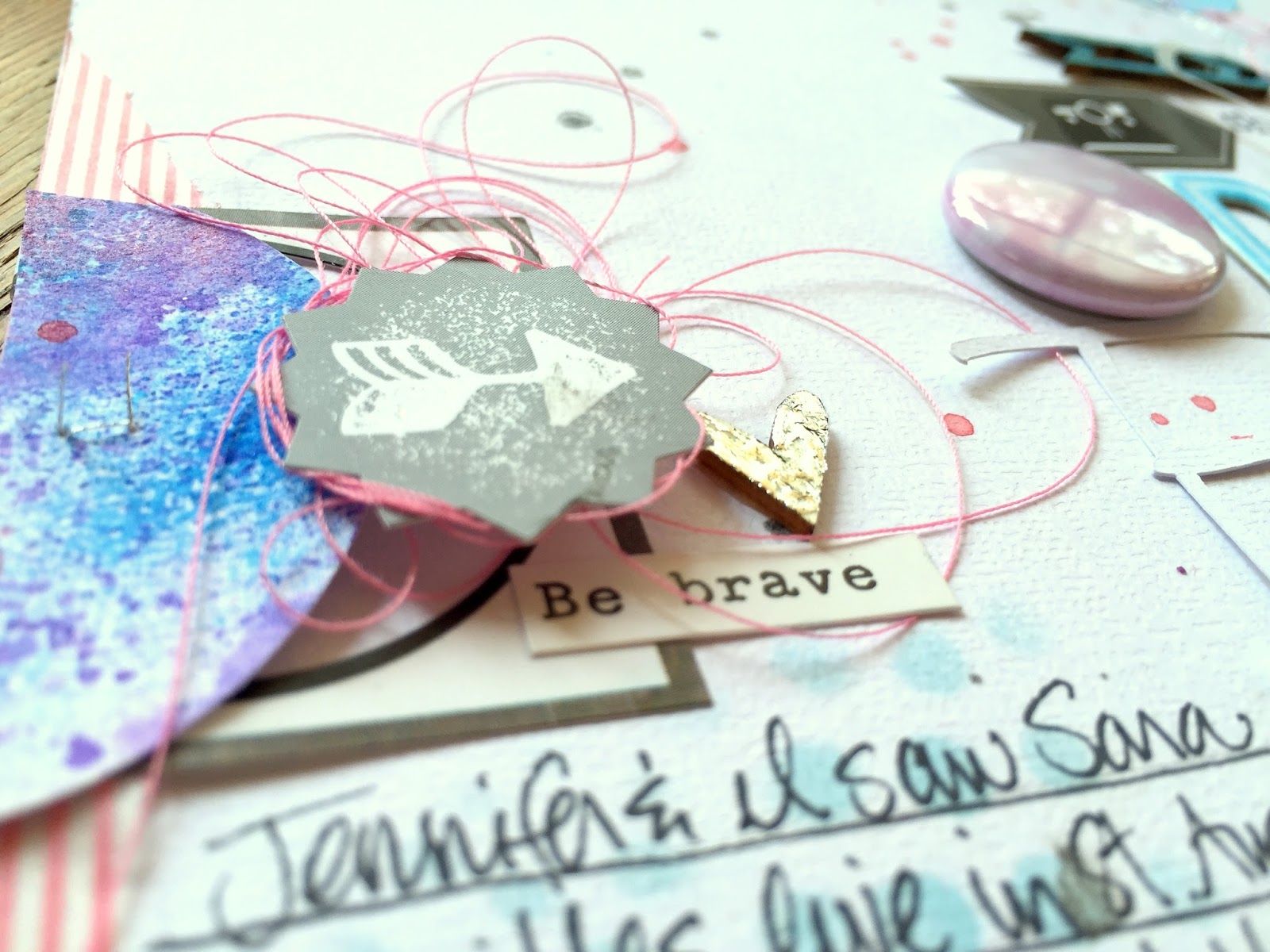
First of all, my photo is what I call a "hard to scrap" picture.  Lots of colors and a busy design.  I didn't have any patterned papers that jumped out at me to use for this, and I honestly didn't want to spend hours going through every single piece of paper I own....haha.  So I decided to work with white cardstock and inks, paints and gelatos.  I covered some cardstock in gesso and then made a big mess of blue, pink and purple.  I used gelatos, some watercolor, some stencils and some spray inks.  Once it dried, I used a few different sized circle punches and made my circles.  I followed the sketch and placed them down and then stitched through them with silver thread.

I wanted something to back my photo with that wouldn't take away from it or add to the busy factor, so I used a piece of white tissue paper and a small bit of patterned paper from Echo Park Capture Life.  It's black and white striped and it subtle.  I added some touches of pink washi tape and lots of tangled thread.

.
Those wood hearts have foil on them....super fun and easy to do.  Michaels carries this on the aisle with all the inks and stencils....and it's actually on clearance.  You just coat the paper or whatever in the foil glue, wait for it to dry and then stick it the foil sheet.  When you peel it off, it's covered in foil!  Super cool and shiny!  I am so in love with the Bokeh Flair....the whole set is just beautiful.  The soft color of this one matched perfectly.


Here's a close up of the mixed media work...very abstract and messy.  I tried to match the colors in the photo, and I love the silver touches.


Here you can see the thin tissue paper layers.  I also added some vellum circles and one of the Sunburst Flair Buttons.....again, the perfect color.  I love tucking them under things so they peek out.


I used some Heidi Swapp chipboard alphas combined with some alpha stamps and a Cameo cut.  The title is a lyric from one of Sara Bareilles' songs :)


Here are the flair sets I used:


I hope this gives you some ideas on what you can do when you have a hard to scrap photo...try and create something that makes the photo stand out.  Sometimes patterned papers can drown a photo out, so this is a great way to make it shine!

You can check out the A Flair For Buttons shop HERE.  SOOOOO many awesome buttons to choose from!

Thanks for stopping by!  Have a great day!

Wednesday, April 1, 2015

Paige is Loved / CREATE Magazine

Happy Wednesday, friends!  Happy April...already! Today I wanted to share the second layout I had published in the March 2015 issue of Scrapbook Generation's CREATE Magazine.  This was for the color challenge, which was a set of beautiful and bright Spring colors...yellows, oranges and greens. 

When I am assigned a color challenge, my first thought is it start from scratch and create my own background.  I'm sure I have the perfect papers in my gigantic mountain of patterned papers (haha), but I don't want to go searching through all of them.  So I started with white cardstock and did my usual messy goodness :)

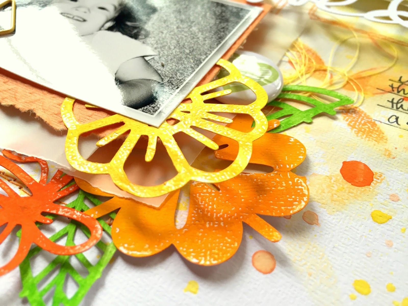
A coat of clear gesso to start...as always.  I used a stencil and some orange and yellow distress ink and rubbed it through the stencil.  Next came the acrylic paints in various shades of yellow and orange.  You can see that I created lots of drips and little splatters.  I did pull a few pieces of solid yellow and solid orange paper...just enough to back my photos with, along with a piece of vellum behind that.  When I think "Spring," I think "flowers," so I used the Funky Florals die cut file from The Cut Shoppe and used acrylic paints and gelatos to paint them.


I absolutely LOVE the dimension of these clusters.  None of the flowers are laying perfectly flat, and the pop dots under the pictures make them higher.  My die cut title is also high up...it all wound up being very dimensional.  I added some orange stitching around each photo cluster.


I love how these paint splatters turned out.  Using acrylic paints is fun...it's a lot thicker than watercolors, but when water is added, you can make it similar to watercolor.  The color will be bolder, like here with this orange.  I added some flair from A Flair For Buttons and some tangled thread.


Some of the flowers I layered under all the layers and some I layered right under the photo.  I am really excited with how this turned out...I just love the depth!


The floating title....to achieve this effect, I just added a bit of glue to the bottom of the L and the top of the D so they would stick to the patterned paper.  It's too thin to add pop dots, so it really is kind of just floating.


I hope this inspires you to try a layout from scratch and get the exact colors you want.  This really is fun, and you don't need one single collection to create it.  Just odds and ends from your stash.  Paint can do so much for a layout...I am so happy I finally decided to embrace getting messy! :D

Thanks for stopping by!

Tuesday, March 31, 2015

This is So You / My Mind's Eye

Hey, friends!  I hope your week is going well...Spring Break is in full effect here, and the weather is just gorgeous.  We did have a few cooler days this past weekend, so our pool is cold again...and I'm not one for just jumping into it.  The kids, on the other hand, don't seem to care that it's still freezing...haha.  More power to them! :D

Today I'm sharing my latest layout for My Mind's Eye.  I have so much MME tapes in my stash from the past few years of being on the team, and so I decided to use A LOT of them.  You know I love rainbows, so I pulled out tons of those colors and just created strips to cover the whole white cardstock.  I love tearing it so it's uneven.  Some of the strips are straight...I mixed it up.

After all the tape was down, I smudged some white gesso all around where my photo is.  The slick texture of tape itself wouldn't be able to hold watercolors or gelatos, so the gesso gives it some grit...something for that color to hold on to.  I used gelatos here to add smudges in the coordinating colors around the picture.


I went through all of my MME collections and pulled out a few stickers and chipboard pieces that matched these bright colors.  Some are from newer collections, like Jubliee, and some are from older ones, like My Girl.


These cute banner pieces are from My Girl.  I can't believe I hadn't used them yet!  They were perfect for this happy-go-lucky layout.  I just wanted to add random things here and there to add more interest and pops of color.  I did lots of stitching in different colors, too.


I think this "Live It Up" piece from the Jubilee line is perfect for the photo because that is exactly what she's doing in the the photo :)


A few more pink pieces from Jubliee and I believe Sweetest Thing...and I used a clear overlay on top of my photo from one of the Record It lines.  I love how they look on top of pictures!


So if you have a huge stash of tapes and you know some of them just don't coordinate with much, pull them out and use them to create a background!  Add some mixed media to it to blend them all together.  It's fun, fast and easy....just don't think about it too much.  Find a color scheme you like and just stick them down!

Thanks for stopping by, and have a great day!
Sunday, March 29, 2015

Cat Photobomb / Hip Kit Club

Happy Sunday, friends!  I hope you're having a great weekend.  This is the first weekend of Spring Break, so I'm looking forward to a week of slowing down, catching my breath and relaxing!  No school schedule for the kids....yay! 

So this is my latest layout for Hip Kit Club...and it makes me laugh.  I was trying to get some cute action shots of the girls out on the patio one afternoon, and the cat wouldn't stop crashing the pictures.  Paige kept chasing him and trying to grab his tail...she has no fear.  The biggest picture is so funny because you can see his little head on the lower left...he was literally laying down on his back and his eyes are open wide.  He looks dead, but he's not.  It just looks like he photobombed the picture.  Silly cat!

All of these gorgeous products are in the 2015 March Hip Kits.  I started with this Crate Paper wood grain paper and added some of the yellow Dylusions using some plastic packaging.  I didn't add the blue color until much later...and I go into lots of detail about this in my process video, which you can see down below.  You can see this layout up on the Hip Kit blog as well.


I really love the look of the yellow and blue mixed together on this wood grain.  I threw in some pops of pink as well.  I wanted to play off the yellow in her shirt.  I used four smaller photos at the bottom because they were all too cute not to use!  I backed the second one and raised it up to break up the monotony of four photos right together.  I added some stitching, some tangled thread and a Project Life card that I tore in half.


You know me....I love layers of things, and this one is no exception.  You can tell my journaling is kind of sketchy.  That's because the clear gesso I used (by Liquitex) is really gritty.  It's hard to get my pen to write smoothly over it.  It's not a huge deal, but it does sort of mess my pens up.  Once this bottle is empty, I'm going to try a different brand.  This cute camera circle is one of the exclusive die cuts made just for Hip Kits!  That gold circle is from an MME sticker sheet.


Isn't this such a pretty blue?  I got this color by mixing the Calypso Teal Dylusions from last month's Color Kit with this month's Cracked Pistachio Distress Paint.  It matched perfectly!  I also added a few Pinkfresh Studio die cuts and some Crate Paper chipboard arrows.


One last close up of the title work....a Cameo cut mixed some kraft Thickers.  This font is awesome because the letters are tall and thin and are great for long words....like Photobomb.  :D


I hope this inspires you to create a page using lots of photos!  I think the key is making them small.  Sometimes you have a series of photos that are all good, and you just want to include them all.  I say go for it!

Here is my process video showing how I put this layout together from start to finish.  Enjoy!


Thanks for stopping by, and have a great day!