Wednesday, July 31, 2019

Sweet Paige / Hip Kit Club

Happy Wednesday, friends!  I'm back today with a new layout for Hip Kit Club using the 2019 July Hip Kits.  I wanted to scrap a soft colored page featuring some of the blue elements in the kits.  I started with one of the watercolored Pinkfresh Studio papers.  I tore a chunk of it and attached it to a sheet of white cardstock.  I covered a lot of the background with white gesso so I could add some of the Lindy’s Stamp Gang Sunburst Sprays.  I mostly wanted blue on the background, so I mixed some of the Blue Hawaiian Blue Spray from the Color Kit with a few blue Shimmerz from previous Color Kits.  I also created a few orange/yellow areas using the Yellow Rose of Texas mixed with Hibiscus Rose, both from Lindy’s in the Color Kit.


I did lots of fussy cutting here.  I wanted to have bits and pieces cascading vertically down the torn edge, so I cut some flowers, circles and shapes from various papers.  I also added in a few of the One Canoe Two Rub-Ons for added detail.  Some of the flowers I popped off the page using adhesive foam.


I used a few Pocket Life cards as layers behind the photo and added foam under that as well.  Here you can see some splatters.  I created this orange color by mixing the yellow and pink spray together.


I went short and simple with my title.  I used the Pinkfresh Studio Puffy Stickers, and I just love the mix of fonts here.


Overlapping flowers is one of my favorite things to do.  I love the variety here, and by just gluing down the centers the petals are easily bent up for dimension.


Here’s a closer look at the blue on the background.  I love the effect of using a few different shades of blue.  I always recommend purchasing the Color Kit each month if you love mixed media because the previous colors are almost always going to match newer kits!


I love how this rub-on turned out on the background.  It went on very smoothly and the way it looks over the mixed media is so neat.


I punched this piece from a Pocket Life card.  I added some foam under it to raise it up.  I love how it stands out against the blue ink.


One last close-up of all the details :)


I hope this inspires you in some way!  Have you fussy cut anything from any of the papers in your kit yet?  Flowers are always a winner when it comes to making your own embellishments like this. 

Be sure to check out my process video here to see all the twists and turns that this page took:


Thanks so much for stopping by, and have a great Wednesday!

Wednesday, July 24, 2019

Paradise at Home / Hip Kit Club

Hello again, friends!  I have a new layout to share for Hip Kit Club featuring the new 2019 July Hip Kits.  They are full of oranges, pinks and yellows.  I couldn't wait to scrap a fun summery page!  I chose a few pool photos (my favorite) to contrast with all the oranges and pinks.  I began by cutting "Paradise" on my Cameo using one of the beautiful Pinkfresh Studio patterned papers.  I love the watercolor effect on them, and I thought those colors would contrast nicely with the blue in my photos.

I did a blue wash on the white cardstock background.  I first used clear gesso and let that dry.  I mixed a few of the Lindy's Stamp Gang Starburst Sprays to create the blue watercolor effect.  I mixed the Blue Hawaiian Blue from the Color Kit with the Tiffany Lou Blue from an older Color Kit.  I also swirled in drops of white acrylic paint.  It created the perfect blue to match my photos!


This month's Embellishment Kit has a big package of tropical die cut flowers and leaves.  I used a lot of those around the page.  I trimmed off the white edges, which is just a preference.  I raised a few of them up off the page using adhesive foam, and I added some colored thread in a few places to add texture.  I layered a few Pocket Life cards under the photos as well as a big torn strip of an Echo Park Paper.


I created a cluster here at the top of the photos using more of the die cut leaves and flowers.  Again, I trimmed off the white edges.


I mixed and matched the title using the exclusive cut file (Paradise) and some of the white Pinkfresh Studio puffy alphas.  I used one of the One Canoe Two rub-ons here as well.  I decided to create journaling strips on my computer instead of handwriting this time.  I love all the dimension here.  You get that by adding dimensional adhesive behind the photos.


I fussy cut this adorable bird from a Webster's Pages paper.  He is the cutest, and he matches my color scheme perfectly!  I also fussy cut these small palm leaves from a Pocket Life card.


Here are a few more photos showcasing all the fun details...


Hopefully this inspires you in some way...it was a lot of fun to make.  I wish I had ten more packs of these awesome flowers and leaves!

Be sure to check out my process video here for more details...


Thanks so much for stopping by, and have a wonderful day!


Sunday, July 21, 2019

Love You So Much / Cut To You

Happy Sunday, friends!  Here's another layout I created for Cut To You as the July Guest Designer.  I'm helping Gwen celebrate her one year anniversary of her wonderful cut file store.  I used the Squares Cubed cut file for this page.  I decided to make a "start from scratch" layout, meaning I began with plain white cardstock.  I coated the whole page with gesso and let it dry.  Then I used a rainbow variety of Shimmerz sprays to basically color the entire page.  I sprayed color, spritz it with water and let the colors run and blend.  Once it was completely dry, I ran it through my Cameo, cutting different sized squares.  I love how they turned out!


I used a sheet of Bazzill Mango cardstock as my base layer.  I wanted to layer all the colorful squares on it, but I wanted to add something first.  I used white gesso on the left side of the cardstock.  I used a few pink Shimmerz sprays on top of that.  I wanted pink peeking through all those squares.  Once that was dry, I layered all the squares and lightly glued them down.


I didn't glue them down flat.  I wanted them to pop off the page, so I only added a little dot of glue in a few places.


I pulled out some of my stash to create the title.  I used some older Crate Paper Thickers and some Amy Tangerine transparent alpha stickers.  I also used some new Vicki Boutin and Heidi Swapp goodies to embellish.  The little solid squares are from the cut file...I just removed the inside shapes and made them really small.


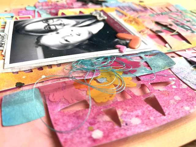
I tucked in a few more Vicki Boutin chipboard pieces here above the photo.  I also tucked in some matching colors of tangled thread around the photo.


I left lots of white space on the right side of the photo to balance all the busy parts.


Here are a few more close-ups of all the fun details :)


These cute puffy hearts are from an older Pinkfresh Studio collection.


Have you ever made a layout "from scratch"?  Sometimes it's fun to just start with white paper and build your page or embellishments.  This is great if you love mixed media because you can control your color scheme, and you're not limited to a specific collection.  It's also a great way to use up some of your stash :)

I do have a process video here:


You can get 20% off all DIGITAL DESIGNS over at Cut To You for the rest of July if you use the code HEARTMISSY.  Gwen has some really amazing designs, so you should take advantage and stock up!

Thanks so much for stopping by, and I'll see you again soon!

Thursday, July 18, 2019

Pineapple Hair Don't Care / Hip Kit Club

Happy Thursday, friends!  Here's my latest layout for Hip Kit Club.  I used the 2019 June Hip Kits, and I'm still addicting to use ALL the colors!  I just adore these bold pinks, blues and yellows.  I wanted to incorporate more black elements into this page.  I used one of the exclusive cut files for July...this cute pineapple.  When I saw it, it reminded me of these photos of me and my daughter.  Our high messy buns reminded me of a pineapple...haha.  I made it work!

I decided to use lots of colorful paper strips, so I cut a lot of bar code strips and other papers to create some horizontal strips.  I also wanted to use some of the long Vicki Boutin horizontal stickers and chipboard pieces, and this design made it easy to add them in.

Although it's hard to tell, I used a sheet of the light pink cardstock as my background (from the Cardstock Kit).  It's so soft that it's difficult to photograph.  It always looks a little washed out, but I assure you, it's pink :)


I coated a lot of the background with white gesso first to prep the paper for some mixed media.  I used all three colors of the Lindy's Stamp Gang Magical Powders from the Color Kit to create some yellow, pink and blue areas.  I also mixed in a few Shimmerz from previous Color Kits.  Once that dried, I started arranging the paper strips.


After I glued them down, I machine stitched through most of them with black thread.  I chose some of the Vicki Boutin pieces to add to the strips in various places.  I also used some of the stickers from the Heidi Swapp Sticker Book.  All these colors just work so well together.


This "That Smile" piece is a Vicki Boutin Chipboard Sticker, and it was perfect for this photo...haha.  I also used my fingernails to ruffle up the edges of the paper strips to give them some messy dimension.


I added some adhesive foam under this long sticker to create some depth.


I love how this pineapple turned out.  I went through all the patterned papers and backed all those spots.  I used some of the hot pink alpha stickers from the Heidi Swapp Sticker Book for my title.  I also used some of the Heidi Swapp Stamps.


I created a little cluster at the bottom here with more Heidi Swapp stickers.  I wrote my journaling to the left here.


One more for detail's sake :)


I hope this has given you some fun ideas to try on your next layout.  I had lots of fun making it!  Sometimes my photos give me fun ideas, and sometimes the cut files do....sometimes the embellishments and papers do.  I have a video here as well:


Thanks so much for stopping by, and I'll see you again very soon!


Tuesday, July 16, 2019

Bon Voyage / Paige Evans DT

Hey, friends!  I'm back today with a new layout for the Paige Evans Design Team featuring one of Paige’s brand new stencils…yay! I used the Sunburst Rays stencil along with Paige’s Bon Voyage cut file and a mix of the Horizon and Pick-Me-Up collections. I scrapped another photo of our recent Bahamas trip, so I wanted it to be bright and summery. I began with the stencil and knew I wanted it to be at the top of the page with my photo under it. I cut the cut file on my Silhouette Cameo about 6x6 on white cardstock. I knew I had to use Horizon Paper 08 because those wavy lines remind me of waves. Perfect!


I used white cardstock as my base, and I coated it with clear gesso first. I wanted to create a blue color wash representing the sky and water, so I used a few blue ink sprays to do that. Once that dried, I mixed yellow pigment powder with modeling paste and scraped it over the Sunburst Rays stencil using a palette knife. The texture turned out amazing! I did go over it with a bit of white gesso since it was extra bright.


I fussy cut lots of the waves from Horizon Paper 08 in different widths and lengths and arranged them on the lower half of the layout. I popped a few of them up with adhesive foam to create dimension, and I also machine stitched through some of them with navy blue thread for added detail. I had to add a fun smaller secondary title, so I used the Pick-Me-Up Foam Mini Thickers and I love how that dark navy pops right off the page. To add a few smaller details, I fussy cut a few dragonflies from the Horizon 6x8 Paper Pad and used some Pick-Me-Up Stickers.


At first I wanted to back the cut file with different patterned papers, but I felt that would’ve been too much pattern mixed with all the waves at the bottom. I decided to use gelatos and lightly color the inner letters and place them back inside the cut file using adhesive foam. I just rubbed the gelatos along the edge of each letter and used my finger to smudge the color. I think these lighter colors make the title stand out against all the other colors. I embellished on a few of the letters using some Pick-Me-Up Stickers, Horizon Stickers, and a fussy cut globe from the Horizon 6x8 Paper Pad. The “together” sticker is from the Horizon Project Pad available at JoAnn Stores.


Do you like to mix and match items from different collections?  I love how these flowers looked even though they are completely different types.


I fussy cut this globe from a Horizon patterned paper...I had to use it for the words on it!  One of the last things I did on this page was fussy cut a few small dragonflies from the Horizon 6x8 Paper Pad to scatter around.


I realized at the end of the layout that I didn't really have a lot of space for journaling, so I typed out a few strips and placed them towards the top.  I added more adhesive foam behind this heart to give it some depth.


One more!


I hope this inspires you to create a fun summer layout! If you love mixed media you will definitely want to get your hands on Paige’s new stencils. They are just wonderful and I really love how the Sunburst Rays just makes this layout come to life! I do have a process video here if you’d like to see this layout in action.


Thanks so much for stopping by, and have a great day!


Monday, July 15, 2019

This is Lovely / Pinkfresh Studio

Happy Monday, friends!  I have a new layout to share for Pinkfresh Studio using the new Just a Little Lovely collection.  This line features so many pretty watercolor designs...it's hard to choose a favorite paper!  I decided to fussy cut this beautiful floral wreath from a patterned paper.  I chose another paper to use as my background...lots of blue and green watercolor effects. 

There is a white space on the background paper, so I chose that area to add a bit of mixed media.  I added some gesso to that area first and then used the Liquid Watercolors to add some shades of pink, yellow and purple.  I mainly wanted the watercolor to show around the edges of the photo and the left side of the wreath.


These watercolor florals are so pretty!  I love the black and white sketchy flowers mixed in there, too.  I went light on the embellishing since the wreath was the star of the page.  I added a few stickers and die cuts here on the right.  I also popped the wreath off the page using some adhesive foam.


Here you can see the pretty purple watercolor.  I used a brush to also add some splatters.  I tucked a floral die cut and some thread under the photo here.  To add the gold splatters, I simply watered down some metallic gold acrylic paint and used a brush.


Here I mixed and matched some of the puffy stickers to create a title.  I love these giant puffy words!  So elegant and scripty...and I love how this one stretched across the inside of the wreath.


Here you can see the dimension created by raising the wreath up off the page.


Do you like to add watercolor to your pages?  I love using it for accents and details like this.  It just jazzes up the background and adds extra pops of color.


Here are a few more close-ups of all the details :)


I hope this gives you some inspiration for your next layout.  It was a lot of fun to put together!  I do have a process video here if you'd like to watch this layout come together.


Thanks so much for stopping by, and have a great week!