Hey there, friends! Time for another awesome sketch from Creative Scrappers! I really love this one! If you love squares or triangles, this one's for you. I love it because it provides the opportunity for using lots of different patterned papers, which is one of my favorites!
I created this using the new Creative Agenda from Echo Park. The colors are just gorgeous, and I love the fun patterns. I stuck really close to the sketch and used a different patterned paper in each section. I used even more papers to layer under my photo. I added a little bit of gelato smudged on all four sides of the design, and I like the way it created some depth. The rest is stickers and stitching.
I love the stickers in this kit, and they worked so well with this sketch. I love creating clusters, and so I did just that here. I added lots of stitching as well.
Layers, thread, stickers, cork and stitching...I love this combo! I'm glad I printed my photo in black and white...it really stands out against all the color.
Here's another shot above the cluster. I love the dimension these embellishments create! The cork pieces are from Studio Calico, and I think they coordinate very well here.
If you'd like to play along with this sketch, be sure to upload your layouts to the inlinkz widget over on the Creative Scrappers blog HERE. December's prize sponsor is 17 Turtles, which is Juliana Michaels' awesome cut file shop! You can link up using sketches 283 and 284 (coming soon). You have until midnight EST December 31st.
You can visit 17 Turtles HERE!
Thanks so much for stopping by :)
Sunday, November 30, 2014
Friday, November 28, 2014
Being Strong is My Super Power / The Cut Shoppe
Hey there, friends! It's Black Friday...have you been out shopping all night? Or did you stay home and relax? I stayed home and did some online shopping...I can't deal with those crazy crowds! :D
I have a fun layout to share today for The Cut Shoppe. This was up on the blog Wednesday, and I'm excited to share it here.
I have a fun layout to share today for The Cut Shoppe. This was up on the blog Wednesday, and I'm excited to share it here.
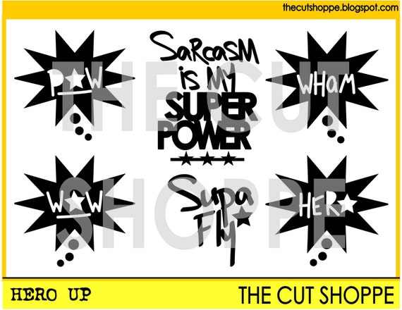
I was so excited when I saw the awesome Hero Up cut file in the shoppe! I teach Body Pump at the YMCA, and last year I dressed as Superman :) I've been waiting for the right time to scrap these photos, and this cut file totally inspired me! The interesting thing about these photos...the colors really intimidated me. I think primary colors are difficult to scrap, and out of all the collections sitting on my shelves, NONE really coordinated.
So what did I do? I grabbed white cardstock, washi tapes and inks and created my design from scratch. I used no patterned paper at all. I cut the files on white cardstock and used gelatos to ink the edges. I made a simple and messy background with some plastic packaging and bright Dylusions inks. I added the tape, some rub-ons and some stictching, and that was it!
Here's a clost up of the Wham cut...I just love it! My Cameo blade was starting to get dull here, so some of the tiny edges did crumple. I did get a new blade since this, so hopefully it will be a while before that happens again :) I used pop dots to raise it up so I could layer thread under it.
Another of the cut files...I just love the POW and the fun title! I changed it to "Being Strong" since it fit my photos better. Love the versatility of these files to make them your own!
Here's the actual cut file...lots of fun possibilities!
Thanks for stopping by, and I hope all of you who celebrate Thanksgiving have a wonderful day tomorrow!
Thursday, November 27, 2014
Wooden Christmas Blocks / Chickaniddy Crafts
Hey there, friends! Happy Thanksgiving to all of you who celebrate it! Before today's festivities begin, I wanted to hop on and share some fun Christmas Chickaniddy projects with you today! This month, the Chickaniddy Craft Team is showing you fun holiday ideas for your home. Honestly, I'm not much of a home decor kind of crafter...but I did have fun making these cute little Christmas blocks. They will go perfectly on the mantle :) You can see these up on the Chickaniddy Blog HERE.
This is a fun and easy thing to do here...these are just small wooden blocks that I altered! They took no time at all. Didn't they turn out cute? I think so! The Jolly Good collection is so much fun!
Supplies Used: Jolly Good: JG140S12 Happy New Year paper, JG14EB03 Journal Tags, JG140S05 Holly Jolly paper, JG14ST01 Clear Stamps, JG14EB01 Sticker Sheet, JG14EB09 Enamel Stars; other: silver thread, Stampabilities ink, Signo Uniball White pen, wooden blocks.
1. I pulled out the 12x12 Sticker Sheet and chose the images I wanted. I loved the little Santa, the man with the tall stack of gifts and the gorgeous flower.
2. Next, chose the patterned papers I thought complimented the stickers best. I simply traced the block onto the paper, cut it out, and glued it down. I used some sandpaper around the edges to smooth them out. I also used pop dots behind the stickers to give them some dimension.
3. I also used the stamps in this collection for my sentiment on this block. I inked up the "December" stamp with some green ink and then traced around it with a white gel pen.
4. Lastly, I added some "tinsel" behind the stickers. It's just simple silver thread, but I love the tinsel effect! Very easy and cute!
I hope this inspires you to turn something ordinary into a festive little holiday decor piece! You could do this with any theme and brighten up your shelves or tables throughout the year!
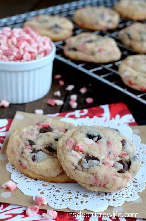
The lovely design team has been sharing their favorite holiday recipes with you each day, and honestly, I'm not a big baker at all. I do surf Pinterest a lot for fun things to make, and I stumbled across these delicious cookies. I found this at insidebrucrewlife.com, so you can go there to find even more fun treats to make!
Ingredients:
1 box white cake mix (15.25 oz)
1 stick of butter, melted (8 tbsp)
1 egg
1/2 tsp peppermint extract
1/2 tsp vanilla extract
4 oz. cream cheese, softened
1 cup Oreo cookie chunks
1 cup Andes Peppermint Crunch pieces
1/2 cup dark chocolate chips
Instructions:
1. Combine the cake mix, melted butter, egg, and extracts. Beat until a soft dough forms. Add the cream cheese and beat in gently until combined. Stir in the peppermint crunch pieces and chocolate chips first. Then gently stir in the cookie pieces by hand being careful not to break up the cookie more. Refrigerate dough for at least 30 minutes.
2. Roll the dough into 36 balls. Bake on a cookie sheet at 350 degrees for 9 minutes. Do not over bake. The cookies will be very soft and look undone. Let them sit on the hot cookie sheet for 2 minutes, then gently remove them with a spatula to a piece of wax paper on the counter.
3. Very gently, tap the tops of the cookies with the bottom of the spatula to even out the tops. Let them sit until completely cool. Store in a sealed container. Makes 36 cookies.
Tuesday, November 25, 2014
Inspired by Abstract Art / My Scraps & More
***For the A Flair for Buttons & The Cut Shoppe Blog Hop, go HERE***
Hey there, friends! How often do you browse for ideas on Pinterest? Honestly, I don't do it very often. A few weeks ago, the design team over at My Scraps & More hosted a Pinspirational Crop and I hosted three challenges. Each one was inspired by a different type of "pin." One was Abstract Art, and when I found this gorgeous design, I knew right away I wanted to create a layout using the idea. I just love the colors, the triangle shapes and the watercolor effect.
Here is what I created. I really love how it turned out...and it was surprisingly very easy to make. I took a piece of white cardstock and used various inks, paints and sprays to create a colorful watercolor design over the whole page. I did coat it with gesso first. Once the big watercolor design was dry, I took a small square punch and punched a bunch of little squares. Then I just cut each square in half, diagonally, to create small triangles.
From there, I just started arranging them onto another piece of white cardstock, trying to mimic the Pinterest design. I lightly outlined each triangle with a black pen to make them pop just a bit more. The rest is just some stickers & embellishments from American Crafts, one from Elle's Studio, and a few I created myself using stamps & embossing powder. Done!
Here's a good close up of the layers under the photo. I just went through all of my bright goodies from American Crafts...a few different collections.
Aren't these colors just so gorgeous? I added a few coordinating sequins here and there to add more interest, and mainly because I just love sequins :)
I really could stare at these colors all day long...and the watecolor look is just my favorite.
I really would've never have created this if I hadn't seen that Pinterest design! It really does help spark your creativity, and it's great for getting you out of your comfort zone. I think this is one of my all-time favorite layouts! I hope it inspires you to try something new and fun!
Thanks for stopping by, and have a great day!
Sunday, November 23, 2014
My Scraps Sketch #94
***If you're here for The Cut Shoppe & A Flair for Buttons Blog Hop, go HERE!***
Happy Sunday! Today I wanted to share the layout I created using the newest sketch up over at My Scraps & More Sketches. It was designed by one of our awesome members, Michelle Gallant. I'm a huge fan of her work, and I just love her sketch! It leaves lots of room for interpretation.
I started with the new Elle's Studio Good Cheer collection and some white cardstock. It's VERY hard to photograph mostly white cardstock...the lighting is never right. So this photo is as good as it gets. Sorry for the different variations in color on the background.
I used these photos from a few years ago. Santa visited the school, and Reese wanted nothing to do with him! I snapped a few pics before she bolted...haha! And he was a great looking Santa, too! Oh, well. I used some clear gesso on my background and then I grabbed a chevron stencil and my Tim Holtz distress ink pad in Spun Sugar. I added a little pink to the background and then added in some aqua watercolor. I used a red gelato as well. I love mixing up the media! I also used some silver ink and a triangle stamp to add more interest.
I added in lots of paper layers and a few die cuts I had laying around on my desk. I layered in some shiny silver thread and some stitching as well as some silver star rub-ons from Studio Calico. Those tiny little red stars are a stamp from Elle's Studio.
Here you can see the layers and textures on the background. I love how the texture of the cardstock shows through really well when you use gelatos. If you wet it a lot, the texture gets covered up, but if you leave it a little drier, you can see it show through like this. I had to get a little creative for my aqua rhinestone there...it's actually a clear one that I inked. I wanted a pop of aqua there, and I don't have any aqua bling. So I made it aqua.
I used the Elle's Studio alphas here as well as a title cut on my Cameo. I love all the little stars around the page...so perfect for Christmas!
Sometimes I get on a Cameo kick and just cut several different shapes in white. I keep them on my desk for random projects, and these circle hearts were one of those. I like having extra little pieces lying around to add in. These worked perfectly. I added a sticker and another rhinestone here. And I think I love silver as much as I love gold! This thread is just gorgeous, and it looks awesome stitched or tangled.
One more angle...I love the dimension created here. That's easy to do if you just curl up the edges of your layers and use pop dots under your photos. It raises everything up a little without adding lots of bulk.
I hope you're inspired by this sketch and layout...if you play along and upload your layout HERE, you could win an awesome prize! Go check it out on the blog HERE!
Thanks for stopping by, and have a great day!
Friday, November 21, 2014
A Flair for Buttons & The Cut Shoppe BLOG HOP!
Happy Friday, friends! I'm so excited to be a part of the A Flair for Buttons and The Cut Shoppe Blog Hop! This is going to be so much fun :) You should have arrived here from Katrina Hunt's blog. If not, you can start from the beginning at Heather Adams' blog.
We have so much awesome inspiration to share with you today, using cut files from The Cut Shoppe mixed with Flair Buttons from A Flair for Buttons! There will also be a giveaway and coupon code for you to save in both shops!
Here is a layout I created using four different cut files from The Cut Shoppe and four different Flair Buttons from a A Flair for Buttons.
These tags are so fun and versatile! They are from two different cut file sets, and as you can see, you can use cardstock or patterned paper. I backed both of them with paper and even stitched around the edges! I also added a Flair Button on the right. A perfect combo :)
Here's another cut file and Flair Button together...they are both just the perfect accents.
Another close up of yet another Flair Button...this little camera is adorable and can be used on a project about anything!
Here are the sets of cut files I incorporated onto my page. All of these are available in the store.
Here's a look at the awesome custom Flair set that Shelley Haganman created for the Hop, using some of the cut file designs from The Cut Shoppe. Aren't they so cute?!
We are having a giveaway and offering a coupon code for The Cut Shoppe and A Flair for Buttons! Here is all of the info:
A FLAIR FOR BUTTONS--
Coupon Code: BLOGHOP2014 Take 10% off your order through November 28.
Giveaway: Custom Flair set to four random winners who visit and leave comments on Design Team Members' Blogs.
The Cut Shoppe--
Coupon Code: SAVE25 Take 25% off your order through November 28.
Giveaway: $15.00 Gift Certificate to one winner who comments on all blogs throughout the Hop and comments on the CS Blog to let us know you did! Comments open until November 26.
Now it's time to visit Daniela Dobson's blog. In case you haven't been through the entire Hop list, here it is. Have fun hopping!
Heather Adams
Els Brige
Amy Coose
Diane Payne
Gina Lideros
Sherri Funk
Allie Stewart
Mary-Ann Maldonado
Stephanie Strader
Katrina Hunt
Missy Whidden
Daniela Dobson
The Cut Shoppe
A Flair for Buttons
Wednesday, November 19, 2014
Shimmerz Design Team!
Hey there, friends!! Just stopping in to say that I have been asked to join the 2015 Shimmerz Design Team! I am SO excited to be a part of this amazing group! I have always admired the awesome products and projects created using Shimmerz goodies. I can't wait to get started!
You can see who else made the team on the Shimmerz Blog HERE. A huge thank you to Stacey for having me, and to my good friend and fellow DT member Tina Walker, for always being my mixed media inspiration!
Thanks so much for stopping by!
You can see who else made the team on the Shimmerz Blog HERE. A huge thank you to Stacey for having me, and to my good friend and fellow DT member Tina Walker, for always being my mixed media inspiration!
Thanks so much for stopping by!
Tuesday, November 18, 2014
Grateful for this Journey / My Mind's Eye
Happy Tuesday, friends! I wanted to share my latest layout created for My Mind's Eye with you today. It was up on the blog last week HERE. I love all of the Jubliee collection...all the different lines within it are all so fun and different. This layout features the Mint Julep range, and I just had a lot of fun creating this.
I know so many of us mothers usually scrap photos of our kids. For the longest time, I never had any interest in doing a page about myself. I thought it was a waste of time and kind of pointless. But then one day I had to create a page for a DT assignment about myself. Once I did it, I realized how therapeutic it was. I realized that I do want to document things about myself...things I do, things I like, things I feel. It does matter, and I have discovered that I love documenting these things.
This page is about stopping and smelling the roses, so to speak. Taking a step back and just being thankful for the simple things you have in life that we take for granted most days. Our health. Our home. Food to eat. Family who loves us. It's easy to get caught up in the rat race, and sometimes we need a reality check.
Onto the layout! I started by doing what I usually do...haha...give the background a makeover. I added gesso and then used a Crafter's Workshop stencil and modeling paste to add those big circles. Watercolors were next, and I also did some heat embossing with gold powder. The pattern didn't turn out as nice as I'd expected...probably because the background wasn't 100% dry when I did it. Note to self...don't be so impatient and DRY it completely first! Then you won't have gold smudges everywhere.
Here you can see more of the gold smudges...oh well. On the bright side, you can't have too much gold, right? I added some black and gold stitching throughout the page. I also used lots of elements from the collection...including the Sticky Notes and rub-ons.
Here you can see lots of the different pieces I used. Chipboard, vellum (from Necessities), stickers, die cuts, brads...I just love going through it all and using as much as I can without going overboard.
Now this big "Journey" rub-on I adhered to a separate piece of white paper. I knew I wanted to layer it and overlap it, so I did it this way. The "Grateful" stickers are from the Just Sayin' line. I like that dimension this technique gives, and these rub-ons really go on very smoothly.
I hope this inspires you to create some layouts about YOU and things about YOU. It really is fun, and it's neat to document all the things you love and feel.
Thanks for stopping by, and have a great day!
Sunday, November 16, 2014
Creative Scrappers #282
Happy Sunday, friends! It's already time for another new Creative Scrappers sketch! If you love layering, then this one is for you. Lots of fun opportunities for paper layers and embellishment layers!
Here's what I created. I used the Crate Paper Open Book collection. This line is just beyond beautiful, and it's overflowing with embellishments. It's really hard to choose which ones to use because there are so many. I decided on using this striped paper as my background and add lots of color on top of it. Although I'm happy with this layout, it's not my favorite. I can't pinpoint why...I love all the elements, but I just feel like something is missing. That's just me over-analyzing myself...it's just scrapbooking, right?! :D
Here's a closer look at the layers I created. In place of the circles on the sketch, I used vellum. I also added in sequins and gold thread. I love this scalloped chipboard banner...I just had to use it here.
More layers. I used pop dots under the photos and the title. It's amazing how raising up a few of your elements can really add some depth to the design. Aren't those little gold banner pieces so cute? There is an entire sheet of gold stickers in this collection.
One last image of the top layers. I did use several rub-ons throughout the page as well. They're really pretty and so much fun to use. And I wish I could just use gold thread to stitch on everything in sight...it's soooo pretty.
Don't forget the prize up for grabs this month is sponsored by Paper Camellia, an awesome kit club. Be sure to upload your layouts using sketches 181 and/or 182 over on the blog to be eligible to win. The deadline is at midnight EST on November 30th.
Also, if you'd like to purchase one of the Creating With Sketches V3 Sketchbooks, you can get 20% off if you use the code V3Creative. Go HERE to purchase one! It's FULL of gorgeous sketches and sample layouts. Amazing work!
Thanks for stopping by, and have a great day!
Thursday, November 13, 2014
My Sweet Darling @ 2 / My Scraps & More
Hey there, friends :) Have you had a chance to check out our fun Pinspirational Crop going on this week on the My Scraps boards? Everyone is still working on all the challenges...there are 15! I hosted three of them, and this layout is the one I created for the Children's Toys Challenge. I chose a pin of a Rubik's Cube...remember those things? I could never get it straight once I turned it all different directions. I took my inspiration from the grid of squares on the cube.
I pulled out the beautiful Shimelle line and punched a lot of little squares from various patterned papers. I took my background paper and added gesso on it. I used my Ingvlid Bolme chalk inks to create my watercolor effect here. I just dabbed the chalk ink onto a piece of plastic packaging and then spritzed a bit of water on it. Then I smudged the plastic onto the paper. It creates such a gorgeous watercolor look! Plus it's fun because you never know what design you're going to get :)
I stitched my squares down and added a few embellishments. I didn't want to add to much since the squares really stood out.
Here's a closer lok at the watercolor and the stitching. Oh how I love my sewing machine! I still wish I would have bitten the bullet and gotten one years ago...
I love the messy look of the gesso and ink here.
I really love how the red and orange blended together here. And the black Thicker really pops!
If you'd like to join our Crop, there's still a few days left. We'd love to have you! Go HERE to join our boards.
Thanks for visiting me!
Subscribe to:
Comments (Atom)




.jpg)


