Hello Hello! I'm back today with a new layout for the Paige Evans Design Team featuring Paige’s beautiful Bungalow Lane collection.
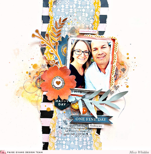
I started with my photo for this page and it has some dark and light
blues in it. I chose three patterned papers to layer behind it in a
vertical direction. At first I had planned on doing a blue-only layout,
but then thought that yellow and orange would be a nice contrast against all
the blue. I tore the papers and glued them together. I used smooth white cardstock for the base and I coated the visible parts with clear gesso.
I wasn’t sure how much mixed media I was going to add, so I wanted it
to be prepped. I used a few orange, yellow, and blue Shimmerz sprays to
add the watercolor effect around the photo.
As soon as I saw this large orange flower, I knew I had to make it work. I smudged a bit of white gesso on it to give it a weathered look. I love bending up the edges on flowers and leaves...it creates such awesome dimension.
I layered a lot of bits and pieces around the photo including some of the large Floral Die Cuts, a few Chipboard Stickers, some Foam Phrase Stickers, and some sentiments from the 8-Page Sticker Book.
I love this large light blue leaf piece and how it helps frame the
bottom of the photo. Here behind these embellishments I added some dark
blue Shimmerz spray to really make the colors pop. I also smudged a bit
of white gesso on
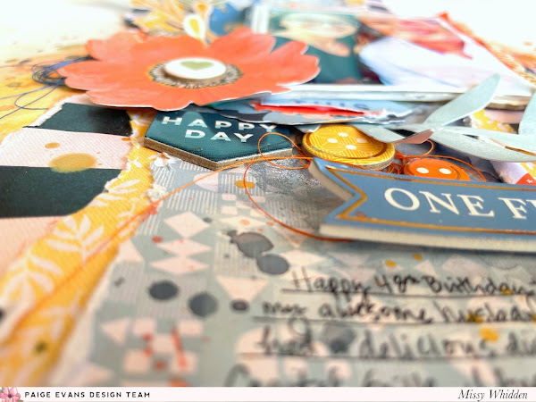
the blue leaves to give it a weathered look. I tucked in orange thread
and wrote my journaling using a black fine-tip Sharpie.
I decided to use orange as the accent color. I used a sliver of orange patterned paper here under the photo as well as an Ephemera Die Cut and white tissue paper. I also tucked in part of a Chipboard Sticker frame piece. I added a bit more orange here using Shimmerz. I used a few of the small gold foiled hearts from the Cardstock Stickers here as well.
I love how these large leaf stems frame the photo so nicely. I decided to use the "One Fine Day" Puffy Phrase Sticker for the title. It fits because we were at dinner for my husband's birthday :)
This smaller leaf sprig is a Cardstock Sticker, and it's shiny metallic gold. I tone down the shine a little bit by smudging some white gesso over it. It's still shiny, but more of a matte finish. Gesso can do so much!
This is a great idea for chipboard frames if they are something you don't normally use. I don't use frames a lot in the traditional way. I used this one as a layer, and I love how it turned out.
More close-ups of all the layering and details :)
I did do a bit of mixed media on the patterned papers. I smudged white gesso down first and then used orange and blue Shimmerz above and below the photo.
Here on the left side I used a large orange Floral Die Cut and topped the center with a Chipboard Sticker. I layered in more flowers and leaf stems to help frame the photo. I added a yellow button Embossed Puffy Stickers to
the center of the blue flower. I did pop the photo and the large orange
flower up off the page with adhesive foam to create depth and
shadowing. I finished off this area with dark blue thread and a few more
heart stickers.
This was a lot of fun to put together. I loved tearing the papers to get the layout going and help determine my color scheme. I hope this inspires you in some way today. Be sure to check out my process video of how I made it :)
Happy Friday, friends! I have a new layout to share for the Paige Evans Design Team featuring Paige's Bungalow Lane collection. I love the denim blue color of Paper 17 so
I used it as a background. I wanted to layer several other bold
patterned papers to contrast against the blue, so I tore big chunks of Paper 6, Paper 11, Paper 21, and Paper 24.
I distressed the edges, layered them together, and used that as my main
background design feature. Before adding mixed media to the blue
background, I smudged lots of white gesso down.
This gave me a bit of white space to work on and it prepped the paper
for paints and sprays. I used a few matching colors of Shimmerz to add
blue, green, and pink color peeking behind all of the papers and
embellishments.
I layered a few of these papers behind my photo as well as some white
tissue paper and adhesive foam. Once I decided on the placement, I
tucked in some of the large Floral Die Cuts. I also used a few of the stickers from the 8-Page Sticker Book. I added dark blue thread here for added color and texture. Here you can see the fun background colors. I also splattered white acrylic paint and a few sprinklings of gold spray. I love that pretty shimmer!
Below the photo I went with a few titles. I used a Foam Phrase Sticker, a large sticker from the 8-Page Sticker Book, and some of the alpha Thickers. I layered in yellow thread and more flowers from the Floral Die Cuts and Epoxy Stickers. I wrote my journaling with a white pen so it would stand out against the blue background.
I layered in another large blue Floral Die Cut here
on the right side as well as more blue thread. I love all of the bits
and pieces in this collection that refer to “home” so I used a small
“Right at Home” sticker from the 8-Page Sticker Book below
the photo. I was pleased with how the mixed media turned out here - I
wasn’t too sure about the blue ink spray on top of the blue background,
but I think the tone-on-tone effect worked out nicely! The gesso helps tremendously with that. I also used my fingers to smudge a bit of the gesso around
the photo on top of the red and pink paper - this helps to fade out
some of the color & pattern to make the photo stand out a bit more.
I did a bit of machine stitching here on this sticker just to add a bit of texture and interest. I love how the yellow thread pops against the dark blue background! Here you can also see the difference that adhesive foam makes--it pops things up off the page to create some depth and shadowing. I love it!
I love this faded look here. Gesso is a miracle worker...haha!
I also love torn and distressed edges. I rarely make things perfectly straight. I have much better luck with making things crooked on purpose...haha :D
Here are a few more close-ups of all the details :)
I hope this has inspired you in some way today. I enjoyed making this and putting it all together. Be sure to check out my process video here:
Thanks so much for stopping by, and have a great day!
Hello again, friends! I have a new layout to share for the Paige Evans Design Team featuring her new Bungalow Lane collection. This is my first layout using this new line, and I just love the colors!
I couldn’t resist creating a fun rainbow design. I started by choosing six patterned papers from the 12x12 Paper Pad.
I cut arcs in each color to create the rainbow which stretches
horizontally across the entire page. I decided to embellish with small
pieces in a tone-on-tone manner to keep the rainbow theme flowing. I
also added some matching colors of Shimmerz to create a watercolor
effect on the background.
I used thick white cardstock for the base and I coated it with clear gesso first
before adding any paint. I used a brush to paint the color on above the
red arc and below the blue arc at the bottom. I wanted it to look like
the layout was left out in the rain and the rainbow started leaking
color. Once that was done, I glued down the rainbow arcs and then
machine stitched through each one using matching thread. I also
distressed the edges to create some texture. I splattered white acrylic paint to create a weathered effect.
Here you can see more of the watercolor effect. For the title I used this large “Lucky” Foam Phrase Sticker.
I love that it was perfect for my rainbow theme and it worked great on
this white area. It has gold foiling, which is so pretty. I added more
embellishments here at the bottom. I fussy cut a butterfly from one of
the 2x2 Paper Pads and
popped up several pieces with adhesive foam. I wrote the journaling
with a black fine-tip Sharpie and tucked in a few colors of matching
thread in a few places.
k
It's so much fun going through all of the embellishments to pick and choose what to put where. When you do a tone-on-tone design, it helps you narrow down your choices--meaning you only have so many blue things to add to the blue area.
As a final touch, I hand cut a few little clouds using scrap Bazzill textured white cardstock.
I distressed the edges and smudged a bit of a gray gelato to give them
depth. I love adding clouds to a rainbow layout! I finished the page off
with gold paint splatters.
A new addition to this collection is these Epoxy Stickers. They are are really neat.
Sometimes I like to tone down the shine on pieces that have metallic gold foiling, so I use my finger to smudge some white gesso over it. It's still shiny, but just a little more matte.
Here are more close-ups of all the pretty things :)
As far as the mixed media goes on this, I was very intentional about where I added the paint. I wanted it just peeking out at the top and at the bottom, so I controlled how much I added with a brush. Also, adding the gesso first was crucial to helping the colors blend and spread out so nicely.
k
I hope you got some fun ideas to try from this layout! I love rainbow pages, and they always make me happy. I'm looking forward to making more layouts using this beautiful collection :)
Happy Friday, friends! I'm back today with a new mixed media layout for the Paige Evans Design Team featuring lots of hearts. I mixed Paige’s Wonders and Go the Scenic Route collections
to create a fun blue, pink, and orange color scheme. I pulled a heart
punch from my stash and went to work with some of the patterned papers.
My design idea changed several times and I wound up trimming the hearts
to make them a little smaller. I also used the trimmed outline of the hearts on the
page.
I used WondersPaper 3 for the background and I coated a lot of it with white gesso - this helped to fade some of the pattern and prep the paper for inks and sprays. I scraped a few matching Distress Oxides across the paper and added a bit of water to make the colors run and blend.
I decided to stack my two photos vertically and place the hearts around
them. I distressed the edges of the solid hearts, glued them all down,
and then machine stitched through the centers with gold metallic thread.
I also used a few matching Shimmerz sprays to add some splatters as
well as some Jen Hadfield Gold Glitter Spray. I embellished around the
photos with a few Wonders Ephemera Die Cuts and Epoxy Phrase Stickers.
I made sure to not glue down the entire heart pieces so the ends would bend up off the page. Here at the bottom, I added an Ephemera Die Cut onto the bottom photo and I fussy cut “home” from another piece. I added “life” from the Epoxy Phrase Stickers. I
tried to keep the embellishing tone-on-tone. I added matching colored
thread in each of the three color areas and then finished off with
sequins from my stash.
I love how the ink colors turned out here in this area. I splattered down white acrylic paint before
everything was completely dry, and I love the effect that creates. I
created a small title on top of the photos. I fussy cut “hello” and
“smiles” from Paper 24. The “today” is from the Go the Scenic RoutePuffy Word Stickers.
I love how the edges of the hearts pop up off the page. Instant dimension and texture :)
I really love how the inks blended here...it looks so dreamy with these colors! Also, if you like to use thread like I do and you don't have the exact color you want, blend two colors together. I added some red thread here to this pink and unless you get up really close it looks like that darker pink color.
I also really love the effect of white paint splatters. Such a small detail with a big impact.
More close-ups of all the details :)
I hope this gives you some ideas to try on your next page. I had fun making this, even if I didn't know where it was going for a while...haha. Just keep playing around and eventually an idea will form!
Here's my process video:
Thanks so much for stopping by! Have a wonderful weekend :)