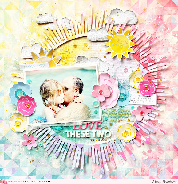
Hey friends! I'm back today with another throwback layout for the Paige Evans Design Team using Paige’s Bloom Street collection. It’s been awhile since I’ve made a layout with these papers and it was fun to put together a bright summer page. I wanted to use Paper 22 in some way and I had originally cut Paige’s Sunburst Cut File on this paper to use by itself. As soon as I played around with the whole thing, I loved how the cut file looked placed back inside the rest of the paper. To make it stand out, I smudged a lot of white gesso around the background edges of the paper to fade it out so the sun would pop off the page while still blending in. I also wanted to show how you can use a busy patterned paper as a background and still make the photo pop off the page. I glued the whole thing to white cardstock and added a bit of coordinating Shimmerz Paints around the photo.

My photo matched this paper so perfectly and so I added aqua color around it to sort of create an extension of the water. I added yellow up top to mimic the sun. I embellished with a few suns, one is a Cardstock Sticker and one is from the Ephemera Die Cuts. I used a few Floral Die Cuts as well as several that I fussy cut from Paper 12. I added in a few more sentiments from the Cardstock Stickers and tucked in blue thread for texture.
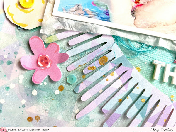
In the end, I decided to use two suns. It just felt right, haha! I love seeing all these different layers here. Here you can also see some sequins I added in from my stash. I love how these blue ones look on the pool water and the flowers. Here's a good shot of how the gesso can soften up the pattern in comparison to the cut file which is not faded out. Gesso is a miracle worker :DI wanted to dress up the top area of the design so I hand cut a few little clouds from scrap white cardstock. I smudged a tiny bit of grey gelato around the edges, smudged it in with a dab of water, and then distressed the edges. I popped a few of them up with adhesive foam and layered them in and around the sun rays. I added splatters in all the colors on the background, including yellow, aqua, pink, and gold. I made sure to leave some plain white area here inside the big circle to give the eye a place to rest since the rest of the page has busy patterns going on.
I needed a small title, so I mixed and matched with the Puffy Word Stickers and some of the Mini Foam Thickers from Paige’s Pick-Me-Up collection. I added adhesive foam behind the sun to pop it off the page. Here you can see the dimension. Lastly, I added a few sequins from my stash on the flowers and around the page for extra interest and texture.
I took a lot of close-ups, so check out all the fun details.
I really love how this came together! You can see in the video how I had a completely different idea in the beginning. It morphed into this, and I think it's way better than my original idea! Hope it inspires you in some way today :)
Here's my video:


