Pages

Tuesday, May 30, 2017

Sun Sand Sea / Paige Evans Design Team

Hello again, friends :)  I'm back today to share my newest layout for the Paige Evans Design Team.  Our theme this week is VACATION, which is perfect since I have lots of vacation photos to scrap!  This is a photo of the beautiful water in Aruba.  We spent five days there last July and it was awesome!  I decided to go all bright and sunny for this page and used products from Oh My Heart and Fancy Free.

I started with a sunburst stencil from my stash and white cardstock.  I sprayed yellow and golden yellow ink sprays over the stencil to create the sun rays.  I used blue acrylic paint next to create some "water" on the background.  I smudged it on with a palette knife and then used a few blue and aqua ink sprays over that to add a little variation in color.  Once that all dried, I machine stitched on each edge of the sun rays to make them stand out a little more and add some texture.  I hand cut all the letters from patterned papers and made the big title part of the background design.


I didn't want to use my Cameo to cut these letters, so I just went for it and started cutting.  I didn't want them to be perfect, and they sure aren't.  I love the contrast of these colors against the background.  I decided to add some flower elements, so I used some Fancy Free Chipboard here.  I fussy cut a flower and leaves from Oh My Heart Paper 06 and layered them in.  I also machine stitched through each word.


All of the letters in "Sea" were cut from the Fancy Free 6x6 Paper Pad.  I layered in a flower behind the photo from the Oh My Heart Ephemera Die Cut pack and then a few stickers from the Chipboard Stickers sheet.


Here you can see all the awesome dimension around the photo.  Most of that is achieved by using adhesive foam under it.  I really didn't want to over-embellish this page since the letters and background stood out so much.  I didn't want it to get too busy.


For the left side of the photo, I added another die cut flower, more thread and two little fussy cut flowers from Paper 06 again.  I also added a multi-colored chipboard frame under the photo.  That's from Oh My Heart as well.


And one more close-up just because of all those gorgeous colors! :)


I hope this gets you in a beachy mood :)  Summer pages are my favorite mostly because they include all my favorite colors.  I hope you're inspired in some way.  I do have a process video if you'd like to see how I put this all together.


Thanks so much for stopping in, and have a wonderful day :)


Monday, May 29, 2017

Love (and a lot of mixed media!) / Shimmerz Education Team

Hey, friends!  I'm back today to share my newest project for the Shimmerz Education Team.  This layout took lots of twists and turns, and it wound up looking completely different than I expected.  Even the color scheme changed as it went.  And that's okay because I love how it turned out :)

I used a lot of the original Shimmerz Paints to start with.  I pulled out some bubble wrap and painted on three colors and then flipped it over and used it as a stamp.  You get a really cool messy circle design.  After that dried, I used some Vibez and Coloringz to add more shades of pink and blue.  I'll list all the colors I used down below.  After I had all those colors down, I decided to scrap this photo I've had sitting on my desk for a while.  It has interesting colors in it, so I challenged myself to make it work with the color scheme I already had going.  As soon as I saw the palm fronds in the photo, I knew I wanted to make some of my own and use as big embellishments.


After I added in all the palm fronds, I decided to go a little bolder with the pinks. I pulled out some flower die cuts from the Crate Paper Cute Girl collection and tucked them in.  These two smaller pink flowers I punched from cardstock that I colored with Pinkadelic Acritonez. The color matched perfectly.  I added in some tangled thread in coordinating colors and wrote my journaling down below that.  Here you can also see some of the gorgeous sequins I used from SpiegelMom Scraps.  Those little flowers are amazing...the petals curl up and they are so dimensional.


I used a cut file from the Silhouette store to cut the palm fronds on white cardstock.  I used Shimmerz Jilted Jade, Vibez Velveteen Green & Acritonez Peas Be Mine to color them.  I love the bright shades of green!  I think they look especially beautiful up against that bright pink acetate die cut.  You can also see more of those cute sequins here.


One fun thing about painting floral or leaf die cuts like this is when they dry, the edges curl up.  It really gives a nice dimensional effect and makes them look a little more realistic.  I used a few random MAMBI Project Life cards as layers behind my photo.


I went super simple with my title and just used one of the Crate Paper die cuts.  It matched and looked cute wedged there in between the palm fronts.  I'm usually not a huge bright green fan, but these mix of greens is changing my mind!


Here's the area above the photo...lots of splatters and layering.


Here's one more look at the awesome texture and dimension.  I'm really happy with how this turned out even if it does look different than I thought :)


I hope this inspires you to create something different and fun!  Try mixing and matching your Shimmerz products.  Layering them is a lot of fun, and you can get some really gorgeous colors that way.  Here's the process video for this page.  I hope you enjoy!


Thanks for stopping by!


Supplies Used: 
Shimmerz: Tickle Me Turquoise, Anchors Away, Jilted Jade, Ultra Marine, Magenta, Royal Red, Pumpkin
Vibez:  Sweetheart, Blue Jeans, Velveteen Green
Coloringz:  Heidi Ho Blue
Acritonez: Peas Be Mine, Pinkadelic


Sunday, May 28, 2017

Happy Girl / Thermoweb Design Team

Hey friends, and Happy Sunday!  I hope you are all having a fantastic weekend :)  Today I'm sharing a new layout and some exciting news.  I was asked to join the Thermoweb Design Team, and I accepted!  Thank you so much to Julia for inviting me.  I have been a fan of their beautiful foils for so long, and I used some of them on my first DT layout here.  If you're unfamiliar with Thermoweb, they also carry a lot of mixed media products as well as dies, inks, cardstock, glue and tape runners.  There are a lot of things, so make sure you check out the website HERE.

My first layout was up on the Thermoweb Blog last week.  I used one of the Mixed Media Sheets, which is a sheet that is almost a cross between vellum and fabric.  You can do anything to it.  I added some of the Gina K. Designs Premium Dye Ink colors to it and created a rainbow watercolor design.  You can cut or tear these sheets, and they can also be printed and stitched on.  I punched circles out of these after the ink dried.  To add all that color, I turned the ink pad over and stamped it onto some plastic packaging and spritzed it with some water.  Then I smushed the packaging down onto the Mixed Media Sheet and it worked beautifully.


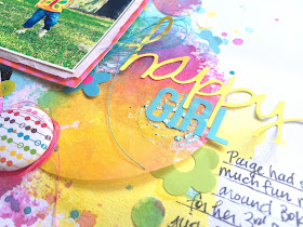
Okay, check out this pink foil.  This stuff is amazing!  To get this look, I first used some of the Deco Foil Transfer Gel.  It look like a smooth white glue almost.  I smudged some over a sunburst stencil with a palette knife and then let it dry completely.  It dries clear.  Next, I placed the sheet of Gina K. Designs Fancy Foil on top of it, foil side up and placed some vellum on top to protect it.  Then I slowly fed it through my laminator.  The heat transfers the foil onto the gel, and you wind up with this!  So gorgeous!  When the light hits the foil, you get a brilliant shine.  I went with a circle theme here, and added in a few flair buttons, sequins and stickers in all the bright colors.


I did the same thing here with some Gina K. Designs Fancy Foils in Turquoise Sea.  I used a few MAMBI Project life style cards to layer behind my photo as well as some tissue paper, adhesive foam and tangled thread.


Here's another look a the pink sunburst.  The foil will stick to any spot where the gel was, so you have to be careful not to get it anywhere you don't want it.  Here you can also see the texture from the Mixed Media Sheet.  I love how they took the ink color, and tearing, punching and stitching through it was really easy.


Here's something else I did before doing the background foiling.  I did some foiling on the Mixed Media Sheet, and it worked great.  I took an old circle stamp from my stash and put some of the Mixed Media Liquid Adhesive on it....that comes in a glue-type bottle.  I stamped it down and it created a messy shape like you see here behind the word "girl."  I let it dry and then put a small piece of blue foil over it, foil side up.  I just used my fingers to press and rub over the area and pulled the foil up.  It sticks beautifully to the glue.  You don't need a laminator for that.  These title stickers are from some old Simple Stories sticker sheets in my stash.


Oh the rich colors here!  I added more little Simple Stories stickers here and a few Amy Tan Rise & Shine epoxy stickers.  My sweet picture is of my little Paige on her 3rd Birthday.  I think the colors were perfect for this, and I just couldn't print this in black & white.  Not with that orange butterfly shirt :)


Here's one more sunburst I created using orange foil.  This is really like magic to watch happen...it's so neat, and the result is so cool!


Here's one more close-up of the blue under the photo.


This was so much fun to make, and with the Transfer Gel, you can really create any type of shape you want.  If you'd like to actually watch how I did all these things, check out my process video here:


Thanks so much, and have a wonderful weekend!

Thursday, May 25, 2017

You Are Capable of Amazing Things / Bella Blvd

Hey, friends!  Today I'm sharing my newest layout for Bella Blvd.  I started off our Stamps Week over on the Bella blog.  I love incorporating stamps onto my layouts, and the Illustrated Faith Homespun Alpha Stamps are perfect for creating a large title.  I wanted to go big and bold, so I found an inspirational quote on Pinterest and made it the focus of my layout.  I used different colors of spray inks to stamp with instead of ink pads.  I wanted an artsy and messy look to the letters, and the liquid did just that.  I mostly used the Illustrated Faith Seeds of Faith collection for this, so I chose ink sprays that matched.  Once they dried, I fussy cut them out.  I cut the word "amazing" on my Cameo using a fun script font and cut it really big on the Birds of a Feather paper.


For my background, I covered the middle area of the page with some white acrylic paint.  I used the same spray inks and watercolors here as I did with the letter stamping.  I combined the packaging technique with using my paint brush to add all that abstract color.   


I love the texture and dimension here!  You're almost always going to get some curling when the paper dries from the watercolor.  That makes it so easy for things to jump off the page...such a fun effect!


I also used this adorable open heart stamp from the Illustrated Faith Delight in His Day collection.  I overlapped them creating a few heart clusters around the page.  I layered in a few die cuts from the Illustrated Faith Basics collection and tucked some tangled thread under my photo as well.


Here I used a few pieces that I fussy cut from the IF Basics Clear Cuts pack.  This cute butterfly and flower matched so well, and I brought in a pop of that aqua by adding in some thread.  I also brought in another stamp here from the IF Icons Stamps.  I added the date to it down by my journaling.


 Here you can see how awesome the watercolor stamping turned out.  I love that the letters aren't perfect.  I also love how the ends curl up.  It creates such awesome texture and dimension.  I did run the page through my sewing machine and used light pink thread to stitch through each word.  I added a few more die cuts here from the IF Basics and Seeds of Faith Paper Pieces pack.


The fun thing about using a big quote like this for your page is that it takes up a lot of space.  I really didn't feel like I needed to add a lot of embellishments.  The letters were design enough and provided plenty of color, interest, texture and dimension. 


I do have a process video for this page if you'd like to check it out:


Thanks so much for visiting me today, and have a great day!

Wednesday, May 24, 2017

A Little Dirt Never Hurt / Cocoa Vanilla Studio

Happy Wednesday, friends!  I'm back to share my newest layout for Cocoa Vanilla Studio.  This is my first layout using the new You Rock collection, and I did my best to create a "boyish" layout.  I only have daughters, so I'm used to creating with pinks, aquas and yellows.  This collection is full of reds, yellows, blues and neutrals.  I decided to go grungy yet still keep some girl elements in it.

I started off with a distressed and messy printed patterned paper.  I covered a lot of it with white acrylic paint.  I used some bubble wrap with some brown texture paste to create some messy circles.  I just used the bubble wrap like a stamp and pressed it onto the paper after painting some of the paste onto it.  I sprayed some blue and yellow golden Shimmerz sprays on top of that and did a little bit of packaging technique.  I also added some splatters.  I love the grungy effect all this created.

My photos are of my youngest daughter digging in our flower bed.  She thrives on getting dirty and loves to play in the little sprinklers here.  She was getting all wet and playing in the mulch having herself a grand ol' time...haha :)


I used some of the Washi Tape strips to create a border around two of the photos.  There wasn't any red or yellow papers, so I used some scrap white cardstock and added the washi to it.  It totally looks like paper!  I also used a few of the Rubber Charms...they are amazing, by the way.  Behind my photos, I added several die cut frames from the Ephemera pack.


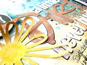
I got the idea for my title from one of the quotes on the Washi Tape strips. This was perfect for my photos!  I cut "dirt" on the wood grain paper using a handwritten font and then cut the rest of it in a block style font using white cardstock.  I think mixing and matching sizes and fonts for titles gives a really striking look.  To make my layout slightly girly, I used some flower cut files from Just Nick Studio.  They're kind of wonky and skinny, and they were perfect for this.  I cut them on white and used the same ink sprays to color them.  I love how the petals curl up at the ends!


Here you can see all the dimension and layering.  I added foam behind my photos as well as some tissue paper.  I machine stitched through all the frames using a dark brown thread.  I tucked in one of the wonky die cut flowers here and added some thread under it.  That cute camera circle is from the Ephemera pack, and so is the little yellow arrow on top of the bottom photo.


These flowers are so cool!  I layered these two at the bottom of the page.  I really like how they look against the yellow golden background.


I added in one of the stickers from the Accessory Sheet here...again, another perfect piece for this.  I really love how the dimension looks here.


I added in a big chipboard circle over to the left of the title...I just liked it, and it brought out some of the black & white from the photos.


Here's one more close-up of the right side.  I used a few more of those cute Rubber Charm arrows.  I love the mix of these colors together!


I hope this inspires you in some way!  It was challenging for me at first to break away from my usual girly ideas, but it was so rewarding to see the end result.  Plus the photos were just meant for this collection :)

Here's my process video:


Thanks so much for stopping by!  Have a great day!

Monday, May 22, 2017

Today Always / Hip Kit Club

Happy Monday, friends!  I hope you all had a wonderful weekend :)  I'm here to share my newest layout for the Hip Kit Club using the 2017 May Hip Kits.  I was recently inspired by a layout created by Paige Evans where she used black cardstock as a background and added lots of small bright colored squares to it.  As soon as I saw this black and white grid paper in the Main Kit (and Paper Kit), I knew I wanted to use it as my background.  I fussy cut lots of beautiful bright flowers from one of the Shimelle papers and tucked them around the photo in a diagonal fashion.

To jazz up the background area, I used lots of white gesso first.  I love using my fingers to smudge it so it has a soft hazy edge.  Next, I used some of the Prima Watercolor Confections from the Color Kit and some gelatos from my stash. I also watered down some white acrylic paint and used my brush to splatter it.  And I finished off with some Gold Color Shine.


These flowers were too pretty to leave on a whole sheet, so I cut them out :)  I added in a few of the Crate Paper chipboard plus signs around the page for added pops of black and some dimension.  I decided to type my journaling on my computer since my background was so dark.  I felt that a black pen would just blend in too much. This way, they white strips show really well.


I fussy cut "Always" from one of the Pinkfresh Studio papers and used that as my main title.  I added in "today," which is an exclusive wood veneer.  The Shimelle die cut pack had coordinating flower die cuts, so I used them to create a third cluster over to the right side.  I popped up the smaller yellow flower with some foam and added some tangled thread under it.  That row of hearts is a Pinkfresh Puffy Sticker, and the shiny button is from Dear Lizzy.


I love all this dimension!  I added in another wood veneer piece above the photo and some Crate Paper buttons as well.  That cute little heart is a Dear Lizzy Puffy Sticker.


I love layering things on top of my photo when there's room to do it.  I had some open space to the right, and the slant of the A fits perfectly right beside the slant of her arm.  I didn't even plan that...it just worked out like that!  Love when that happens :)


I love how these colors turned out on the dark background.  The white gesso helped tremendously with this.  I used my fingers to smudge the gelatos after adding the watercolor.


Here's one more close-up of the flower cluster at the bottom.


I really love how this turned out!  I probably never would've thought to combine the dark background with the bright flowers if it hadn't been for Paige's layout and this awesome kit.  Kimberly does such a fantastic job of pairing things up, and I really love all the mixing and matching.

I have a process video here for you :)


Thank you so much for stopping by!  Have a fabulous week, friends :)


Thursday, May 18, 2017

Island Vibes / Hip Kit Club

Happy Thursday, everyone!  I'm back today to share a new layout for Hip Kit Club using the 2017 May Hip Kits.  This is my first one using these kits, and I love how it turned out.  Right away I was inspired by this beautiful Dear Lizzy paper from the Main Kit I used as a background.  It's like a pretty watercolor sky, and for the first time in a LONG time, I didn't do any mixed media work on the background.  It just didn't need it...it was beautiful the way it was :)  You can also find it in the Paper Kit.

I used one of Jana's cut files and enlarged it.  The theme for this day was to supersize something, so I made the sun & cloud really big.  I cut it on white cardstock and then used the beautiful Prima Watercolor Confections from the Color Kit to color it.  Once it dried, I adhered some vellum behind the open sun.  It adhered it to the background and then used some matching embroidery thread to hand stitch around the edges.  I love how the sun's rays curl up off the page...such awesome dimension!  I embellished with a lot of the exclusive floral die cuts, some of the Shimelle clear floral stickers from the Sticker Book, some Dear Lizzy Puffy Stickers, enamel dots & a fussy cut floral cluster from a Project Life card.


I love how the title turned out.  I combined some of the exclusive blue alphas (LOVE that font!) with an exclusive wood veneer.  I fussy cut "today" from a Project Life card.  The colors were too perfect to pass up.  You can see all the dimension and layering here behind my photo.  I used a few Project Life cards and some floral die cuts under it as well as some tissue paper & adhesive foam.


I created another little cluster over to the left here using some Shimelle clear stickers, a flower die cut, a Crate Paper button, an exclusive puffy sticker, some tangled thread and a few enamel dots.  I love the texture created from the stitching here...such a great detail without taking away from anything.  To created this blue color on the cloud, I mixed some of the blue watercolor with some white acrylic paint.


Kim Watson & Kimberly Hutchinson did such a beautiful job with these exclusive flower die cuts.  Even the leaves are fabulous!  The clouds are also in that ephemera pack.  I think I used them all on this one page :)


Here's one of the clouds.  I love the gold metallic dots on it.  I tucked it in here under the sun and then added some enamel dots.  I also machine stitched through the white clouds.


I just had to fussy cut this flower cluster from a Project Life card.  The colors were perfect, and I love how it looks layered under the photo.


Here's one more close-up to show the colors, texture and dimension.


I hope this inspires you.  I had such a great time putting it together!  Here's my process video if you'd like to check it out!


Thanks so much for stopping by today!  See you soon :)